The network for creativity
Join 1.25M professional creatives like you
Connect with clients, get discovered, and run your business 100% commission-free
Creatives on Contra have earned over $150M and we are just getting started
Back to feedPost

Infinite Threads — Podcast Growth & Brand Strategy
Leading brand growth for a podcast centered on love, human connection, compassion, and emotional growth. Driving audience development through SEO, organic marketing, content distribution, brand positioning, and community building.
Results: 10,545 impressions (last 30 days), 974 total audience, 3,610 consumption hours, +459 followers (all-time).






The network for creativity
Join 1.25M professional creatives like you
Connect with clients, get discovered, and run your business 100% commission-free
Creatives on Contra have earned over $150M and we are just getting started







Related posts

Created the complete brand identity for Nerada, a natural tea brand — developing the visual direction and design elements that shape how the brand looks and feels across every touchpoint. The goal was a clean, organic aesthetic that reflects the brand's natural positioning and builds a consistent, recognizable identity.


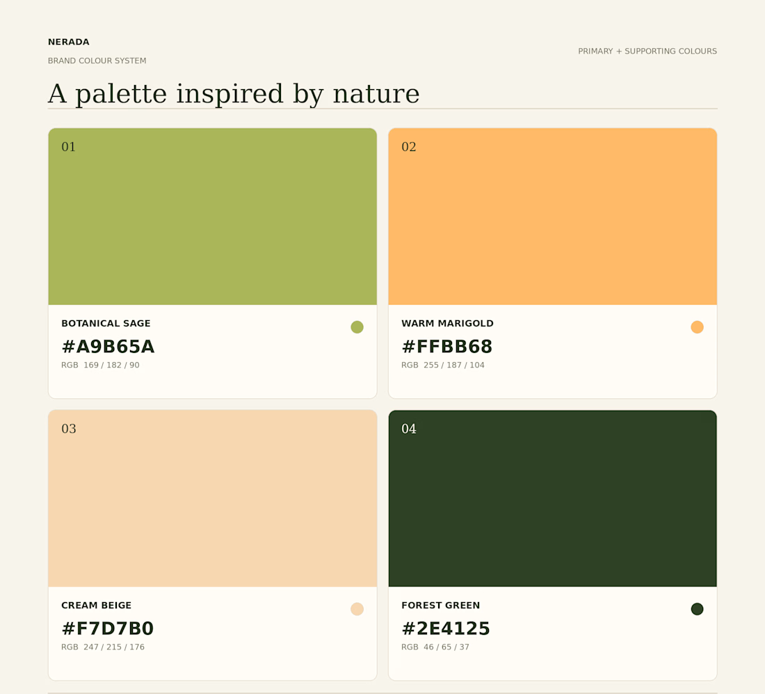
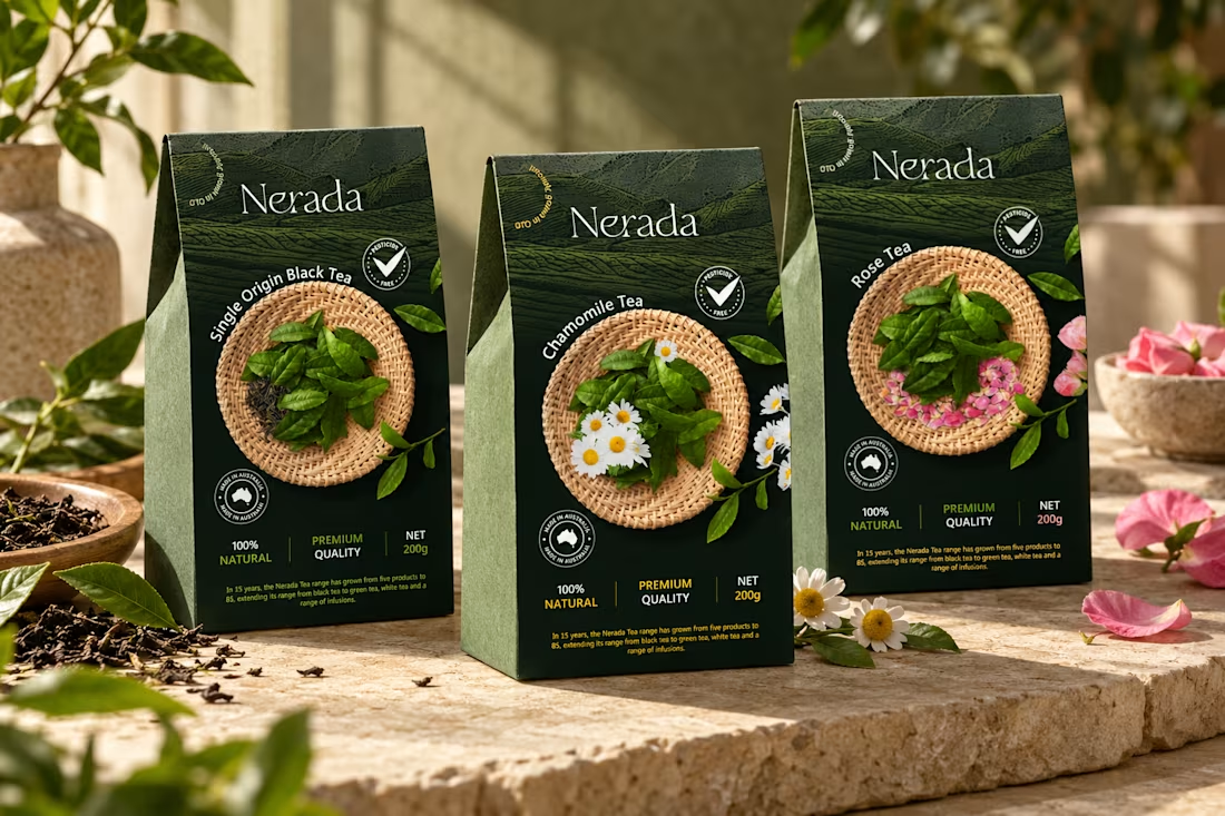
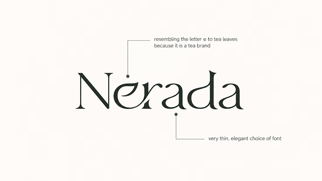
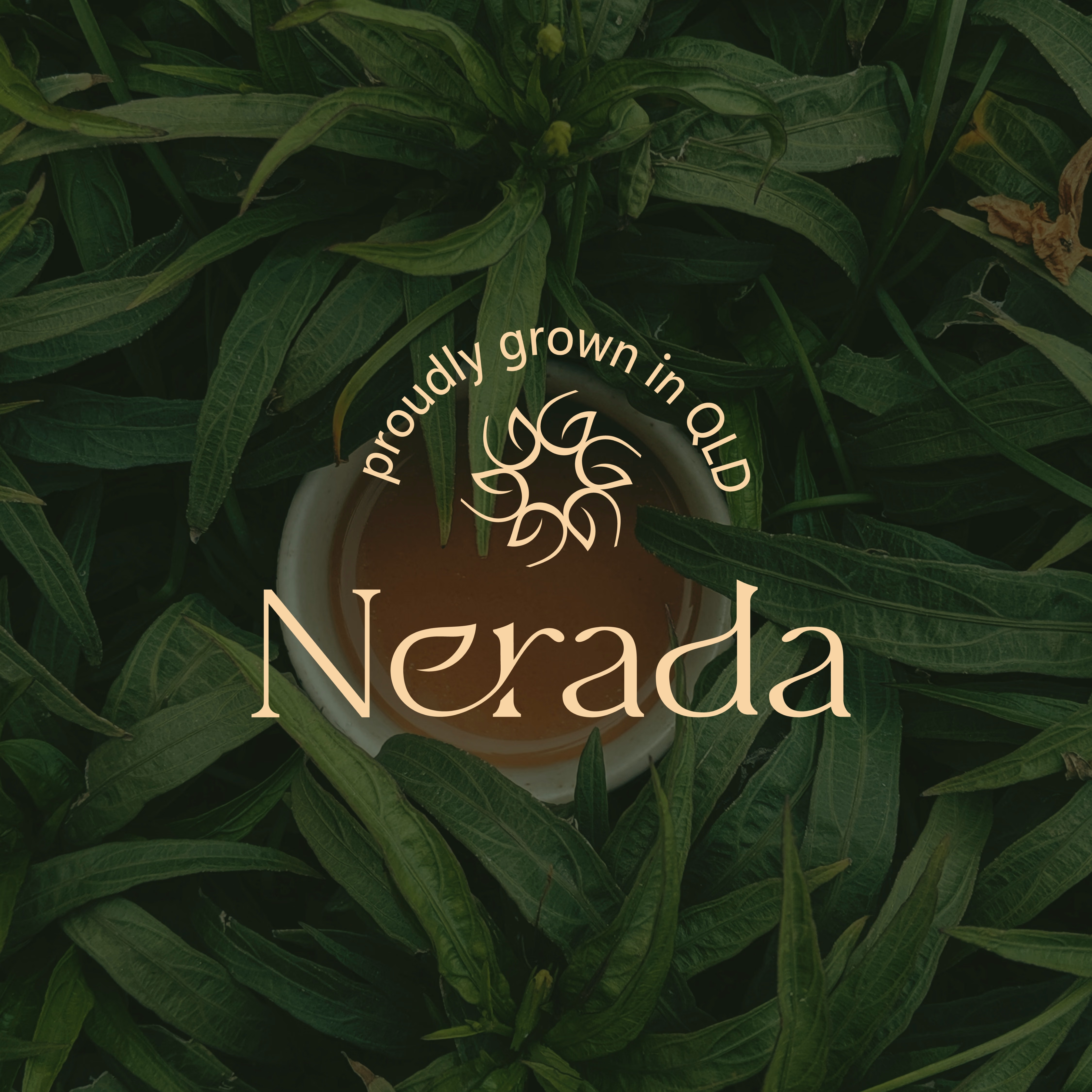

The mark feels grown rather than drawn, which is exactly right for a natural tea brand. Packaging is where tea brands win or lose. Does the identity change tone across blends, or stay one voice with different colours?


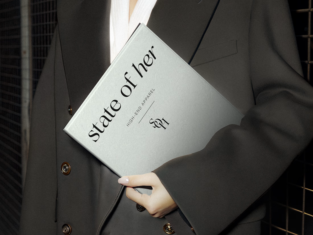
Introducing State of Her, a womenswear brand made for every state of her life.
Custom typography, sculptural monograms, and a softly grounded palette come together in an identity that balances confidence with ease.

GIANT — Move Different.
Built around a bold gorilla mark, oversized typography, and an electric purple + neon-lime palette.
A streetwear identity designed to feel bold, rebellious, and instantly recognizable — from hoodies and caps to packaging, tags, and everyday brand details.
Concept branding project | Open for custom projects


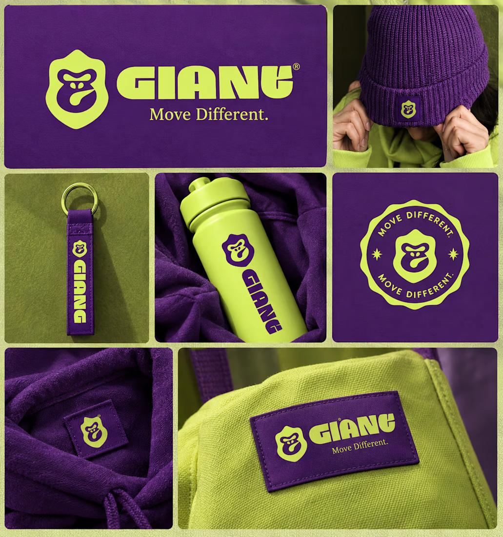
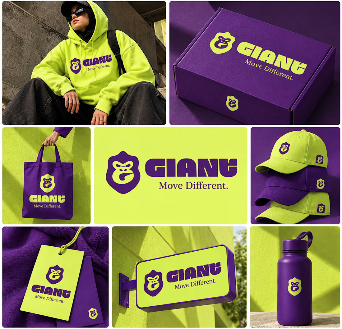

Using electric purple paired with neon lime is a high risk color choice that demands exceptional contrast management. Getting that balance right across different fabrics and lighting conditions is often where streetwear brand identities actually fail.