The network for creativity
Join 1.25M professional creatives like you
Connect with clients, get discovered, and run your business 100% commission-free
Creatives on Contra have earned over $150M and we are just getting started
Back to feedPost

Check it out Espresso Joint — Brand Identity, Packaging & Web
The brief
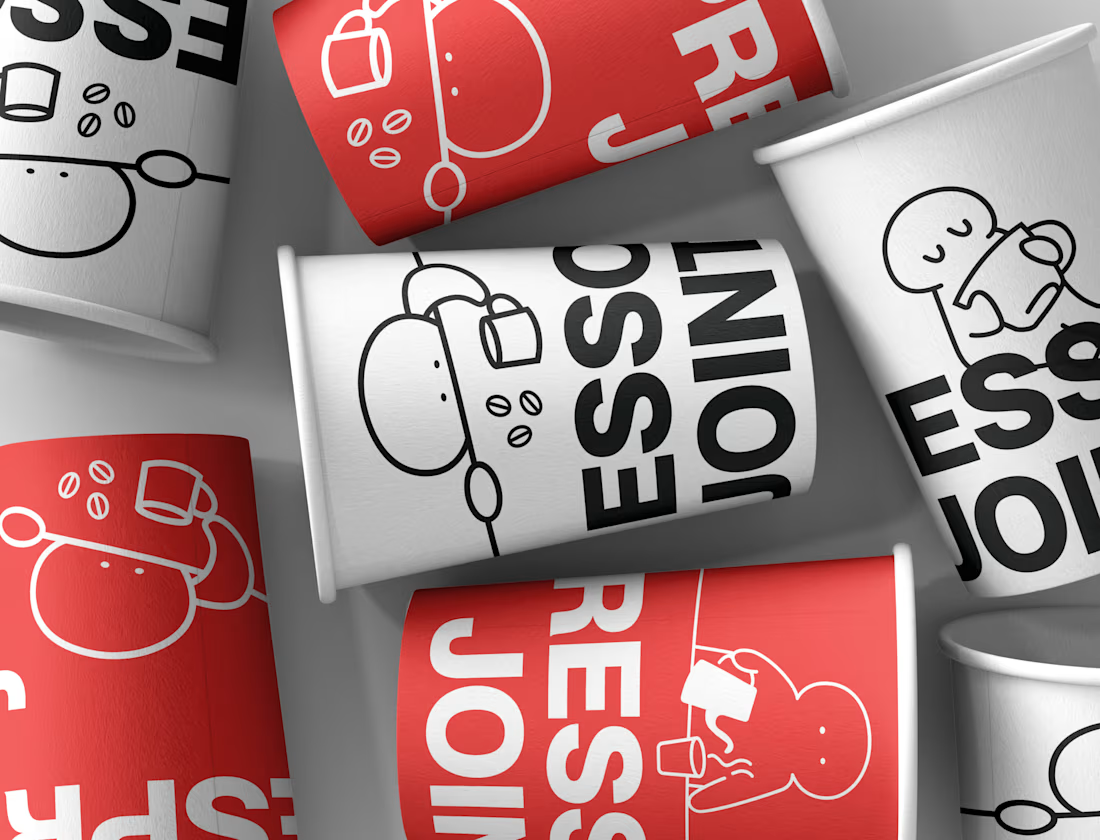
Espresso Joint is a specialty roaster that didn't want to look like one. No kraft paper, no hand-lettered warmth, no burlap sacks and sepia photography. The category has settled into a single well-mannered look, and the ask was to leave it: a coffee brand with the posture of a streetwear label, loud enough to read across a café from the cup in someone's hand.
Identity
Everything rests on two elements. The first is a heavy grotesque wordmark, set tight and stacked, built to be cropped — letters run off the edge of a cup or a can and the brand still reads. The second is a red pill, drawn from the silhouette of a coffee bean, which works as a standalone mark at sizes where the wordmark falls apart.
The palette is deliberately narrow: one red, black, and an off-white paper tone. Nothing else. A three-colour system this blunt needed somewhere to be warm, so the third element is a cast of single-weight line characters — small blobs pouring from a kettle, hugging an oversized mug, slumped across the counter before the first cup of the day. They're drawn in one consistent stroke weight so they sit inside the system rather than decorating it, and they carry all the humour the typography refuses to.


The network for creativity
Join 1.25M professional creatives like you
Connect with clients, get discovered, and run your business 100% commission-free
Creatives on Contra have earned over $150M and we are just getting started


Trending
retrofuturism
Share your favorite designs from the past exploring the distant future. Or your own take on the aesthetic 🚀
halftone
Dots. Texture. Grain. Let's see your designs using the halftone technique.

Midjourney
Creatives are showing off what they're making with Midjourney.
colorgrade
Video editors sound off: How do you enhance the mood of your video in color grading?


Related posts

Building a visual studio (video, motion, design, vfx) rooted in hyperrealistic futurism.
Our vision is to develop accelerated storytelling formats: AI-generative tools and scripts, detailed post-production techniques, human creativity at the core.
Name’s still TBD. The mark’s closed. Help us pick!
Which one works better?


12 voted
33%
24 voted
67%
36 votes
Closed

B for me 🙌 A* feels a little too close to a hashtag at first glance. Can you see it? 😂

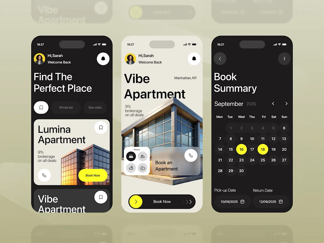
📱 𝐑𝐞𝐜𝐞𝐧𝐭𝐥𝐲 𝐰𝐨𝐫𝐤𝐞𝐝 𝐨𝐧 𝐭𝐡𝐢𝐬 𝐌𝐨𝐛𝐢𝐥𝐞 𝐁𝐨𝐨𝐤𝐢𝐧𝐠 𝐀𝐩𝐩
I approached it from both sides: designing the experience and thinking about how it becomes a real application.
On the design side, I worked through the apartment discovery, property details, saved listings, booking flow, dates, interactions, and UI system.
On the development side, I think through how the design translates into a working product using React Native, reusable components, interaction states, navigation, and responsive layouts.
🏠 Property discovery
📅 Booking flow
✨ UI/UX & interactions
⚛️ React Native
💻 App development
For me, the Figma file is only part of the process. The real test is how well the idea survives when it becomes a working app.




Adaptive Landing Page🤎
A clean and modern landing page for ŌURA, designed to highlight the premium experience of the ŌURA smart ring.
The design combines a clear visual hierarchy, refined typography, and a minimal interface that keeps the product at the center. The adaptive layout ensures a consistent and intuitive experience across desktop and mobile.
A focused approach to product presentation, where visual simplicity supports both the brand and the user experience✨


Wow, looks cool! And the product is great!!