The network for creativity
Join 1.25M professional creatives like you
Connect with clients, get discovered, and run your business 100% commission-free
Creatives on Contra have earned over $150M and we are just getting started
Back to feedPost

For the second month now, I've been part of a design community called "Design Like Girls". Every week there's a challenge, and this one took me somewhere I wanted to share. These challenges keep pulling me outside my usual B2B habits.
The format:
Pick a UI shot, recreate it in 20 minutes, then draw a random task from a bag and redesign around it.
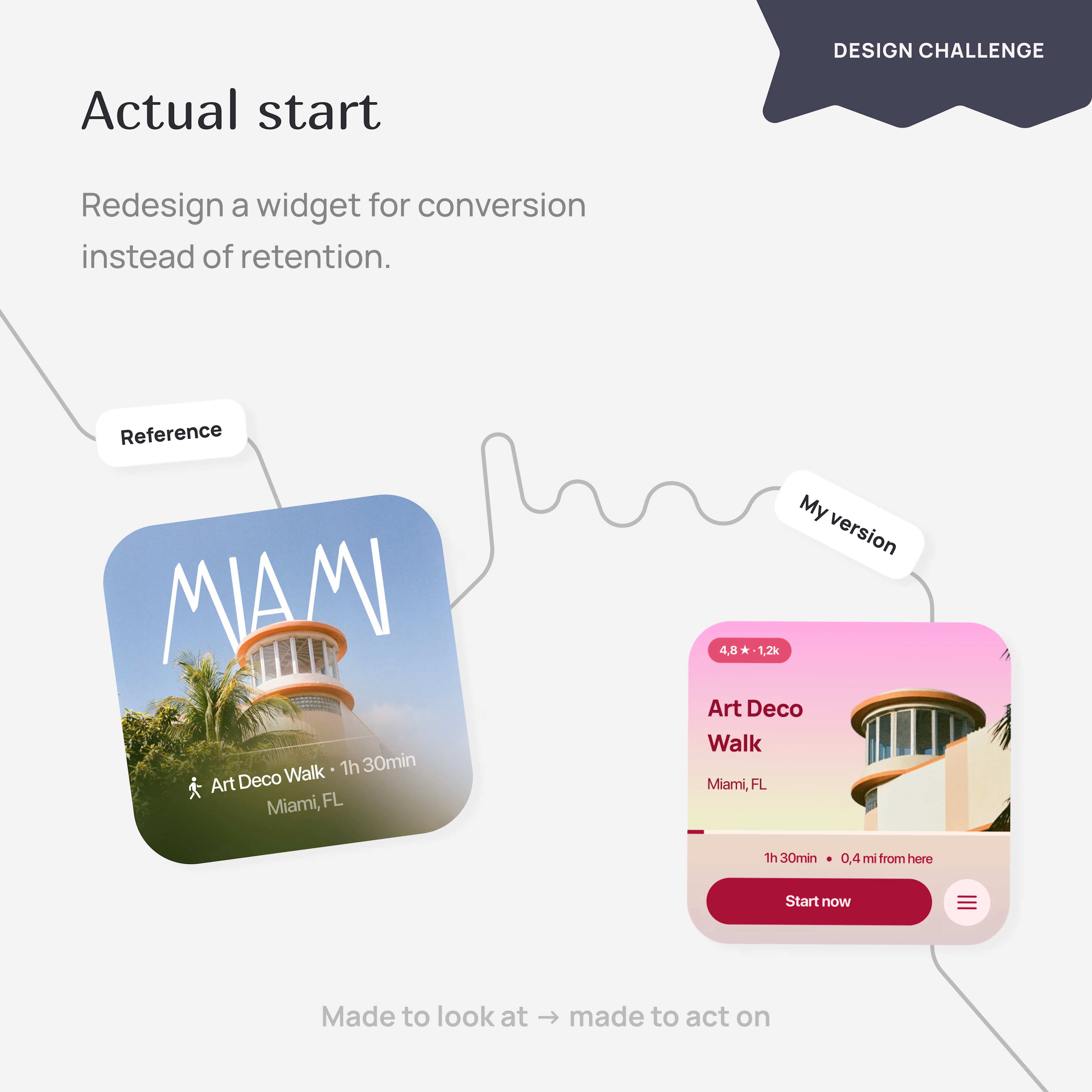
My shot was a beautiful Miami location widget: full-bleed photo, big elegant "MIAMI" typography, quiet everything else.
My task:
Redesign it for conversion instead of retention.
The actual redesign.
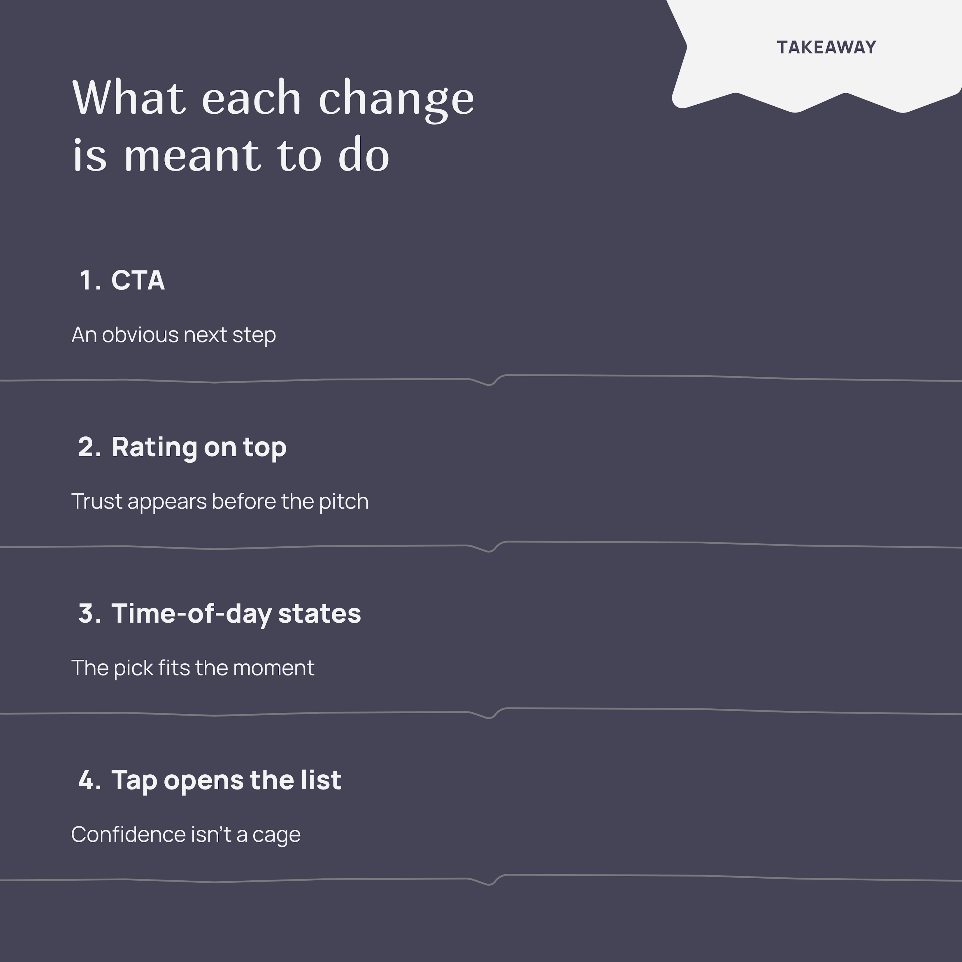
The original was made to look at, but easy to scroll past. My version had to be made to act on. So the hero image got demoted to a background. A big CTA became the point. The rating moved to the top, doing the persuasion work before anything else. Time and distance appeared right above the button, so "how far, how long" wasn't a mystery. The location name was increased to turn it into the whole reason someone would tap. What used to be admiration became information + action.
Then I pushed it further.
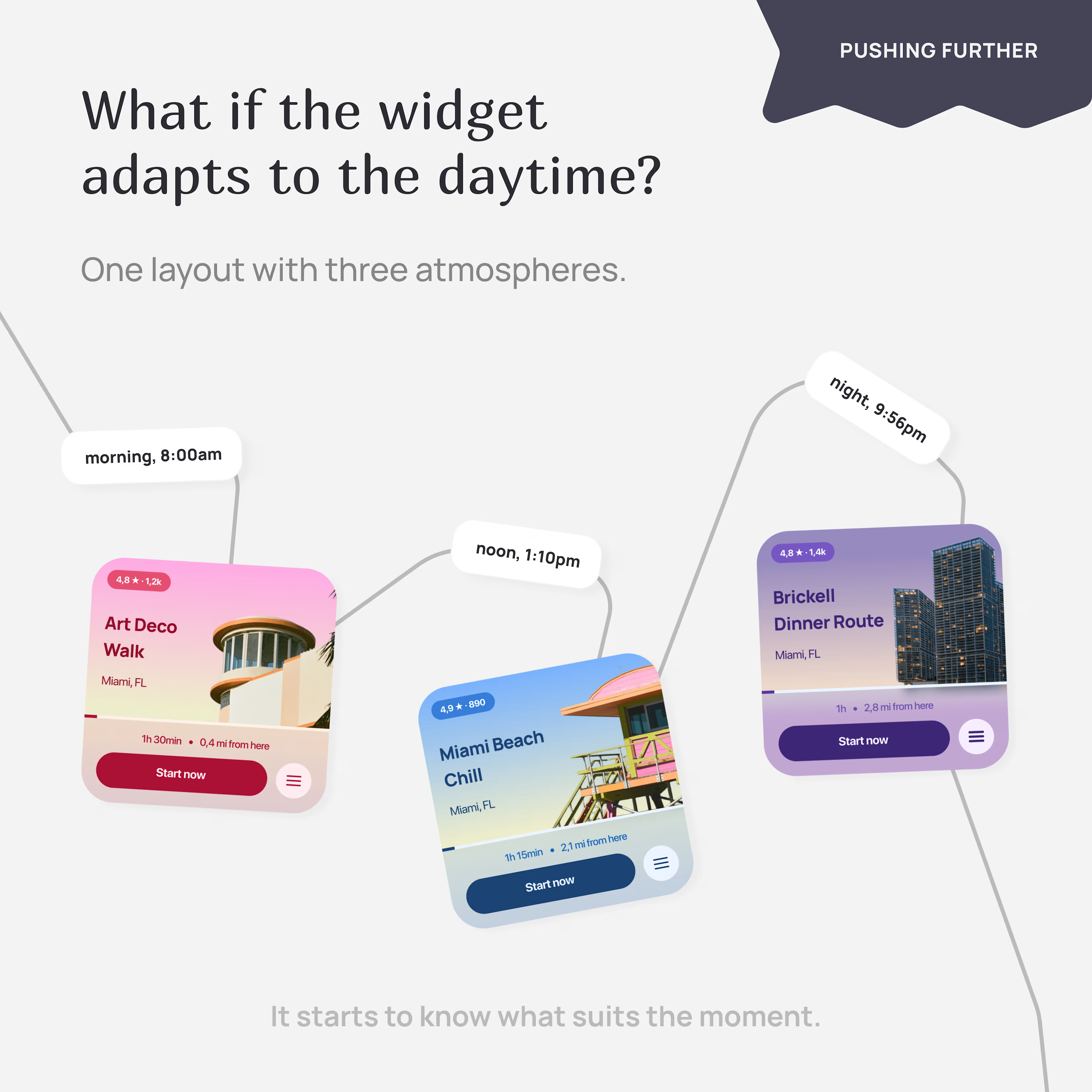
A single widget always shows the same thing. But a Miami morning is nothing like a Miami evening: different energy, mood, and a length of walk you can handle.
So I designed three states, one for each part of the day:
Morning: Art Deco Walk — architecture, warm light.
Afternoon: Miami Beach Chill — coastal and easy.
Evening: Brickell Dinner Route — city lights and dinner.
Same layout with three different atmospheres. The widget stops being a card and starts being something that knows what suits the moment.
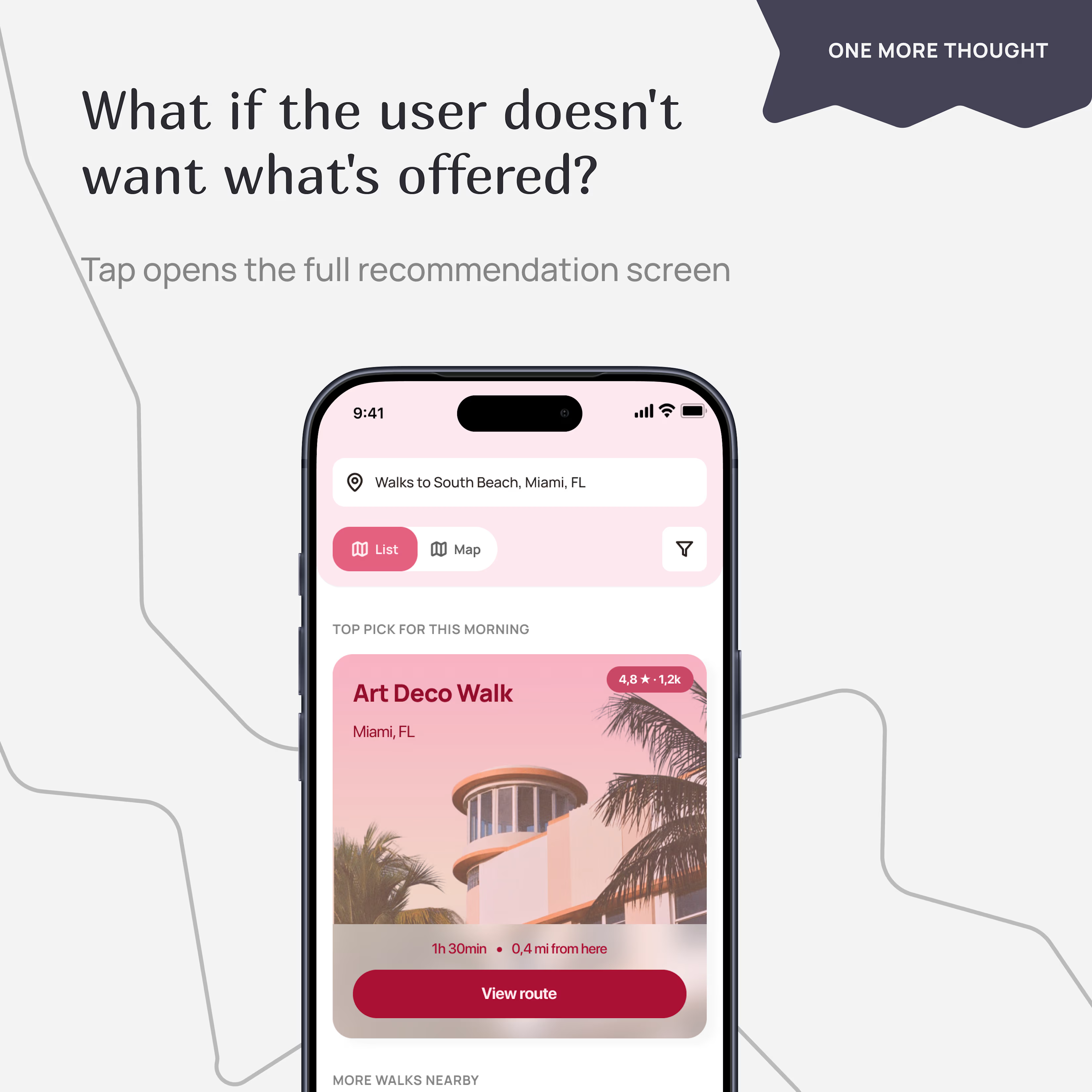
And then, one more thought. A contextual widget is smart, but it's also opinionated because it picks only one thing for you. What if the person didn't want what was offered today?
So I added a list button to the widget and designed what happens when you tap it: the full screen opens with a list of walks, the current recommendation at the top labeled "top pick for this morning," and alternatives below.
What I liked about this exercise:
The brief was about conversion. But the more I sat with it, the more the real question became something else: how does a widget stay useful when the user changes their mind?
That's the question I want to keep designing around.
Made with Figma and Claude.
The network for creativity
Join 1.25M professional creatives like you
Connect with clients, get discovered, and run your business 100% commission-free
Creatives on Contra have earned over $150M and we are just getting started











Related posts

15 seconds of smooth UI, editorial layouts, and micro-interactions.
Kept the micro-interactions snappy, typography expressive, and transitions buttery smooth.
Rate this UI animation from 1 to 10 in the comments, or tell me what you’d improve! 😉


Solid 10/10 bro! 🔥 Micro-interactions are super snappy and transitions are buttery smooth indeed. Editorial layout game is strong. Keep it up!


Lovely cohesive work, Alex. The motion is spot on!


📣 calling all junior & aspiring designers!!
i get a lot of DMs from people asking how to get started in design, improve their skills, or build a portfolio without having real clients.
so i built something to help with that.
a free resource filled with creative challenges to help you practice, experiment, and grow as a designer.
it's my small way of giving back to the design community!
→ alexispresa.com/practice
would love your feedback too! 🙏🏼

The Practice is such a generous idea, Alexis. Creative challenges that build skill, taste and consistency through daily exercise are exactly what juniors need when they don't have real clients yet.