The network for creativity
Join 1.25M professional creatives like you
Connect with clients, get discovered, and run your business 100% commission-free
Creatives on Contra have earned over $150M and we are just getting started
Back to feedPost

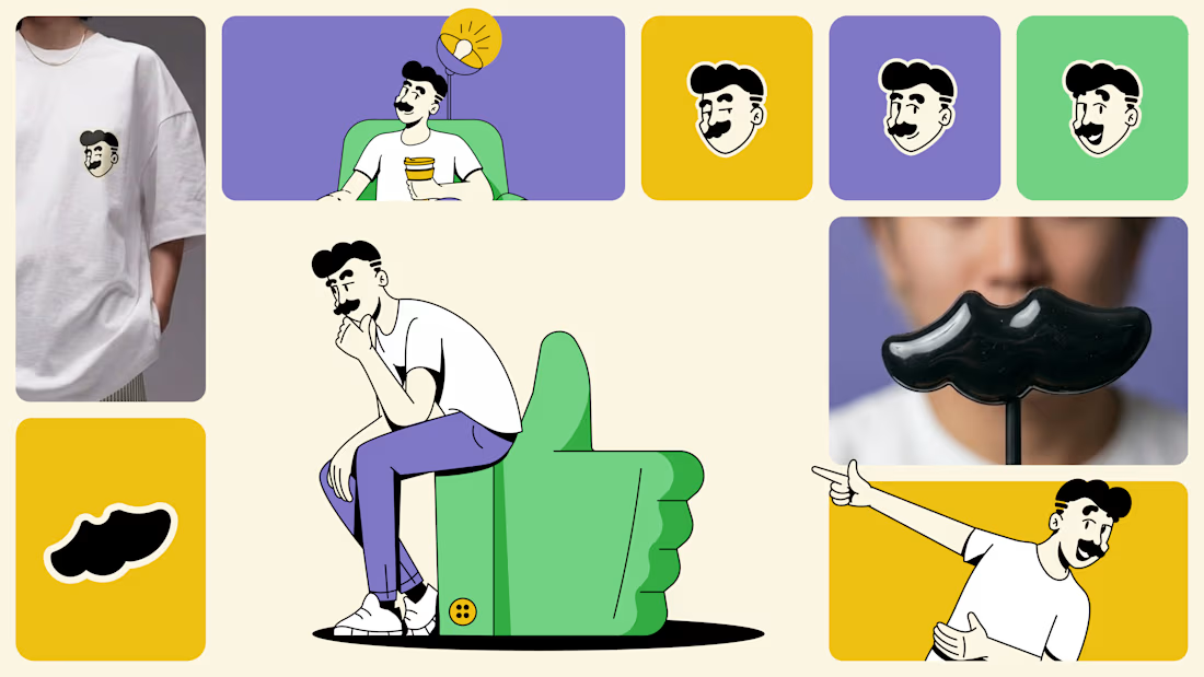
SaaS gradient blobs don't fail because they look bad. They fail because nobody remembers them. Safe disappears, on purpose or not. Went with texture and contrast instead.
Open to projects if this is more your speed.
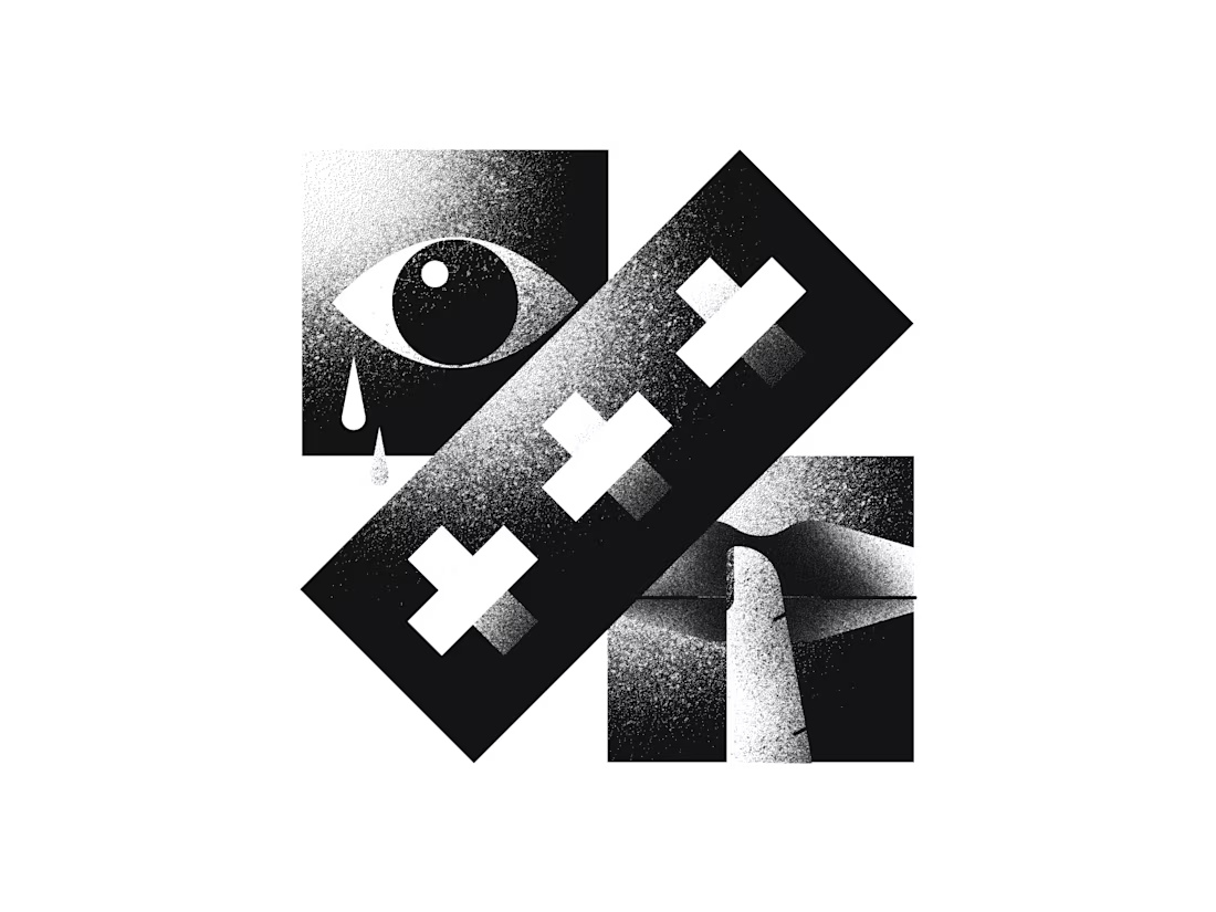
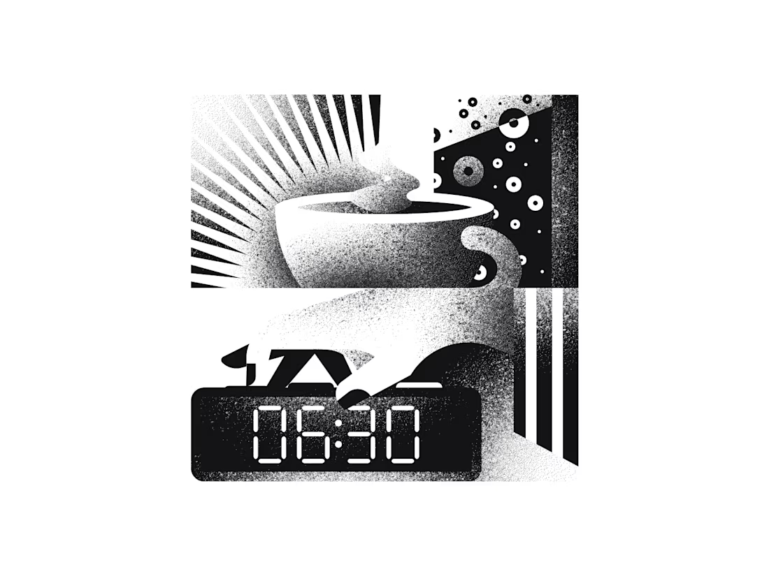
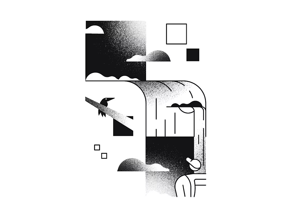

This deserves more than just liking, this deserves to be featured! 🏆 Moving away from those generic SaaS gradient blobs into high-contrast textures is exactly how you build unforgettable web layouts. Total masterpiece.

Beautiful work!
Thanks!

Nice work👏
Thank you!

Thank you, friend!

really love the grain on this
Cheers!


Nice Work
Thank you!@

impresive
Thanks!

Love this style!
Ah man, thanks!

Absolutely stunning! 😮
The network for creativity
Join 1.25M professional creatives like you
Connect with clients, get discovered, and run your business 100% commission-free
Creatives on Contra have earned over $150M and we are just getting started
Related posts

Doing look-dev for these shots what do you guys think?
3 voted
50%

3 voted
50%

6 votes
Closed

These are beautiful
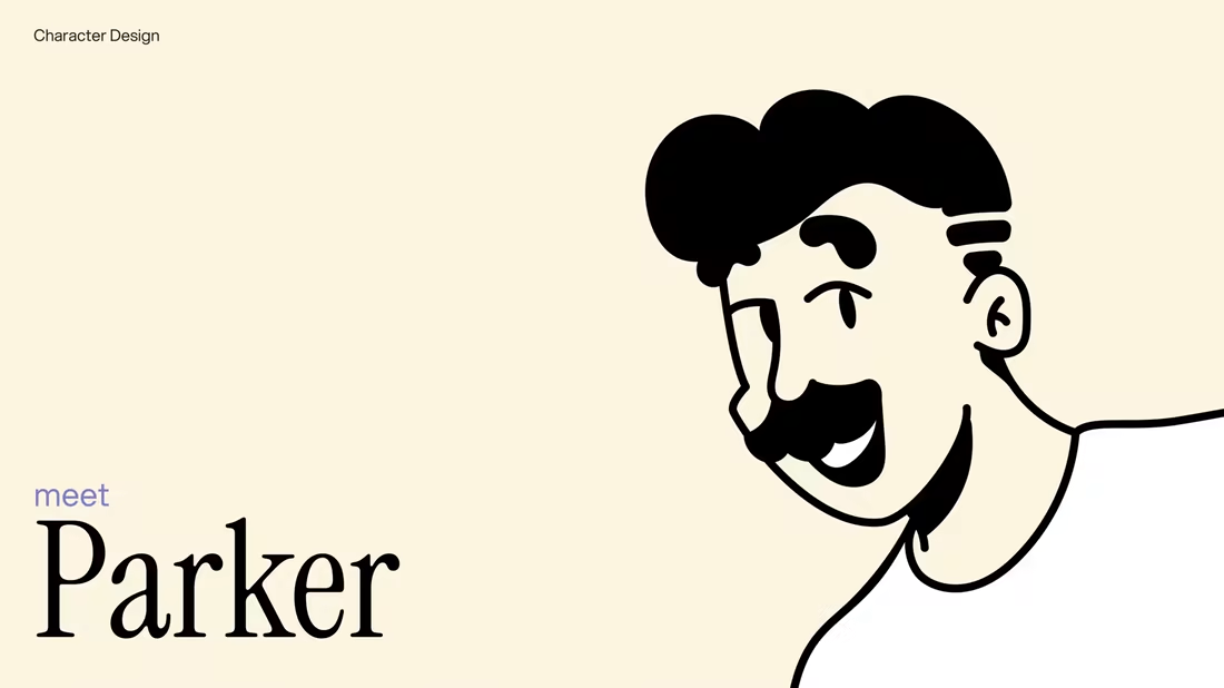

Everything about this feels premium. Fantastic work!

Just finished an updated for a SaaS site. Witch do you think looks better, the original or the updated version?


0 voted
0%

5 voted
100%

5 votes
Closed

Updated for sure








Trending

Claude
Claude has entered the design space. How are you using Claude Design?

Contra University
Learn from expert creatives how to earn more using next-gen AI tools.
fifaworldcup2026
The World Cup is here and the whole world's watching. How are you designing for the world stage?
creativeaiflow
Creative AI workflows are evolving. What tools do you use, and what are their strengths and weaknesses?
freelancerlife
Freelancer life is wins, pivots, and everything in between. What’s yours right now?