The network for creativity
Join 1.25M professional creatives like you
Connect with clients, get discovered, and run your business 100% commission-free
Creatives on Contra have earned over $150M and we are just getting started
Back to feedPost


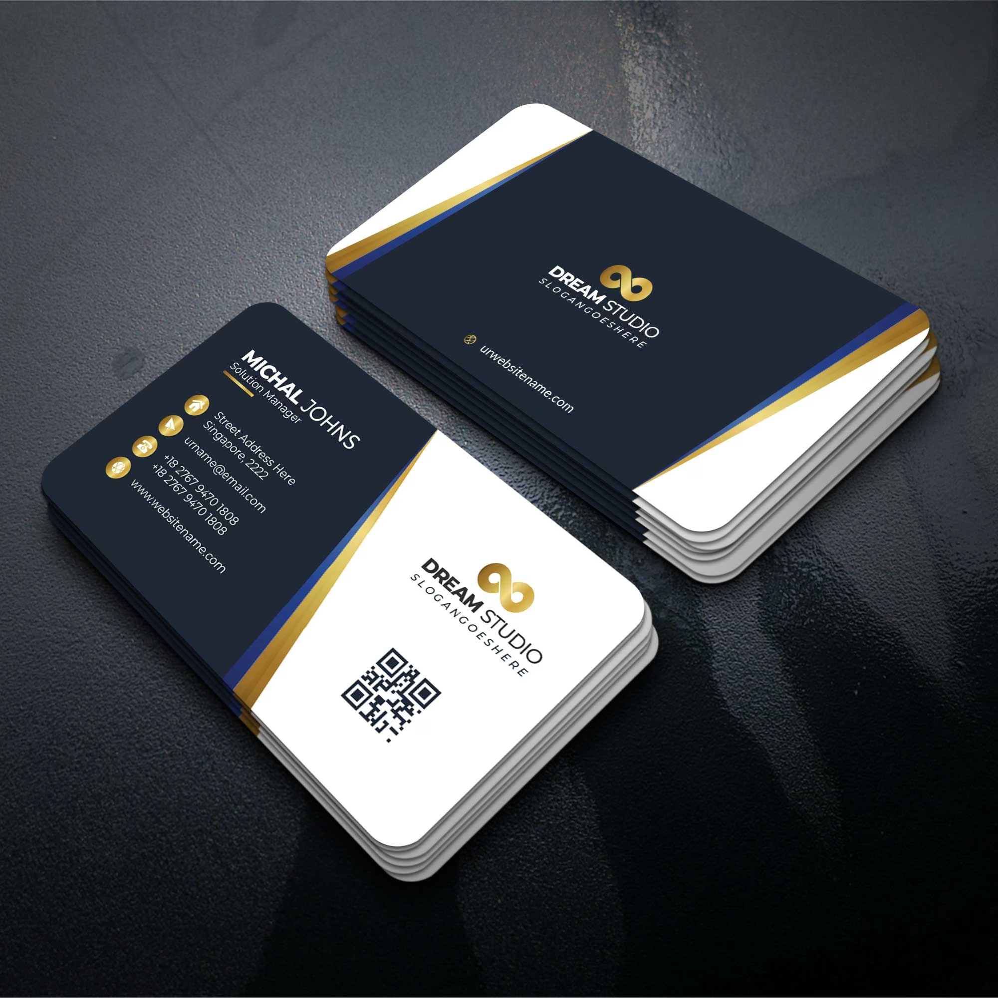
Designing tailored solutions for your business growth.



Very nice
The network for creativity
Join 1.25M professional creatives like you
Connect with clients, get discovered, and run your business 100% commission-free
Creatives on Contra have earned over $150M and we are just getting started







Related posts

So, what is ROSI?
A few cans.
Five colours.
One very simple fish.
A ridiculously large wordmark.
And hopefully proof that everyday products don’t have to look everyday.


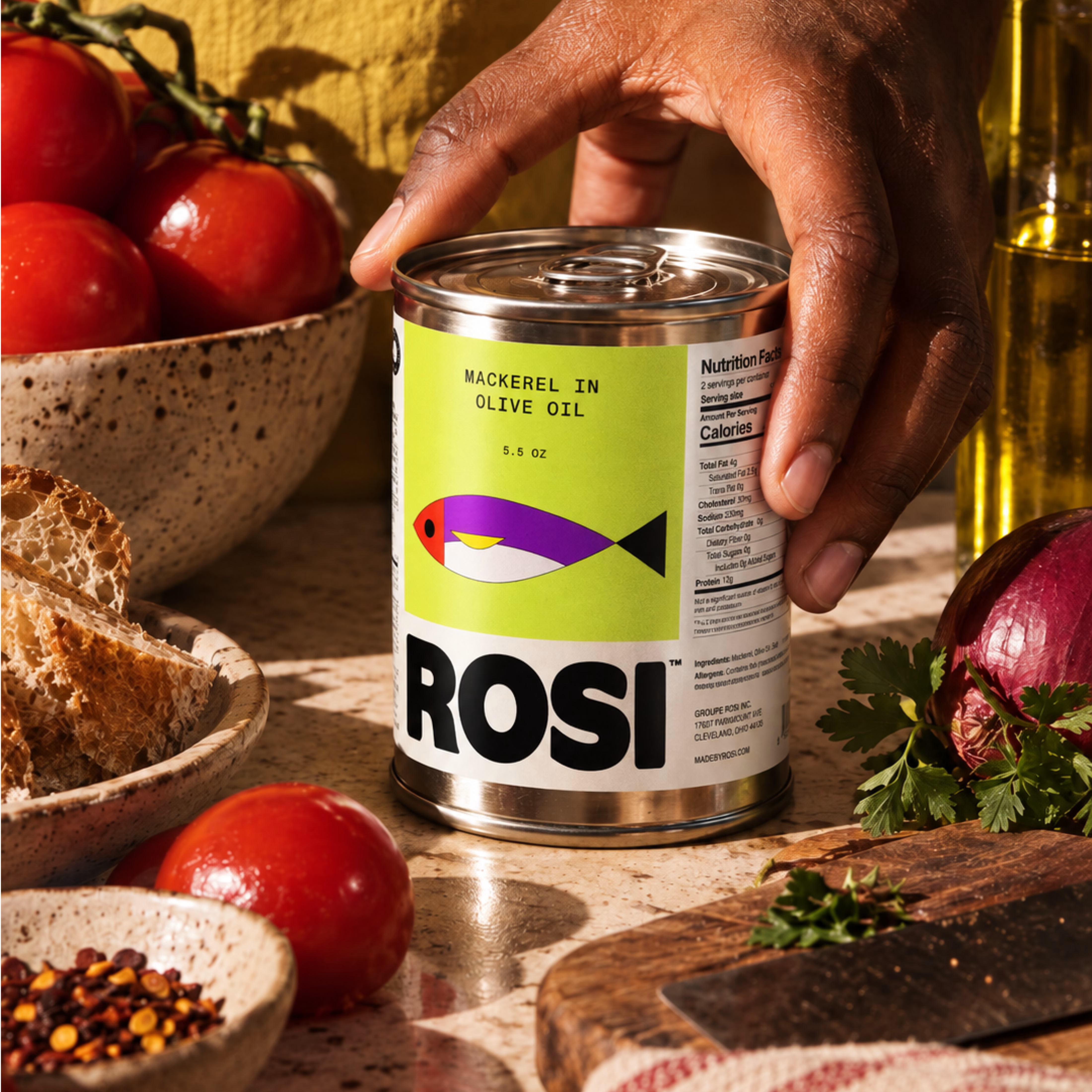
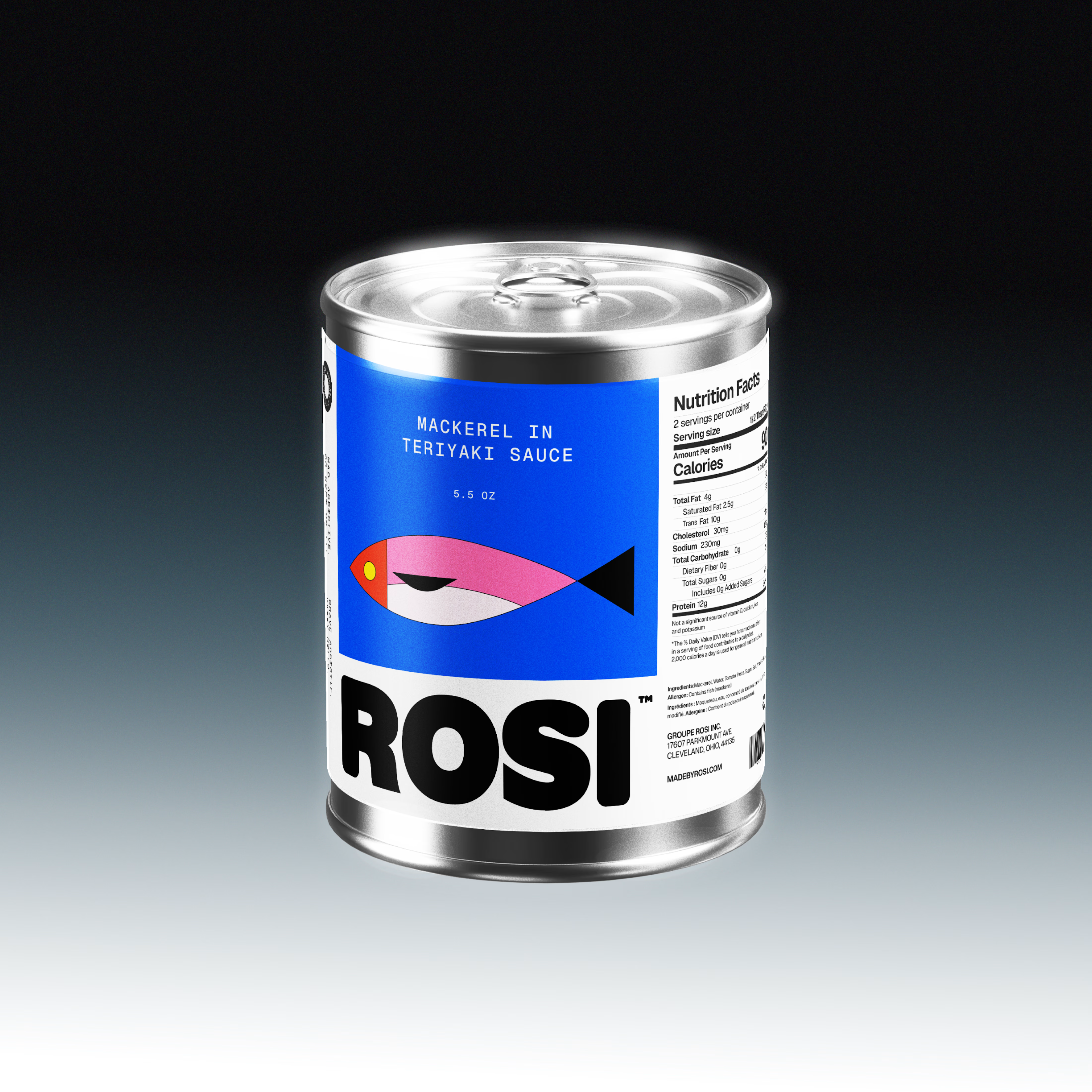
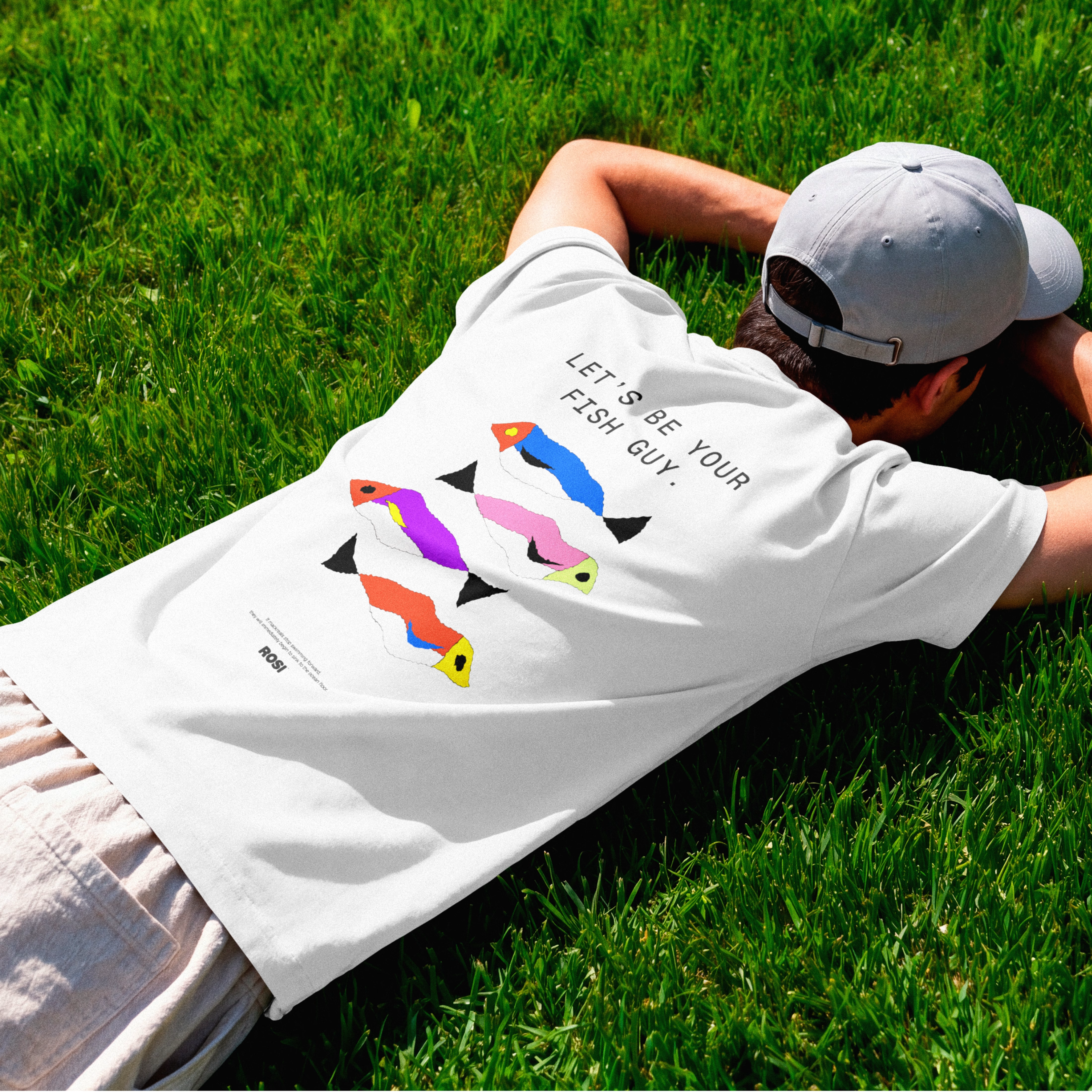

The ridiculously large wordmark is the entire personality, tinned fish has never strutted like this. Proof that confidence is a design decision, not a budget line.


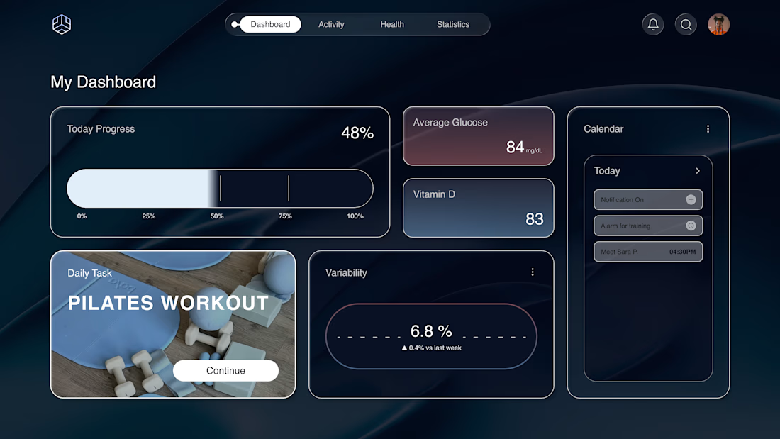
Why does a dashboard full of numbers still feel calm?
Bento grids are everywhere, and done right it's not a trend, it's information design. Each cell = one number, one meaning. The grid does the hierarchy for you.
Our three rules for a bento that works:
One idea per cell. Progress, glucose, one task. If a card needs two sentences, it needs two cards.
Mix the scale. One hero cell, a few mediums, one tiny stat, same gap everywhere.
One warm cell. A single card runs warm against the cool, dark screen; it carries the eye, and the rest stay quiet. No neon needed. Grids are calm. Content is loud. That's the whole trick.

Love the three rules. How do you handle this grid when it collapses to mobile without losing the hierarchy?

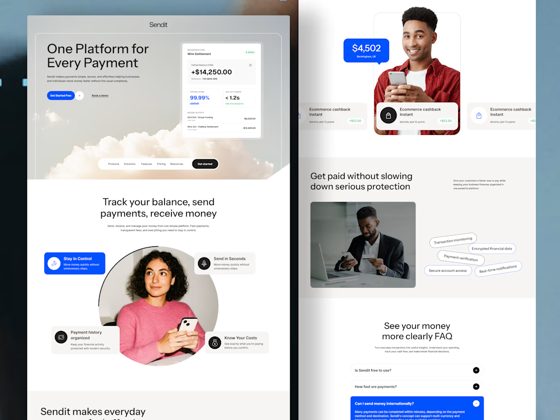
Sendit finance payment website Homepage
Instead of overwhelming users with financial terminology, the experience guides them from
Understanding → trusting → taking action.
Designed for businesses that want their website to do more than look good—it should help people understand the product and move closer to becoming customers.
The design focuses on:
💳 Clear payment-focused messaging
🔐 Trust and security signals
📊 Simple presentation of financial features
🎯 Strong, action-focused CTAs
👤 Human-centered visuals to build confidence
✨ Clean UI with a modern fintech feel
If you're building a fintech, SaaS, payment platform, or financial product and your website isn't communicating its value clearly, I'd love to help.
Available for website design, landing pages & UI/UX design.


Love the creative approach.