The network for creativity
Join 1.25M professional creatives like you
Connect with clients, get discovered, and run your business 100% commission-free
Creatives on Contra have earned over $150M and we are just getting started
Back to feedPost

Just hitting $10K isn’t the win.
Becoming the person who can consistently make $10K… that’s the real milestone.
Most people think it’s luck, one viral client, or a one-time project.
But behind it? Systems. Late nights. Learning what actually sells.
From $0 → $10K, you don’t just earn money —
you earn clarity, confidence, and control over your skills.
And the best part?
Now you know it’s repeatable.
Next stop: $50K 🚀
Thanks @Contra 💙


Congrats! Wish to see you on more milestones.


Wishing you the best

Congratulations


Congratulations Nexila...!


Huge milestone Nexila. Congratulations 🎉
You're welcome Nexila 😊
The network for creativity
Join 1.25M professional creatives like you
Connect with clients, get discovered, and run your business 100% commission-free
Creatives on Contra have earned over $150M and we are just getting started



Related posts


Today I analyzed the website of a $10M startup.
Great positioning. Great messaging. And no way I’d have read all of it if it weren’t my job.
if you can read the text on your website doesn't mean everyone can.
While very few people have severe visual impairment, about 1 in 3 American adults have some degree of problems with their vision. Even with my glasses on, I struggle with low-contrast text.
Of course people who are really interested in your product will strain their eyes. The rest might just leave.
A quick check: body text should have a contrast ratio of at least 4.5:1 with its background. It might be the cheapest conversion fix on the whole site.

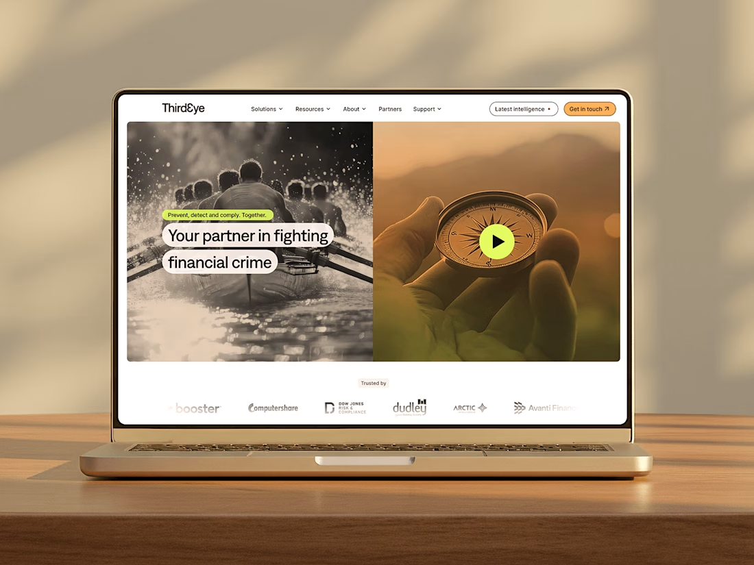
Delivered a complete rebrand and launch, backed by a full asset and template library, website and a comprehensive brand system for a Fintech SaaS product.