The network for creativity
Join 1.25M professional creatives like you
Connect with clients, get discovered, and run your business 100% commission-free
Creatives on Contra have earned over $150M and we are just getting started
Back to feedPost

Today I analyzed the website of a $10M startup.
Great positioning. Great messaging. And no way I’d have read all of it if it weren’t my job.
if you can read the text on your website doesn't mean everyone can.
While very few people have severe visual impairment, about 1 in 3 American adults have some degree of problems with their vision. Even with my glasses on, I struggle with low-contrast text.
Of course people who are really interested in your product will strain their eyes. The rest might just leave.
A quick check: body text should have a contrast ratio of at least 4.5:1 with its background. It might be the cheapest conversion fix on the whole site.
The network for creativity
Join 1.25M professional creatives like you
Connect with clients, get discovered, and run your business 100% commission-free
Creatives on Contra have earned over $150M and we are just getting started
Related posts

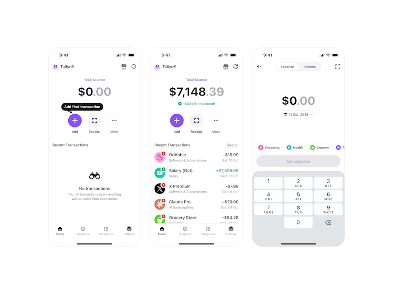
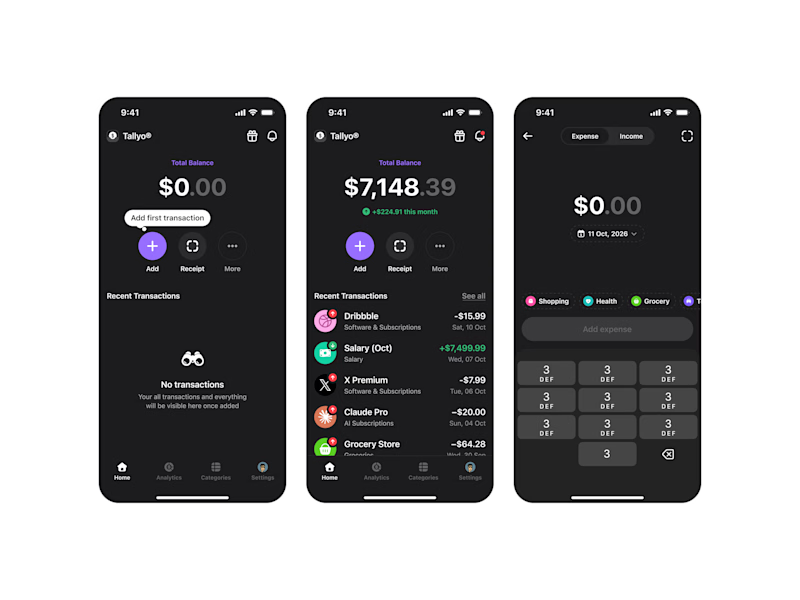

Dark!

🚀 Just completed the UX/UI design and website redesign for Spartan SEM!
The goal was to bring their refreshed brand identity to life with a modern, conversion-focused website and a better user experience.
Really enjoyed working with the team and seeing the design go live!


This is amazing

A great example of how a course landing page can have its own personality.
I really like the bold typography, immersive visuals, and how the entire design reflects the freediving experience.
Good work👏
#Kajabi #KajabiWebsiteDesign #WebDesign #LandingPageDesign


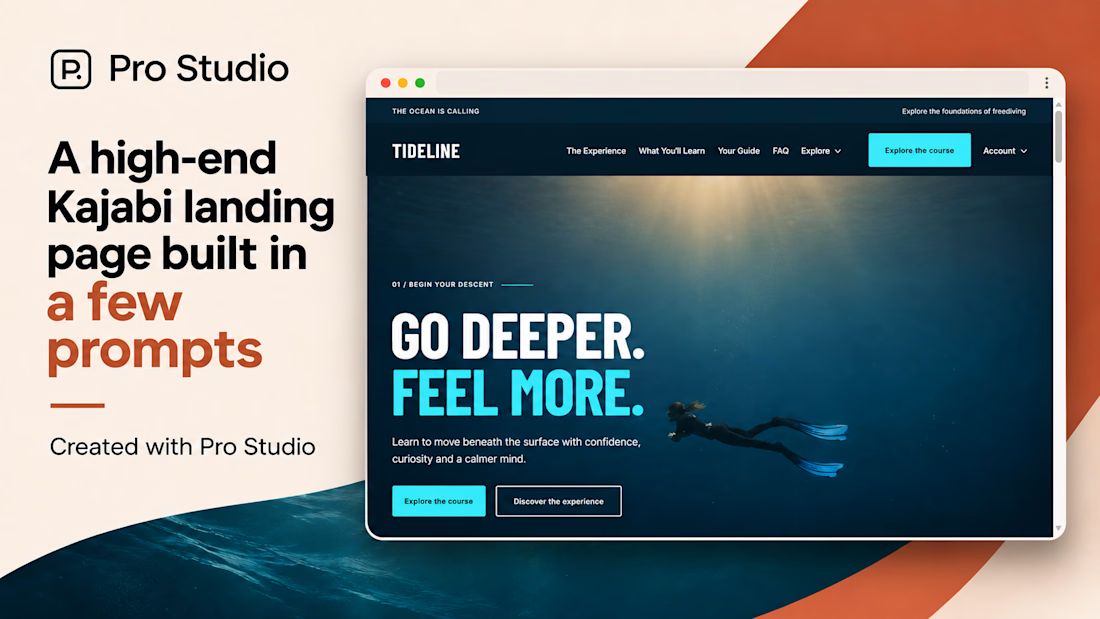
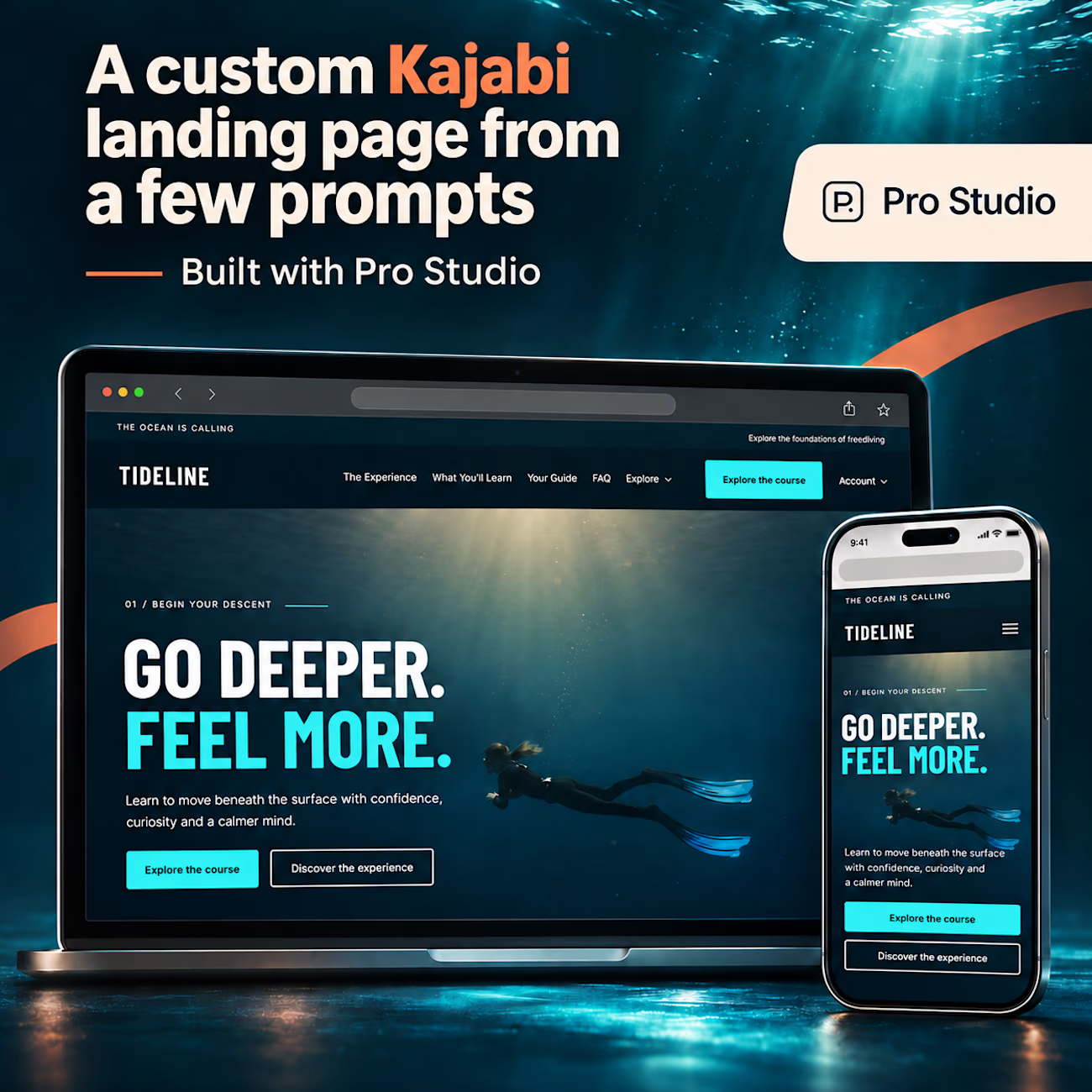
A high-end Kajabi landing page, built in just a few prompts with Pro Studio. 🌊
Meet TIDELINE: a fictional freediving school demo with immersive visuals, oversized typography, a custom header with dropdown navigation, and carefully crafted layouts. One page, with a whole lot of...

Amazing



