The network for creativity
Join 1.25M professional creatives like you
Connect with clients, get discovered, and run your business 100% commission-free
Creatives on Contra have earned over $150M and we are just getting started
Back to feedPost
Why Add a Comparison Section to Your Product Page?
Your customers don't just want to see your product. They want to understand why they should choose it over other alternatives.
That's where a comparison section makes a difference.
A well-designed comparison section helps customers quickly understand what makes your product different without having to search through multiple pages.
I recently explored the Lovu Beauty website, and I liked how they approached this on their homepage.
Their "Not All Glow Is Equal" section compares Lovu with creams, mystery gummies, and powders.
Instead of simply listing product features, they highlight key differences such as:
✅ Product ingredients and formulation
✅ Vegan vs. non-vegan options
✅ Dosage transparency
✅ Added sugar
✅ Ease of daily use
Why does this section matter?
Makes Decision-Making Easier: Customers can compare important details in one place.
Highlights Your Unique Value: Show what makes your product different from alternatives.
Builds Customer Confidence: Clear information helps customers make more informed purchasing decisions.
Reduces Buying Confusion: Answer common questions before customers leave the page.
Supports Conversions: Give shoppers more clarity and confidence when deciding to purchase.
My Takeaway:
A comparison section isn't just another design element. It's an opportunity to communicate your product's value and help customers make confident buying decisions.
When designing Shopify product pages, I believe every section should have a purpose — and comparison sections can play an important role in the buying journey.
🚀 Need a Shopify product page or landing page designed with a conversion-focused approach?
Let's connect!
Reference: https://lovubeauty.store/
#Shopify #ShopifyDevelopment #ShopifyDesign #ProductPageDesign #PDP #CRO #EcommerceDesign #LandingPageDesign #Replo


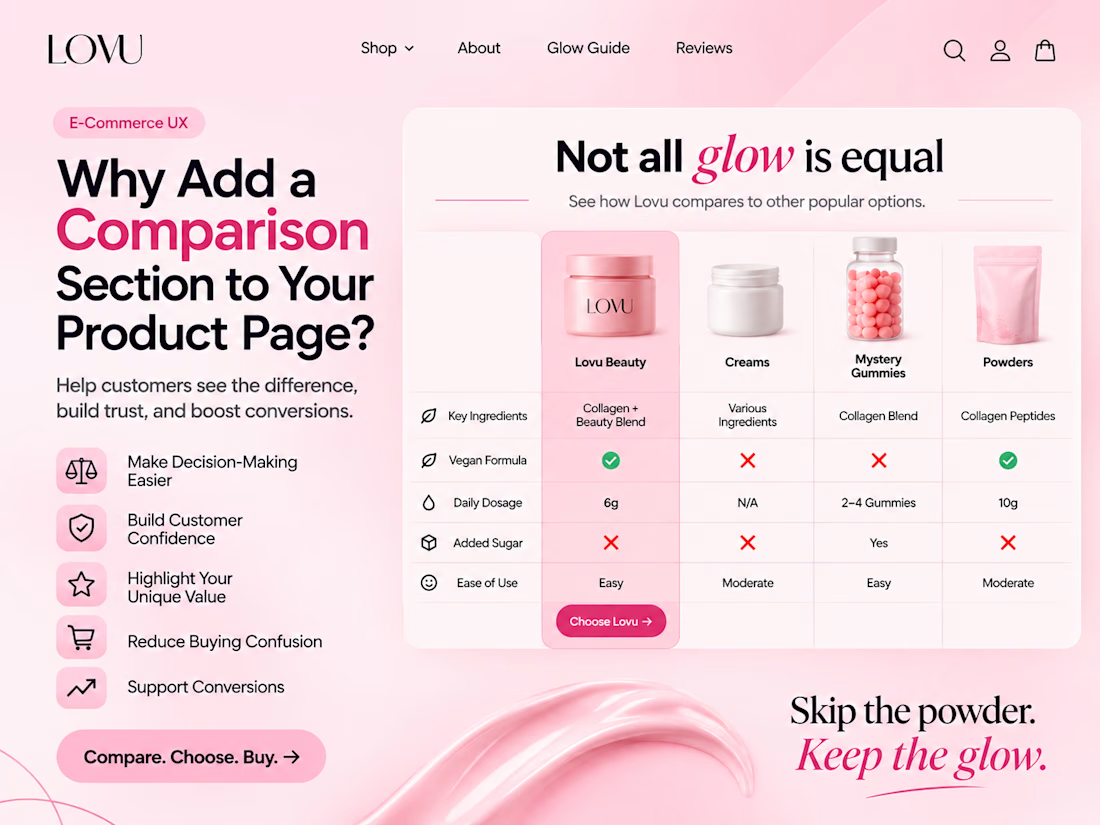

The dosage and added sugar rows stood out to me. Those are the questions people have before buying anything they swallow, so having them answered on the page saves the shopper from going off to search. It only works if it stays fair to the alternatives, though.

Thank you for your thoughtful feedback! I completely agree that clear information and fair comparisons help customers make confident buying decisions. Appreciate you sharing your perspective!
The network for creativity
Join 1.25M professional creatives like you
Connect with clients, get discovered, and run your business 100% commission-free
Creatives on Contra have earned over $150M and we are just getting started
Related posts


Keeping the Halloween-inspired concepts coming! 🕯️✨
This time, we're sharing Ovelle — a luxury candle e-commerce website with warm tones, elegant typography, and a moody editorial aesthetic. Would love to hear your thoughts! 🎃


If a doctor has to hunt for a patient’s vital signs, the dashboard is getting in the way of care.
Doctors don’t need another dashboard. They need the full patient picture at a glance.
In healthcare, confusing UX isn’t just frustrating. It can delay understanding when every second matters.
DocuVerse brings vital signs, patient metrics, and health trends into one clear view, making complex health data easier to scan and understand.
Less searching. More clarity. Better informed decisions.
That’s what healthcare UX should deliver.
Would you design a healthcare dashboard for more data, or better decisions?


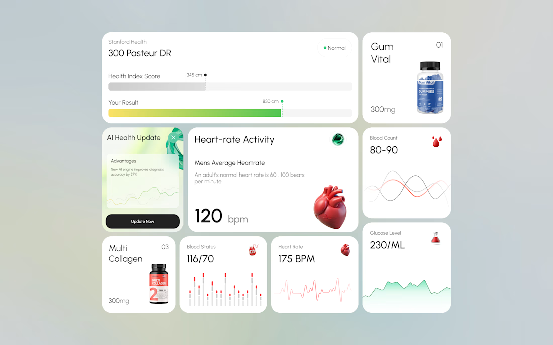
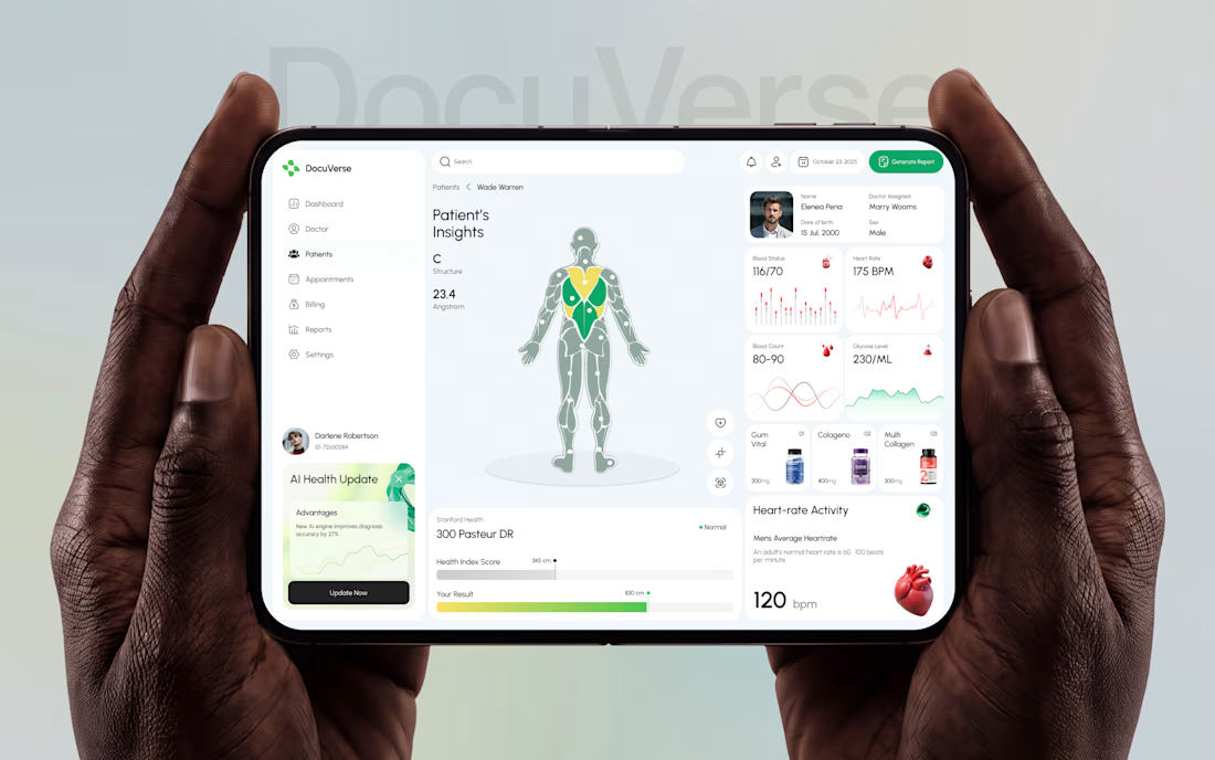

A clearer patient overview can make complex health data feel far less overwhelming. That’s thoughtful UX.


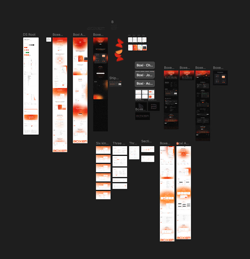
3 Page landing btw. Somehow ended up with dark versions, light versions, a whole DS and like 6 card explorations.
Is this overexploring or is this just the job? Genuinely asking. 🧠

Man, this is wonderful and modern


