The network for creativity
Join 1.25M professional creatives like you
Connect with clients, get discovered, and run your business 100% commission-free
Creatives on Contra have earned over $150M and we are just getting started
Back to feedPost
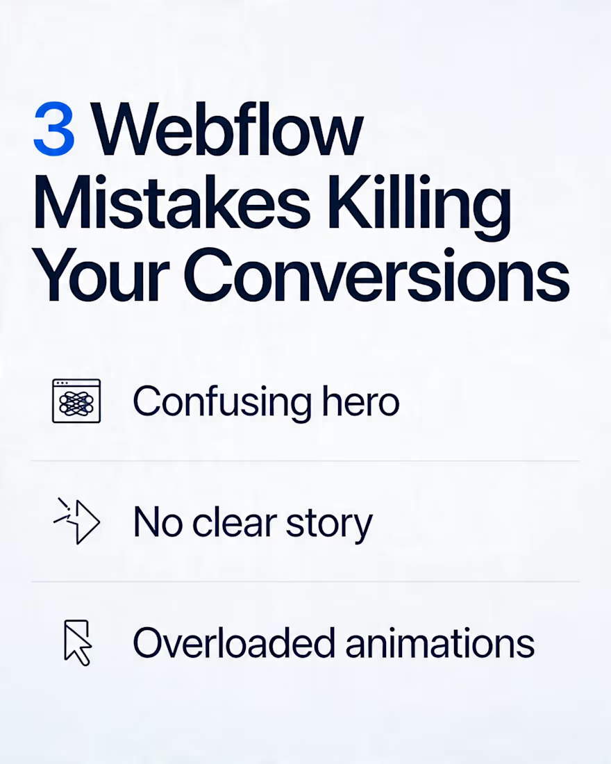
3 Webflow Mistakes That Kill Conversions (And How I Fix Them)
Most Webflow sites I’m asked to “improve” don’t have a design problem, they have a conversion problem.
Here are 3 patterns I see all the time when auditing Webflow builds:
Confusing hero sections
One clever headline, 3 different CTAs, and no clear “what this does.”
Fix: One simple promise, one primary CTA, and a sub‑headline that explains exactly who it’s for.
Pretty layouts, weak structure
Gorgeous sections, but no story: why, proof, offer, FAQ, risk reversal.
Fix: Treat each page like a funnel. Order the sections so a cold visitor can go from “What is this?” to “I trust this” to “I’m ready to act.”
Interactions that fight the content
Scroll effects and animations that lag, cover copy, or hide important CTAs.
Fix: Use motion to guide attention (reveals, micro‑hover states), not to show off. If an animation doesn’t help someone understand or click, it probably shouldn’t be there.
I build Webflow sites and funnels for creators and brands doing 7–8 figures in revenue, so I’ve seen how small UX changes translate into real numbers.
If you’d like eyes on an existing Webflow project (or you’re planning a new one), I’m happy to give quick structural feedback or walk through a live example.
The network for creativity
Join 1.25M professional creatives like you
Connect with clients, get discovered, and run your business 100% commission-free
Creatives on Contra have earned over $150M and we are just getting started
Related posts
Good design doesn’t ignore ideas – it helps you see the difference.
At the start of this Kajabi project, the client asked to use their Facebook banner as the website hero.
The reason was simple: they wanted everything to feel consistent with their social media.
And we totally respect that.
Even though we knew this approach usually doesn’t work well for a hero section, we always make sure our clients can see their idea in action.
So instead of pushing back – we did both:
👉 their version (social banner as hero)
👉 our version (optimized hero section)
What’s the difference?
The banner version keeps the visual style… but it doesn’t function as a real entry point to the page:
🧩no clear headline
🧩no defined offer
🧩no call-to-action
🧩no immediate clarity
Our version focused on one thing – clarity.
What we changed:
✔️ A confident, clear headline
✔️ A simple and understandable offer
✔️ A strong CTA
✔️ A modern, clean photo of the artist (easy to recognize)
We also:
- kept the original background to maintain brand consistency
- removed the extra logo (since it’s already in the header)
Result:
The client didn’t lose their visual identity, but gained something much more important:
👉 clarity
👉 structure
👉 direction
And in the end, they chose our version


Impressive thought process.
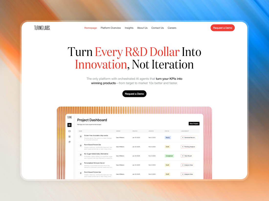
Latest work for Turing Labs is live! 🚀
For R&D-heavy projects like this, we prioritize clean structures and scalable data layouts.
Check it out and let me know what you think!
Nice work
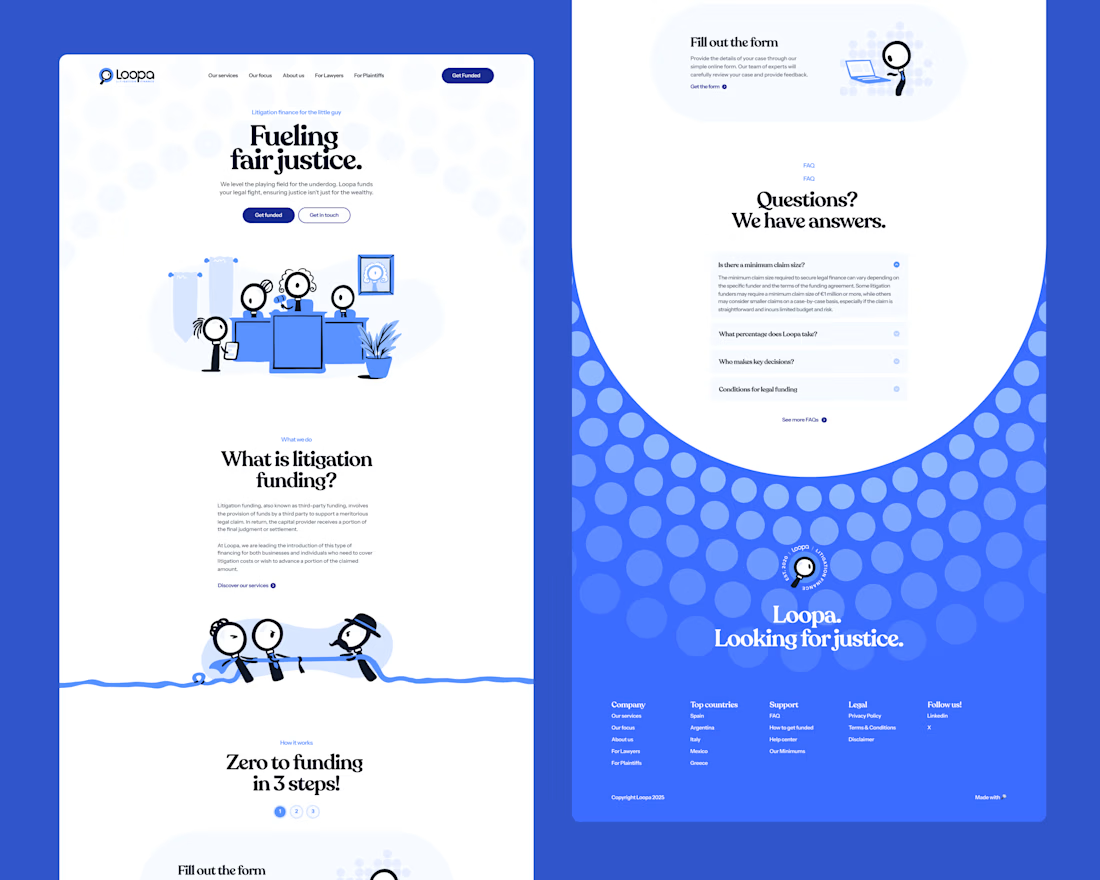
The Loopa brand and website are still legendary when you think this is a Law & Finance brand! I wish I had more clients that are as brave as them!
This looks like the kind of work that delivers real results, not just aesthetics. You’ve clearly put thought into both form and function. From this project, what was the most valuable lesson you learned that you’ll carry into your next one?
Trending
Runway
AI video generation is exploding. What are you dreaming up in Runway?
Contra University
Learn from expert creatives how to earn more using next-gen AI tools.
creativeaiflow
Creative AI workflows are evolving. What tools do you use, and what are their strengths and weaknesses?
portfolioreview
The best portfolios tell a story, not just show a grid. Share yours for feedback.
freelancerlife
Freelancer life is wins, pivots, and everything in between. What’s yours right now?