The network for creativity
Join 1.25M professional creatives like you
Connect with clients, get discovered, and run your business 100% commission-free
Creatives on Contra have earned over $150M and we are just getting started
Back to feedPost

We started with a playful, pastel direction full of characters and decorations. But it needed more focus, so we stripped things back.
The final identity uses a simple planetary design, subtle orbit details, and a palette of navy, lavender, and peach to bring the range together.
No unnecessary elements, just a clean and consistent packaging system across three cans, three pouches, and one assorted box.
Sometimes, less really does more.
Tell us what you're making.

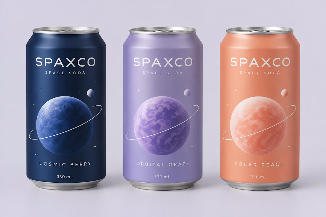
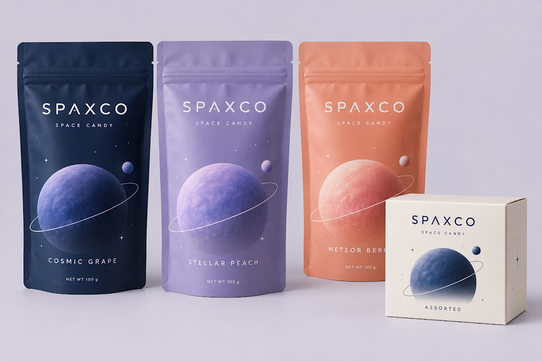

The planet size and ring tilt do the flavor-coding while the palette stays tight, which is a smart place to spend the variation. Once the characters were gone, did you test how the cans read at shelf distance, or was the simplified version already clearer in the first mockups?
We did both, but the simplified version already felt much clearer in the first mockups. The shelf-distance check helped confirm that each flavor still had its own identity without relying on characters or extra graphics.

Adorable!
The network for creativity
Join 1.25M professional creatives like you
Connect with clients, get discovered, and run your business 100% commission-free
Creatives on Contra have earned over $150M and we are just getting started
Related posts

What if your biggest streaming platform got a Halloween makeover? 🕸️
As Halloween is closing by, I decided to do a short campaign teaser for one of the biggest streaming platforms.
I redesigned their logo and played with the wording as part of their brand messaging in a spooky theme for the upcoming Halloween event.
I retained the brand consistency across the typography and overall logo shape and changed few details within.
Any twitch streamers, viewers or halloween celebrants here?


Fun concept and perfect timing. The spooky wordmark twist still feels on brand, nice one.


Cool branding

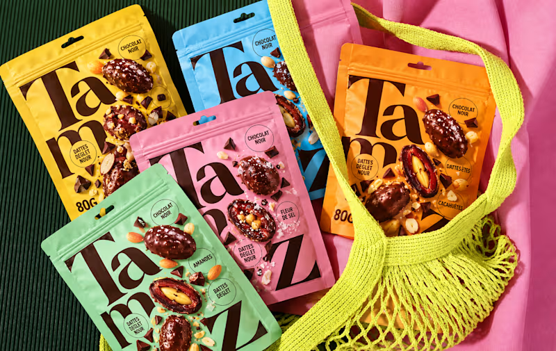
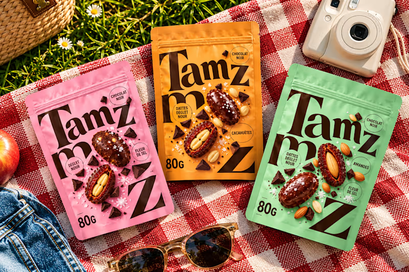
Which option works better? 👀
Option 1: the full lineup with the mesh bag
Option 2: the picnic setup
7 voted
20%
28 voted
80%
35 votes
Closed


option 2 for me, the picnic setup feels like something you would actually want to buy