The network for creativity
Join 1.25M professional creatives like you
Connect with clients, get discovered, and run your business 100% commission-free
Creatives on Contra have earned over $150M and we are just getting started
Back to feedPost



The network for creativity
Join 1.25M professional creatives like you
Connect with clients, get discovered, and run your business 100% commission-free
Creatives on Contra have earned over $150M and we are just getting started

Challenges
View all


Related posts

A cinematic luxury-fashion concept with a premium brand feel refined visuals, elegant styling, and high-end commercial energy
aivideomarketingaivideoadsaifilmmakerAI Content CreationAI Video ProductionAI VIsual DesignerHiggsfield AI


Creative

Custom liquid interaction built in Framer.
Turning a static hero into a responsive visual surface through cursor-driven distortion.


How do you adapt the cursor-driven effect for touch screens?

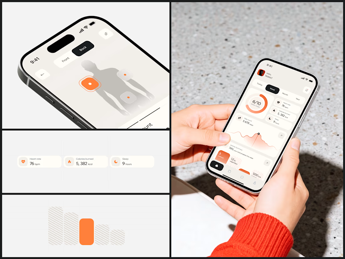
Health & Wearable Tracking App
I chose the warm background to make this feel like a wellness journal. And limiting the entire UI to a single accent means your eye always knows where the important thing is - because there's only ever one color telling you.
The body mapping screen is the standout. Whether it's sensor placement for a wearable or pain tracking, the interaction model is immediately obvious. Point at where it matters.
The dashboard packs a lot without feeling dense. All on one screen. That works because every card uses the same visual weight and only the circular progress ring gets to be larger. Equal hierarchy across metrics means the user decides what's important.
#HealthTech #MobileApp #UIDesign #WearableTech #ProductDesign