The network for creativity
Join 1.25M professional creatives like you
Connect with clients, get discovered, and run your business 100% commission-free
Creatives on Contra have earned over $150M and we are just getting started
Back to feedPost
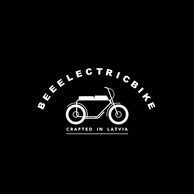
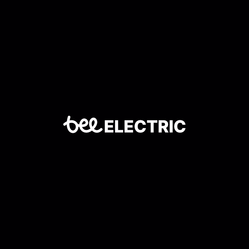
Taste Test
old vs new, which one is the new one? what do you think was the dealbreaker issue that forced the redesign?
8 voted
50%
8 voted
50%
16 votes
Closed
I like This😍
The old one was a nice wordmark, but the new one is a complete brand identity. Really well executed!
what seemed like a complete brand identity felt limiting and too definitive
we are moving the focus from the product to the experience
The first logo signals more of an insect based brand which confuses customers because it doesn't portray the brand at all. The redesign solved exactly that
good point
yoo ngl this is nice
thank you!
The right one looks newer with the modern script font. Probably simplified for better readability at small sizes!
yes, that's the main reason, specifically ..BEEELE.. part was creating issues for us
The right side suits the vibe of the electric bike much more.
thank you!
First one (This)
Thus was really like a hard pick the new design feels elegant but the old so much going on but works like just this bike illustration can let its users know its bee electric something like an icon and it leaves a big impression
The network for creativity
Join 1.25M professional creatives like you
Connect with clients, get discovered, and run your business 100% commission-free
Creatives on Contra have earned over $150M and we are just getting started
Related posts
Nice design
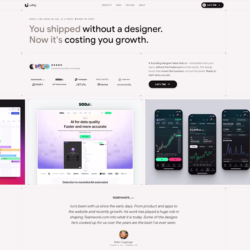
I learned Framer on the go, while building my website about 3 years ago and barely touched it after I launched it so major overhaul is way overdue.
I started it from scratch, as I don't wanna clean the old mess, I'm keeping the overall content structure as the flow feels right, but trying something much more clean in terms of visual style.
What do you think guys?
Does it look like an improvement or a downgrade? 😅
16 voted
40%
24 voted
60%
40 votes
Closed
Hmm, I can't say I didn't like the colorful vibe in V1 but we can totally say projects are more prominent in V2!
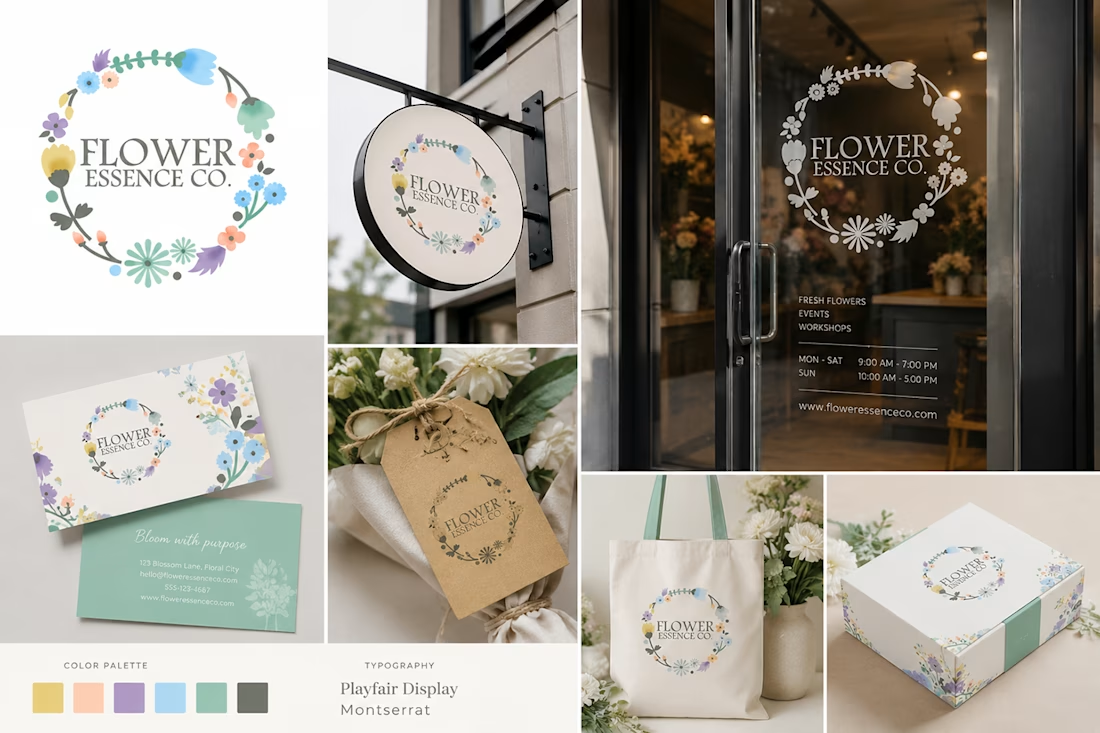
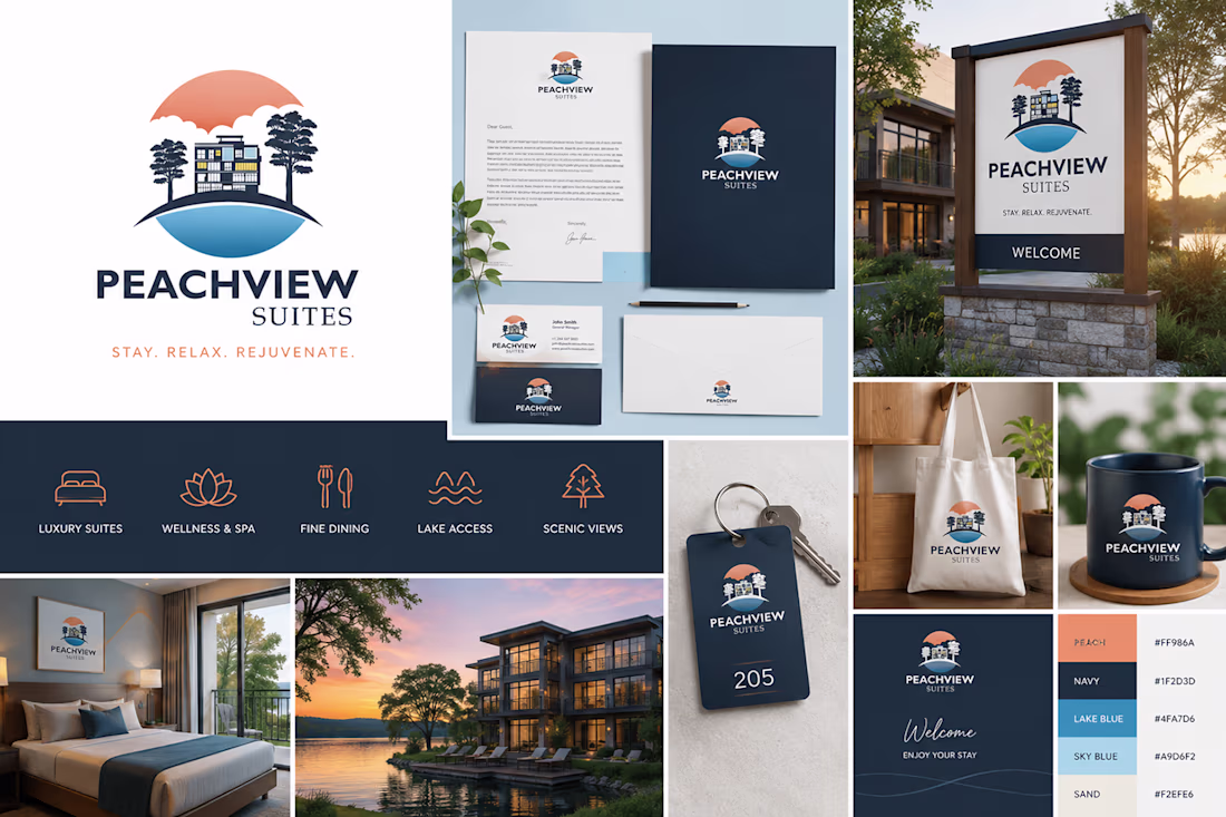
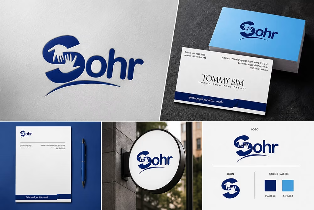
Every brand has a story, and my goal is to transform that story into a visual identity that feels professional, memorable, and aligned with the client’s vision. This logo and branding project was created with careful attention to the client’s industry, target audience, brand values, and long-term business goals.
From concept development to final execution, I focused on creating a design system that communicates trust, uniqueness, and strong brand recognition. The process included researching the brand personality, understanding client requirements, exploring creative directions, and developing a logo that represents the business in a meaningful and impactful way.

Great visuals
Trending
Claude
Claude has entered the design space. How are you using Claude Design?
Contra University
Learn from expert creatives how to earn more using next-gen AI tools.
creativeaiflow
Creative AI workflows are evolving. What tools do you use, and what are their strengths and weaknesses?
portfolioreview
The best portfolios tell a story, not just show a grid. Share yours for feedback.
freelancerlife
Freelancer life is wins, pivots, and everything in between. What’s yours right now?