The network for creativity
Join 1.25M professional creatives like you
Connect with clients, get discovered, and run your business 100% commission-free
Creatives on Contra have earned over $150M and we are just getting started
Back to feedPost
Taste Test

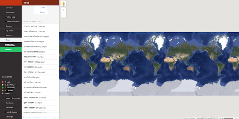
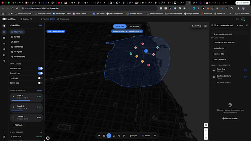
They said "build a simple app." I accidentally built an entire Enterprise Spatial OS.
🤷♂️ Not bad (I 🥹 guess!) for a beginner designer who just learned what the Z-axis is.
Pushed Figma Make to the absolute limit. Enter Cirkul Map:
🔗 https://cirkulmap.figma.site/


1 voted
25%
3 voted
75%
4 votes
Closed

Voted Cirkul Map. The dark spatial interface with the connected data nodes looks like something out of a real ops center. The fact this came from "build a simple app" and ended up as an Enterprise Spatial OS says a lot about what Figma Make can unlock.

Going with the Cirkul map
The network for creativity
Join 1.25M professional creatives like you
Connect with clients, get discovered, and run your business 100% commission-free
Creatives on Contra have earned over $150M and we are just getting started

Challenges
View all


Related posts

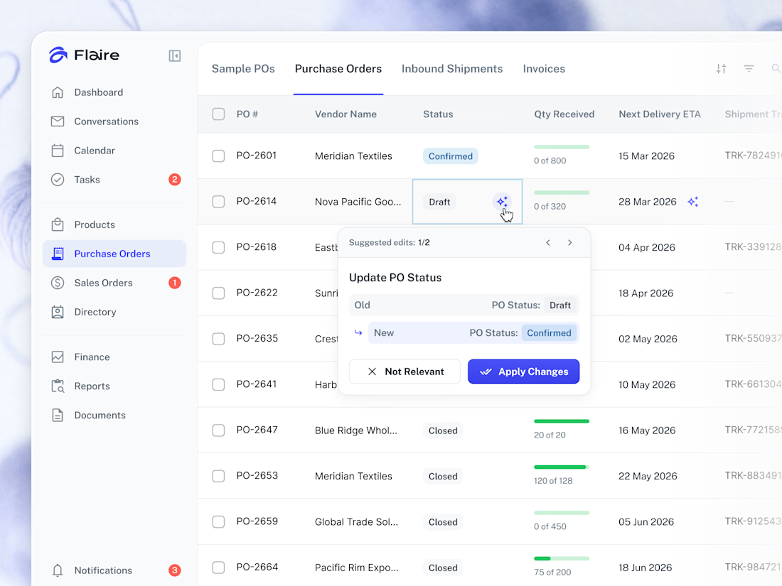
✨ AI Suggestions on the Purchase Orders list. Proposed record edits surface inline for the user to apply or dismiss in one tap.



Great work


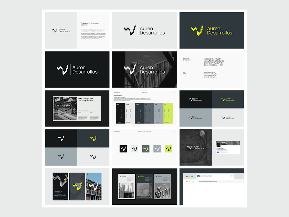
Not every direction makes it to the final brand.. this was one of the directions we explored for Auren Desarrollos, a new construction and development company we’re currently working with on its branding and website.
I’ll be sharing the final result soon, and I think the difference will be interesting to see.
What do you think?


Great!

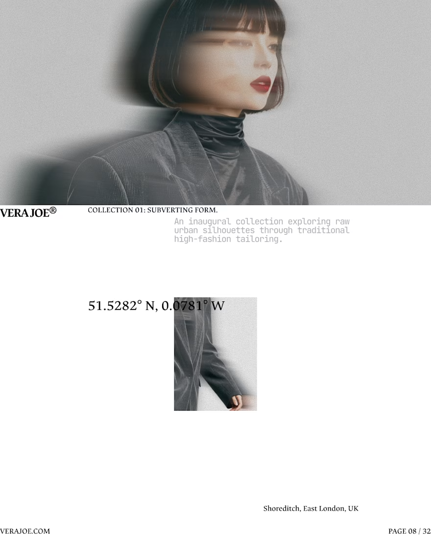
An editorial exploration for VERA JOE® Autumn/Winter 2026.
Exploratory Brand Identity & Visual Campaign.




Like the art direction