The network for creativity
Join 1.25M professional creatives like you
Connect with clients, get discovered, and run your business 100% commission-free
Creatives on Contra have earned over $150M and we are just getting started
Back to feedPost

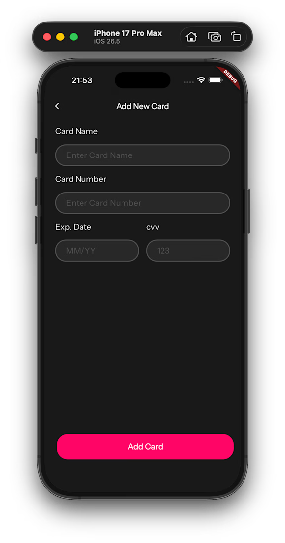
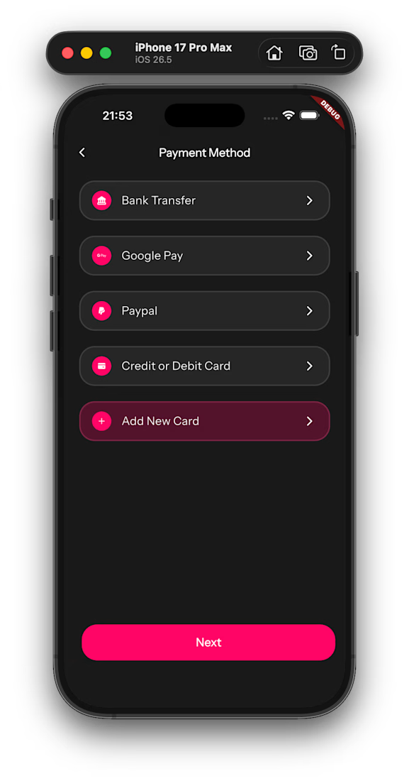
Today's focus was improving the payment experience by allowing users to add a new debit or credit card before purchasing movie tickets.
The flow is simple:
✅ Select Add New Card from the payment methods.
✅ Enter your card details securely.
✅ Continue to payment.
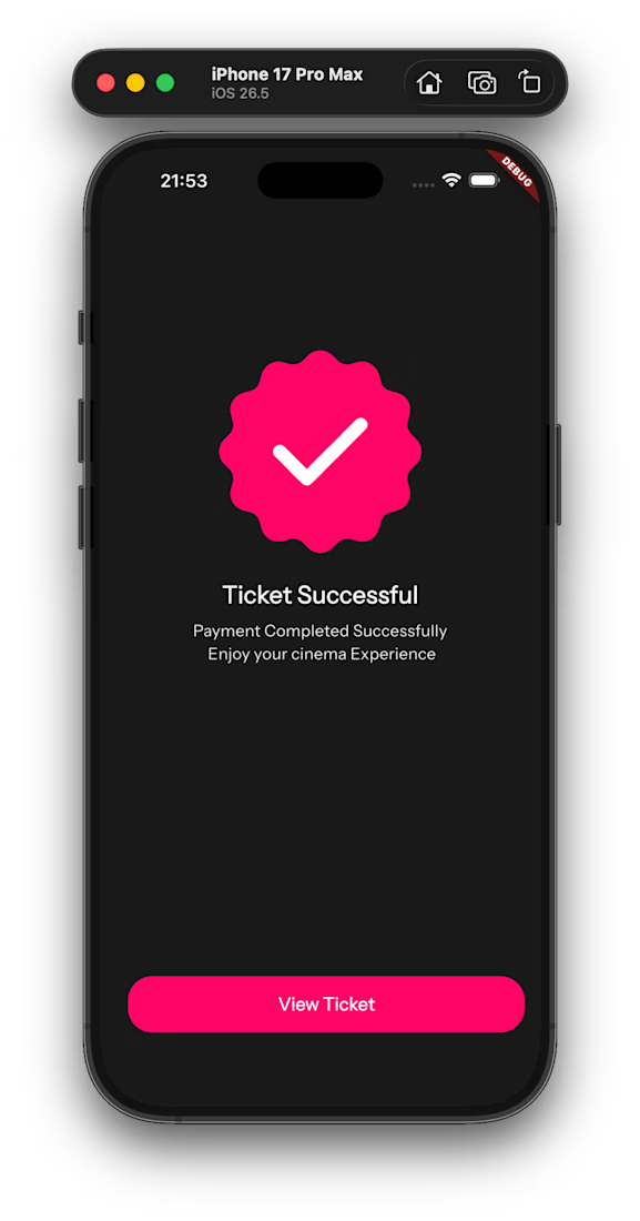
✅ Receive a successful ticket confirmation.
One small UI decision I made today was changing the primary button from "Add New Card" to "Next" after navigating to the card details screen.
Why?
Because at that point, the user is no longer adding a payment method—they're moving to the next step in the payment process. Small changes like this make the interface feel more natural and reduce confusion.
It's another reminder that good UI isn't just about how things look—it's about guiding users through an experience that feels effortless.

The network for creativity
Join 1.25M professional creatives like you
Connect with clients, get discovered, and run your business 100% commission-free
Creatives on Contra have earned over $150M and we are just getting started








Related posts

AI can build the UI in minutes.
Bringing it up to a good standard, still needs a designer. Agree or disagree?

I see some of your work and honestly your work is really premium 🎉🎉
Great job Alex🎉🎉🔥🔥

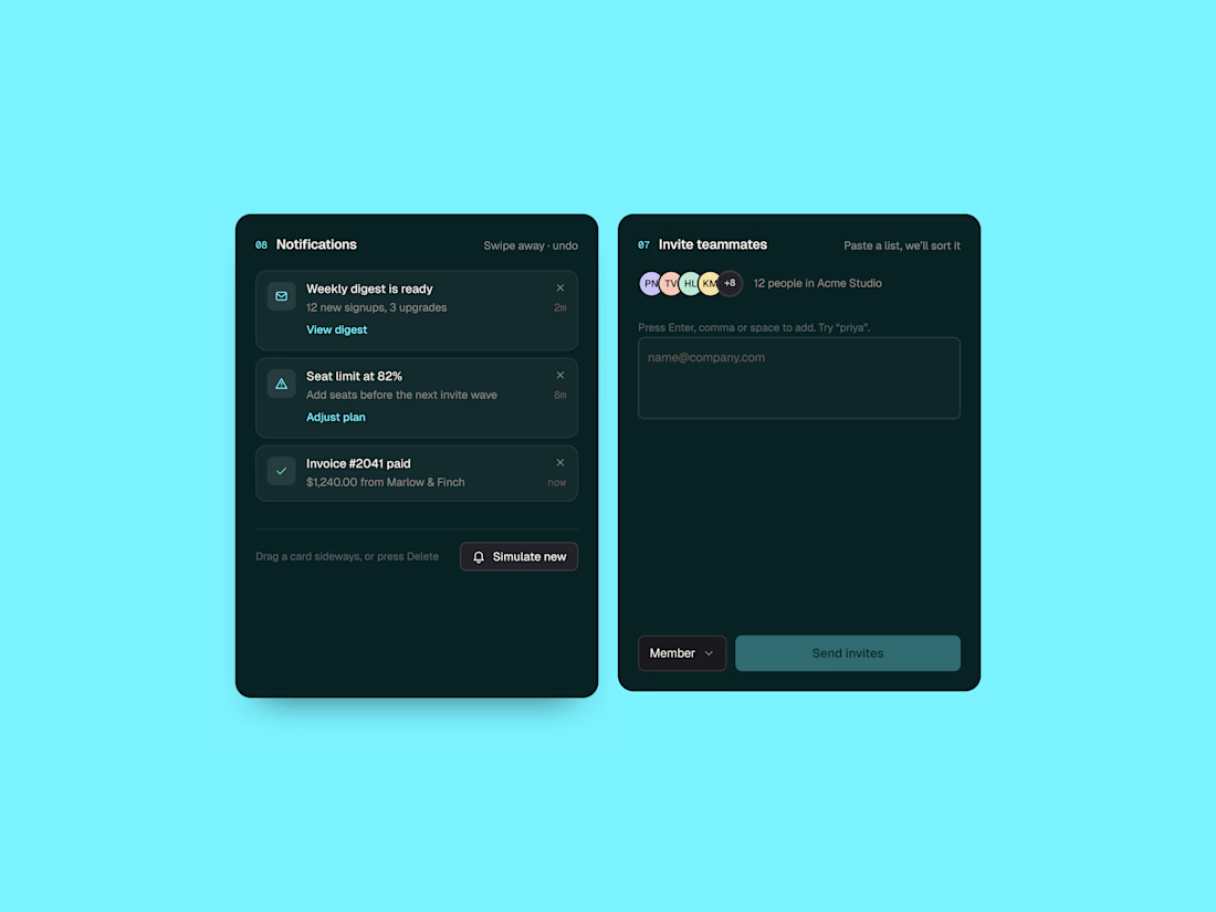
A little exploration in dashboard UI ✳️
Two small SaaS components focused on making everyday interactions feel clearer and more intuitive — from notifications to inviting teammates.
Exploring clean layouts, subtle details, and a dark interface with a pop of cyan.
Designed in Figma. Built with HTML, CSS & JavaScript.
I design in Figma and develop in Webflow and Framer.



The dark interface with that pop of cyan looks sharp, Abdul. Notifications and invite flows are the unsung heroes of dashboards, and designing them with real HTML/CSS craft shows care. Nice exploration.

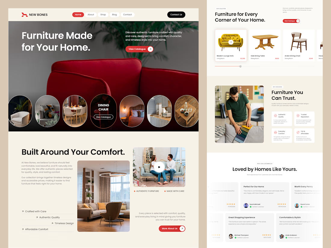
Excited to share my latest design project: New Bones 🛋️
New Bones is a furniture e-commerce landing page designed to make discovering home items and exploring decor trends completely seamless. The main focus was to break down complex online shopping layouts into a clean, minimal, and frictionless user journey.
From smooth product slider discovery to a transparent trust badge flow, every section is crafted with close attention to clear visual hierarchy and layout consistency.
Check out the full UI/UX case study here! 👇

Nice focus on simplifying furniture discovery!