The network for creativity
Join 1.25M professional creatives like you
Connect with clients, get discovered, and run your business 100% commission-free
Creatives on Contra have earned over $150M and we are just getting started
Back to feedPost


I’ve been working on Taste Notes for Hipppo. It turns every reference you save into a small design brief.
Po studies the grid, typography, palette, contrast, composition, mood, and visual complexity using established design principles. You can keep or dismiss his suggestions, helping Hipppo understand what matters to your taste.
The goal is clearer creative direction and less generic AI slop.
The network for creativity
Join 1.25M professional creatives like you
Connect with clients, get discovered, and run your business 100% commission-free
Creatives on Contra have earned over $150M and we are just getting started





Related posts

Some more experimental futuristic typography story design for Bar LOQA.


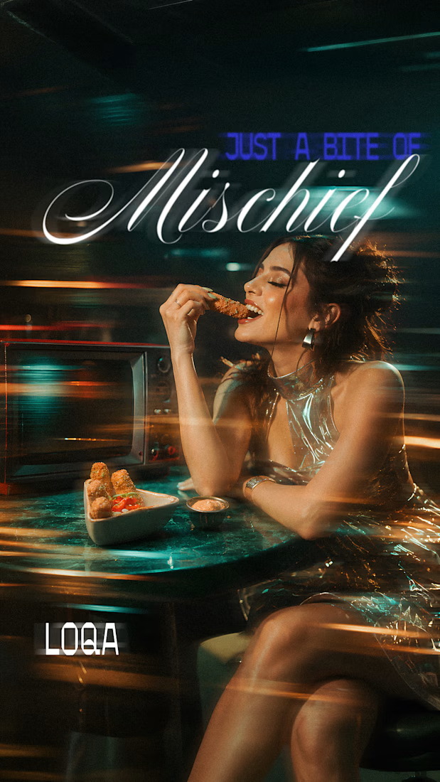
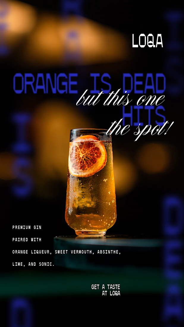
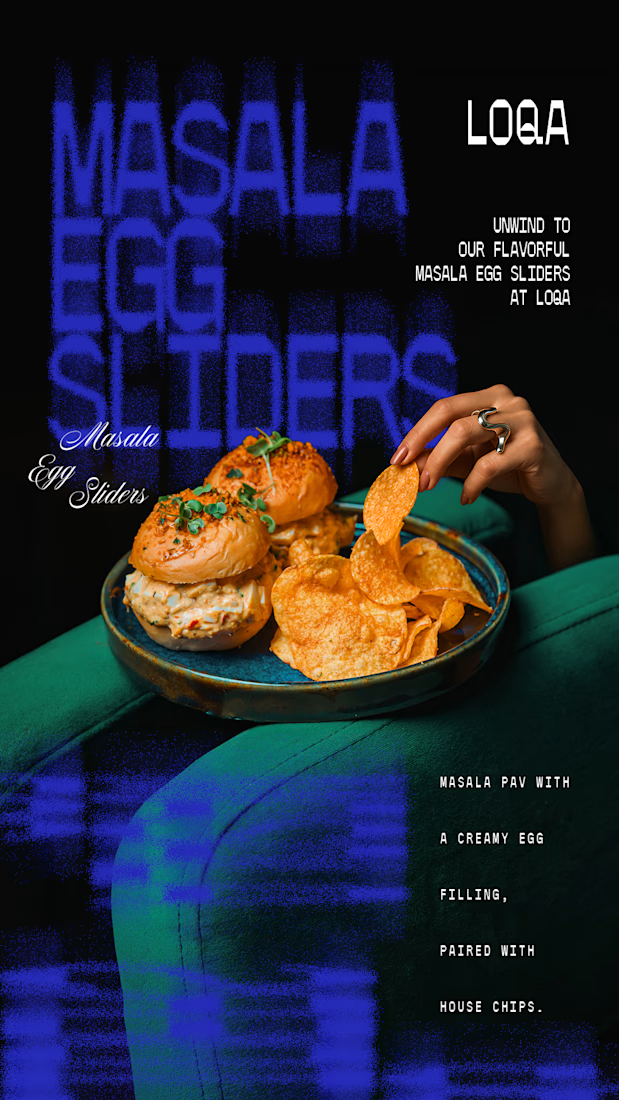
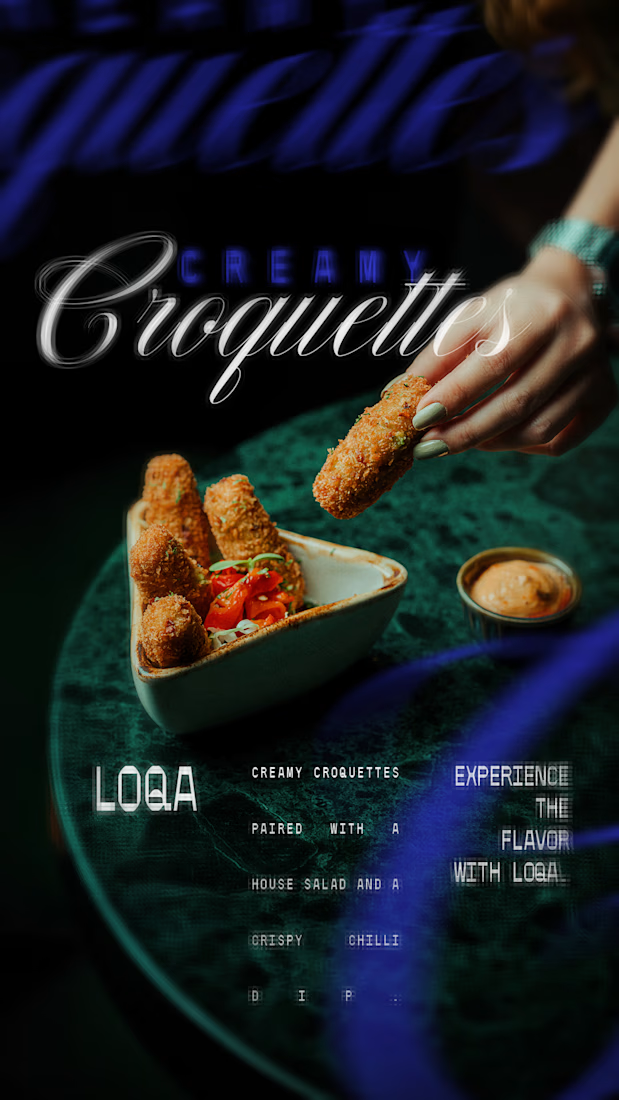

The script lettering over the cocktail sits in the glow without fighting the photo, while the sliders frame gets a much lighter touch. Do you place the type first and crop the image around it, or the other way round?


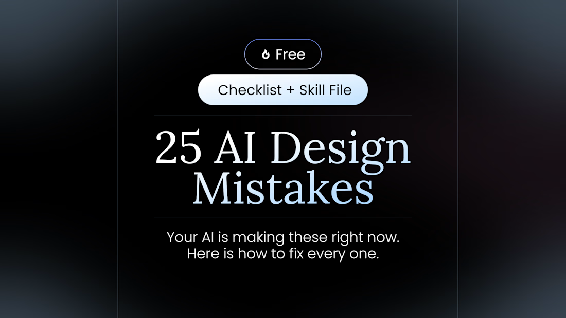
100+ people already use my free skill file to stop their AI from making the same 25 design mistakes.
Drop it into your project and your agent gets better at typography, spacing, color, and dark mode. Link in the comments.


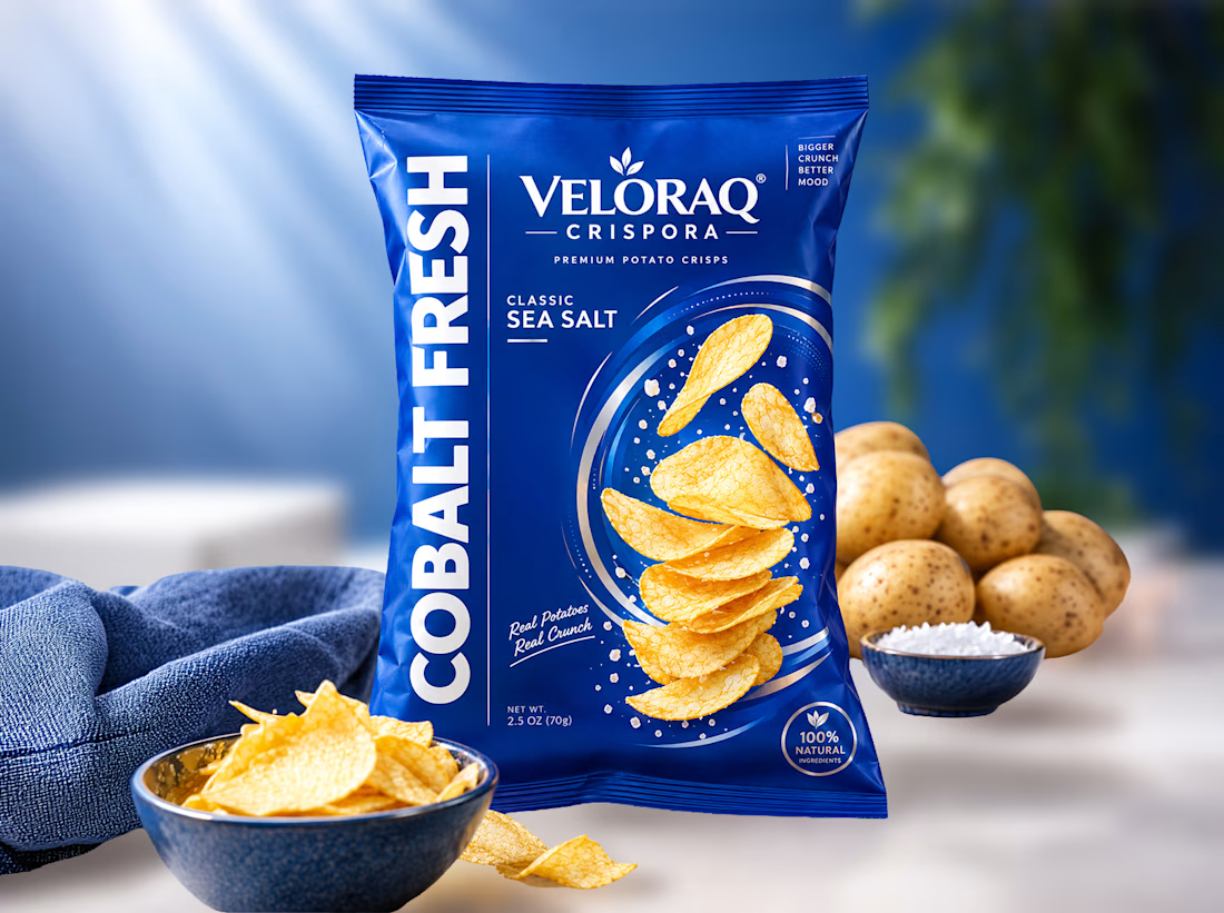
Is your snack packaging failing to convert on Amazon and retail shelves? Boost your sales with vibrant, trust-building pouch designs! 🥔✨
Food brand founders often struggle to stand out in the crowded CPG market. Generic designs make premium snacks look cheap, costing you retail placements. As a specialized packaging designer, I solve this by blending deep consumer psychology with striking, FDA-compliant visuals. Partnering with me ensures your product commands premium pricing and builds instant buyer trust.
Curious to see how this Cobalt Fresh concept comes to life? I've shared the complete visual breakdown and 3D mockups in the first comment below. Take a look!
Ready to scale your food brand?
#SnackPackaging #FoodPackagingDesign #CPGBranding #FMCGPackaging #PackagingDesigner