The network for creativity
Join 1.25M professional creatives like you
Connect with clients, get discovered, and run your business 100% commission-free
Creatives on Contra have earned over $150M and we are just getting started
Back to feedPost
Taste Test
Choosing between these two brand identity concepts is genuinely tough! Option 1 brings a bold, 3D metallic presence, while Option 2 offers a refined, luxury monogram feel.
If you appreciate the work, please give this post a like/upvote and vote for your favorite option below!
SPECIAL OFFER:
I am offering a 100% FREE custom logo design for anyone who needs a visual identity for their brand in exchange for an honest review on my profile!
How to get yours:
Upvote and vote for your favorite design above.
Send me a direct message with your brand name and vision.
Let's collaborate and bring your brand to life!


3 voted
38%
5 voted
62%
8 votes
Closed

"Thank you all so much! A huge thanks to all my friends who voted for me."

Luxury gold is so good tbh
Thank you! Glad you liked the gold version! I noticed you do web design—do you usually prefer dark luxury themes for your landing pages, or light minimalist ones?
Tbh I prefer light minimalist themes. Clarity and compatibility is so important in web design.
Valid point! Minimalist light themes definitely offer great contrast and readability across different screens. Appreciate your input!

I'd choose Luxury Gold
Awesome choice! The luxury gold monogram really brings out that premium feel. Thanks for the support

Great work 👏
The network for creativity
Join 1.25M professional creatives like you
Connect with clients, get discovered, and run your business 100% commission-free
Creatives on Contra have earned over $150M and we are just getting started

Challenges
View all


Related posts


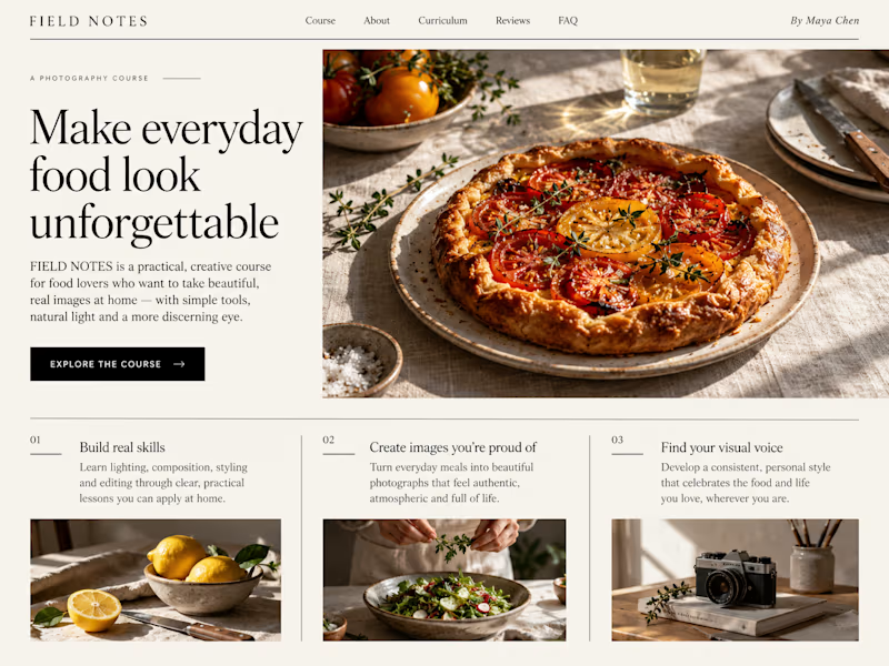
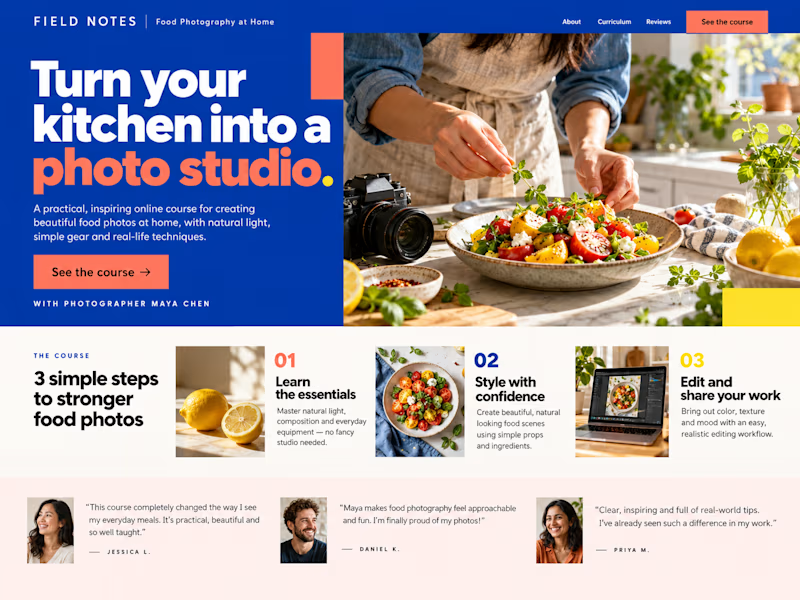
Which Kajabi sales page design would you choose for this course? Vote for A or B and tell me what made the difference.

23 voted
50%
23 voted
50%
46 votes
Closed

B still could be polished though...maybe try giving the text section little bit more real estate..I don't know

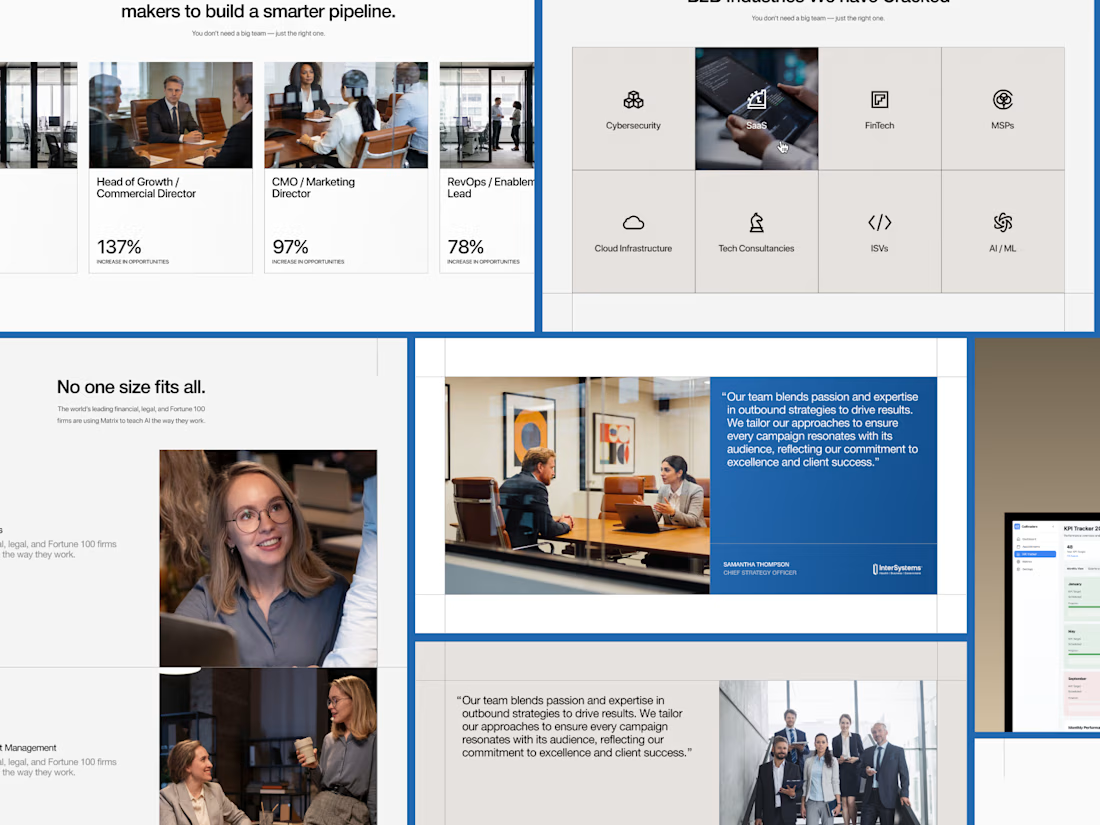
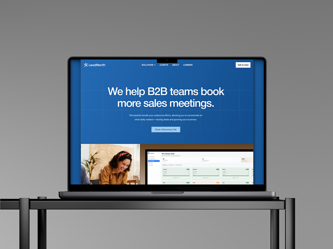
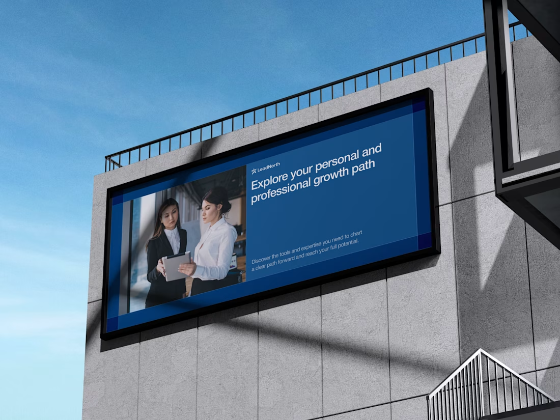
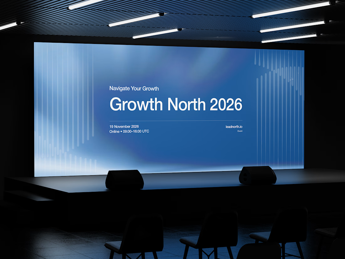


That saturated cobalt blue carries cleanly from the laptop hero onto the outdoor billboard and the Growth North 2026 stage screen.


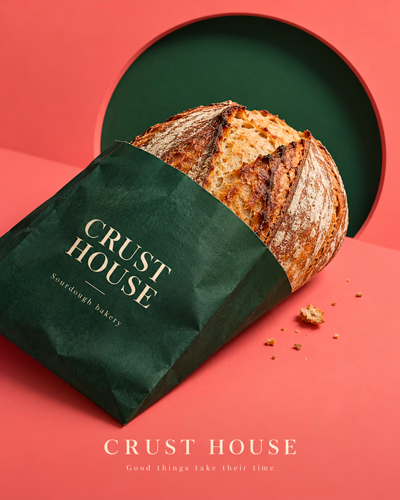
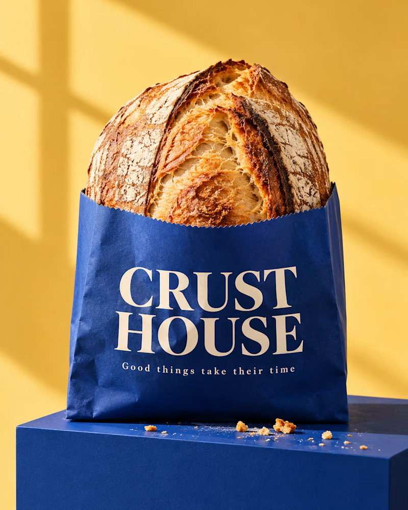
Which one would you brand the bakery on?
The first is a forest green bag on coral, the loaf tipped out of it, a dark green disc behind, crumbs scattered on the surface, fine serif in cream.
The second stands upright, a cobalt bag on a cobalt block against yellow, the loaf rising out of the top, window light across the wall, crumbs at the base.
One sells the loaf. The other sells the shop.
👇 #packagingdesign #brandconcept #foodphotography
3 voted
33%
6 voted
67%
9 votes
Closed

window