The network for creativity
Join 1.25M professional creatives like you
Connect with clients, get discovered, and run your business 100% commission-free
Creatives on Contra have earned over $150M and we are just getting started
Back to feedPost

Designing a SaaS product around attention, not dashboards.
Most SaaS websites try to prove how much their product can show.
For Current, I wanted to communicate the opposite.
The product connects pipeline, tasks, and cash flow — but the design focuses on one question:
What actually needs your attention?
That led to three simple ideas:
— What's moving
— What needs you
— What's coming
Instead of filling the page with dashboard screenshots, I used editorial typography, strong imagery, and three visual principles to explain the product.
The goal wasn't to make the product look more complicated.
It was to make the value easier to understand.
Current is my fifth Framer template, currently in production.

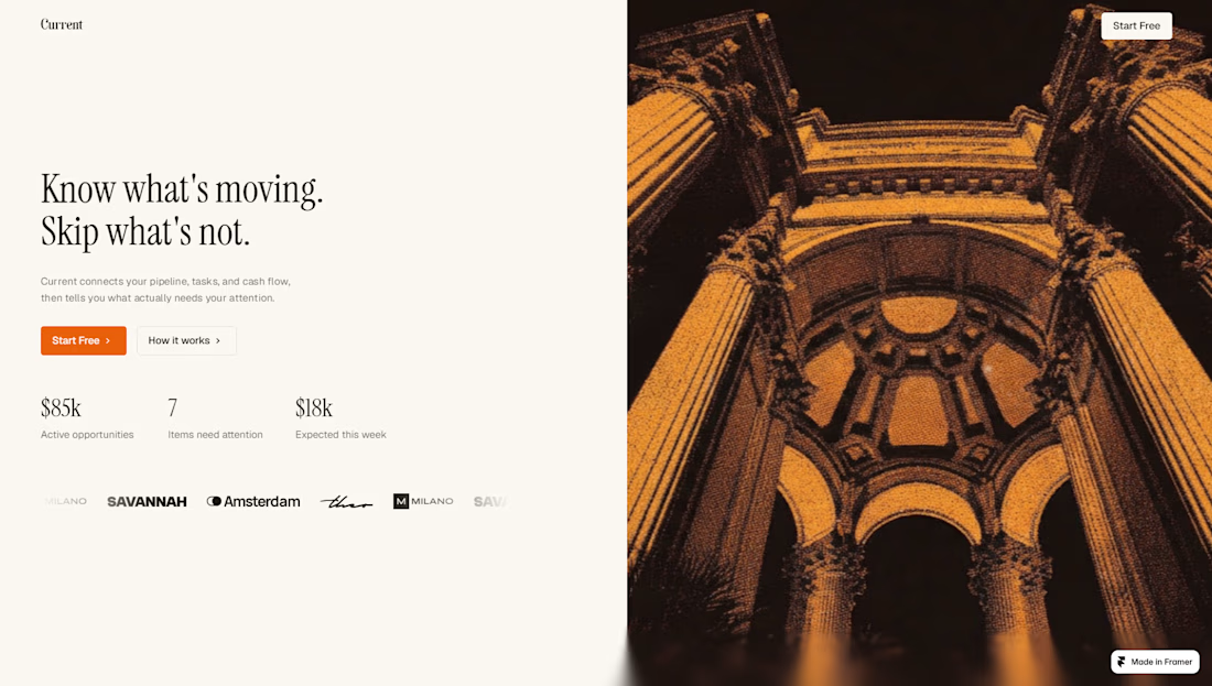
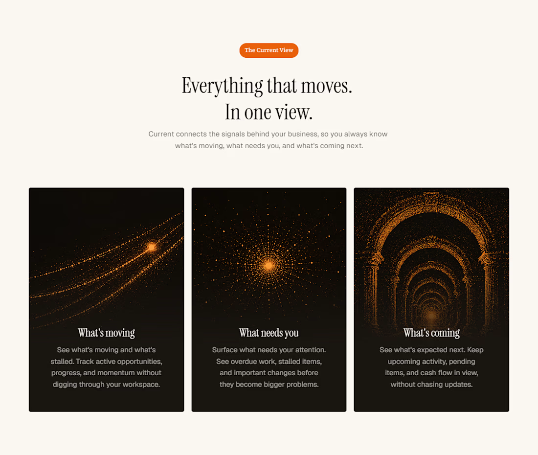

Connecting pipeline, tasks, and cash flow is already complex; choosing to foreground attention rather than dashboard density is a strong strategic decision. The product feels designed around decisions, not data accumulation.
The network for creativity
Join 1.25M professional creatives like you
Connect with clients, get discovered, and run your business 100% commission-free
Creatives on Contra have earned over $150M and we are just getting started
Trending
retrofuturism
Share your favorite designs from the past exploring the distant future. Or your own take on the aesthetic 🚀
halftone
Dots. Texture. Grain. Let's see your designs using the halftone technique.

Midjourney
Creatives are showing off what they're making with Midjourney.
colorgrade
Video editors sound off: How do you enhance the mood of your video in color grading?





Related posts

What if a gallery felt like scrolling through someone’s feed?
For Namaste Studios, I wanted the gallery section to have a bit more personality than the usual collection of neatly arranged images.
So I borrowed a visual language we already know instinctively: Instagram posts.
The cards sit around the main content and stay sticky as you scroll, creating this playful, layered composition that slowly unfolds with the page.
It makes the section feel less like “here are some photos from our studio” and more like you’re getting little glimpses into the world of Namaste.
Sometimes a familiar interaction, used in a slightly unexpected way, is all a section needs.
Built for my Namaste Studios Framer template. 🌿


Love it 🧡

website design done in framer, case study coming soon😍


Your sense of balance and proportion is inspiring


ai gave us time to put extra effort into pages nobody cares about
so we made this privacy page side nav for our new framer template

Great!