The network for creativity
Join 1.25M professional creatives like you
Connect with clients, get discovered, and run your business 100% commission-free
Creatives on Contra have earned over $150M and we are just getting started
Back to feedPost

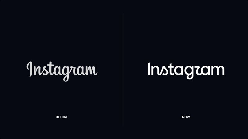
Instagram just became "Instagzam."
Everyone's calling it a legibility mistake.
I don't think it is.
Meta didn't touch the app icon. That's the one thing tied to how often you open the app. Touch that, and usage drops.
So they touched the wordmark instead.
The old 2016 script was made for a still photo feed. Today's Instagram runs on reels and motion — the type needed to move, not just sit pretty in a grid.
And the "mistake" everyone's roasting? That's friction, done on purpose. A logo you stopped noticing gets noticed the moment it looks slightly wrong.
Good branding isn't about being liked on day one. It's about solving a platform problem without breaking a habit.
What do you think — smart move, or overthinking a font?
— Shayan Imran
The network for creativity
Join 1.25M professional creatives like you
Connect with clients, get discovered, and run your business 100% commission-free
Creatives on Contra have earned over $150M and we are just getting started





Related posts




Viral Podcast Clip Editor | Hormozi Style Shorts & Reels | Retention Editing
I turn boring podcasts into viral short-form content that stops the scroll.
This clip is an example of my work:
-Kinetic captions (keyword highlighting)
-Visual B-roll & memes overlay (YouTube, Algorithm, Thumbnail icons)
-Clean transitions & sound design
-Optimized for 9:16 retention
-Perfect for: Founders, Coaches, Podcasters, Personal Brands on TikTok, IG Reels, YouTube Shorts.
Tools: Capcut + After Effects


the keyword highlighting in the captions is doing the real work here

POLIDO’s brand identity brings the wordmark, typography and color into one visual system. The video shows it through application mockups.
What has changed in your business that your brand still needs to reflect?


The handwritten polido wordmark on that muted green has real warmth. Hot take: your closing question about what has changed in the business is stronger than the logo reveal, because it speaks straight to a buyer. I would open every case study with it.