The network for creativity
Join 1.25M professional creatives like you
Connect with clients, get discovered, and run your business 100% commission-free
Creatives on Contra have earned over $150M and we are just getting started
Back to feedPost

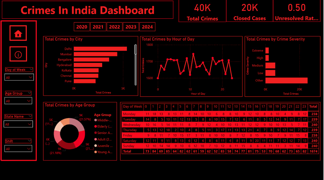
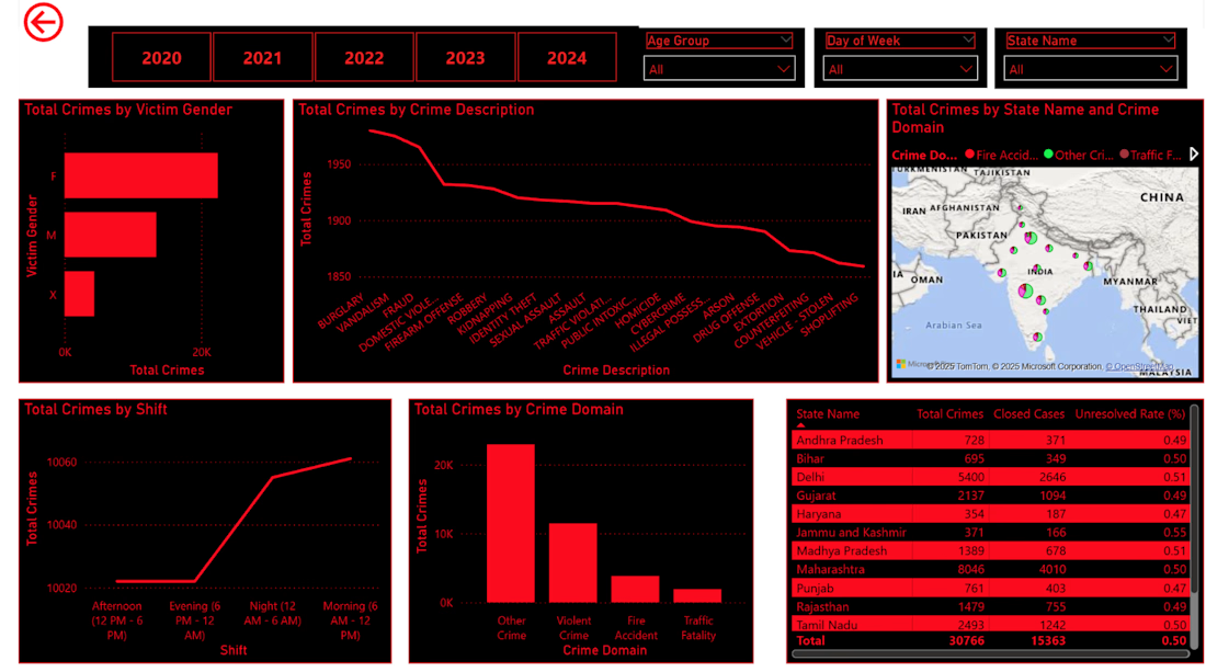
I developed an interactive Power BI dashboard analyzing crime trends across India (2020–2024).
The dashboard provides insights into:
• Total crime patterns
• Case closure rates
• City & time-based trends
• Data-driven decision support
Built using data cleaning, modeling, and DAX measures to generate actionable insights.
Open to freelance work in Data Analytics & Dashboard Development.
The network for creativity
Join 1.25M professional creatives like you
Connect with clients, get discovered, and run your business 100% commission-free
Creatives on Contra have earned over $150M and we are just getting started

Challenges
View all


Related posts

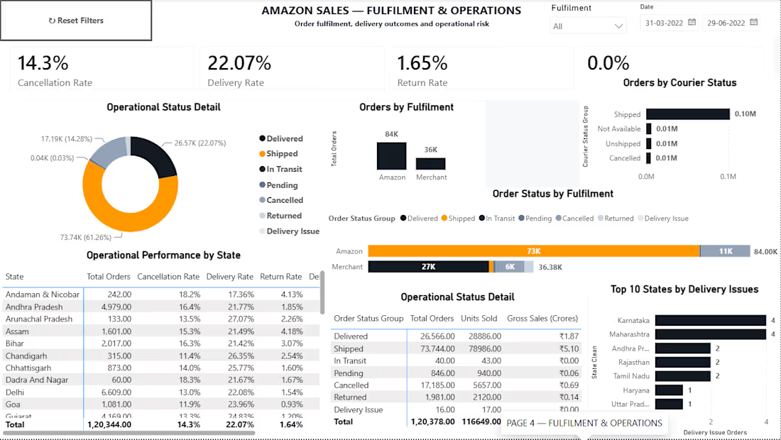
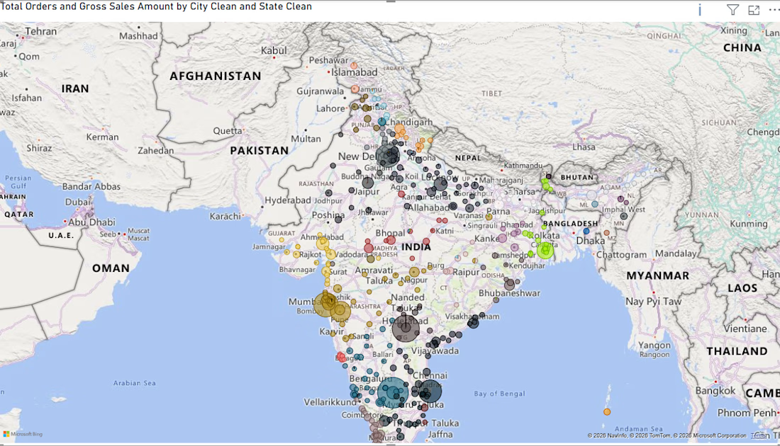
ARTHADṚṢṬI — Amazon Sales Intelligence & Business Performance System
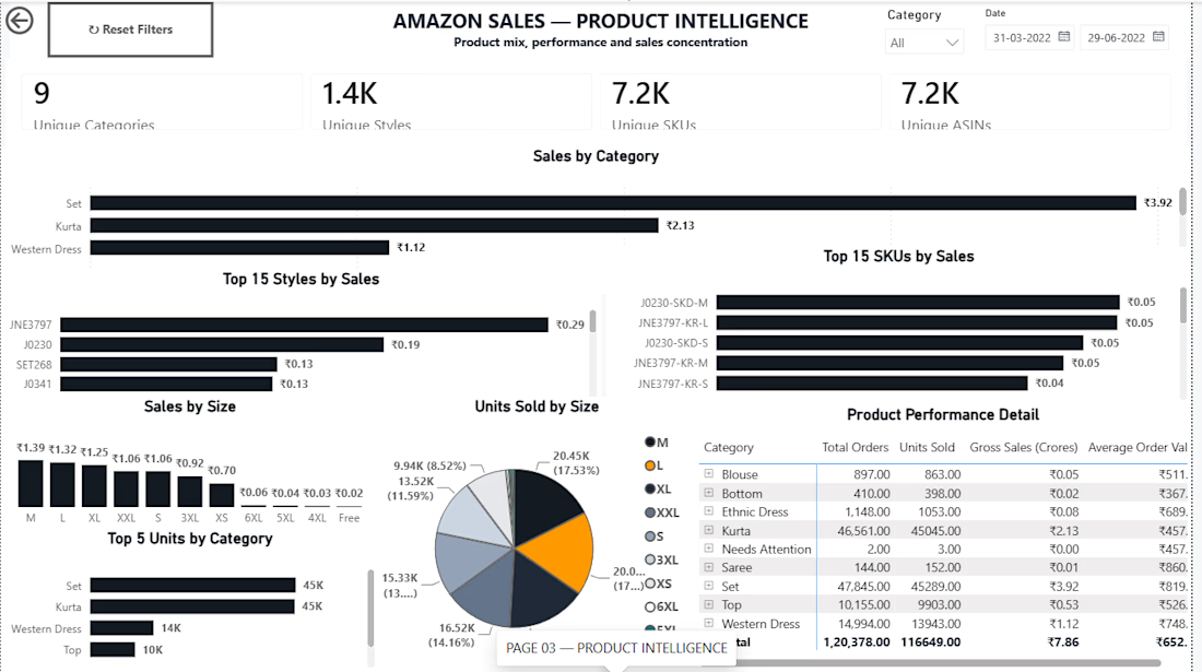
What started as an analytics project became an opportunity to build something closer to a real-world business reporting system.
I worked with Amazon sales data and took it through an end-to-end analytics workflow:
Raw Data → Data Cleaning → Transformation → Data Modeling → DAX → Power BI → Business Insights
What I worked on
• Data profiling and quality checks
• Cleaning & transformation using Power Query
• Handling missing and inconsistent data
• Business KPI development
• Data modeling
• DAX measures
• Interactive dashboard design
• Sales, product, fulfilment & geographic analysis
The final system provides visibility into:
→ Sales & revenue performance
→ Orders and units
→ Category & SKU performance
→ Fulfilment operations
→ Monthly trends
→ Geographic distribution
→ Interactive filtering & drill-down analysis
But the biggest lesson from this project was simple:
A dashboard shouldn't just look good. It should make the underlying data easier to understand and act upon.
I’m also available for dashboard projects.
If you have Excel, CSV, or other business data that is difficult to analyze, I can help transform it into a clean, professional and interactive dashboard.
Services I can provide:
→ Power BI Dashboard Development
→ Excel Dashboard Development
→ Data Cleaning & Transformation
→ Power Query Automation
→ DAX & KPI Development
→ Business / Sales Analytics
→ Interactive Reporting Systems
Check the github Repo
https://github.com/lokeshyadavalli001-star/ARTHADRSTI
Whether you need a dashboard built from scratch, an existing report improved, or messy data transformed into something usable, I'm open to working on it.
Have a dataset or reporting problem?
Send me a message. Let's turn the data into something useful.
#PowerBI #DataAnalytics #BusinessIntelligence #PowerQuery #DAX #Excel #DashboardDesign #DataVisualization #DataCleaning #FreelanceDataAnalyst

Any Suggestions and improvements is Sincerely Appreciated
Git hub Repo
https://github.com/lokeshyadavalli001-star/ARTHADRSTI

github.com
GitHub - lokeshyadavalli001-star/ARTHADRSTI: Amazon Sales Intelligence & Business Performance System
Amazon Sales Intelligence & Business Performance System - lokeshyadavalli001-star/ARTHADRSTI

I made this project around a pretty data-heavy product, and I actually really enjoyed working with all that information.
A big part of the process was figuring out different ways to organize metrics, charts, and numbers, and deciding what should be more visible, what could stay secondary, and how everything should work together on one screen.
It was fun to explore different layouts and find clearer ways to present complex information without making the interface feel overloaded.


Choosing what deserves emphasis is the real challenge in data-heavy UI.

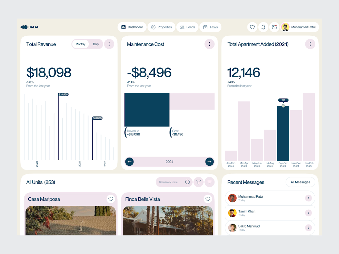
Real Estate SaaS Dashboard
Real estate software often sits on top of a large amount of operational data.
Properties, leads, deals, revenue, tasks and performance all need to be visible without turning the product into an information wall.
For this dashboard concept, the design process started with hierarchy.
The most important metrics get immediate visibility. Supporting information is organized into focused sections, while actions remain close to the data they relate to.
The result is a SaaS interface designed around clarity, decision-making and everyday workflow.
Focus: Real Estate SaaS · PropTech UI/UX · Dashboard Design · Data Visualization · Property Management Software
The goal wasn't to make the product look complex.
It was to make a complex business easier to operate.
Designed by WaxyWeb.
Working on a SaaS or PropTech product?
hello.waxyweb@gmail.com
www.waxyweb.com

great one