The network for creativity
Join 1.25M professional creatives like you
Connect with clients, get discovered, and run your business 100% commission-free
Creatives on Contra have earned over $150M and we are just getting started
Back to feedPost
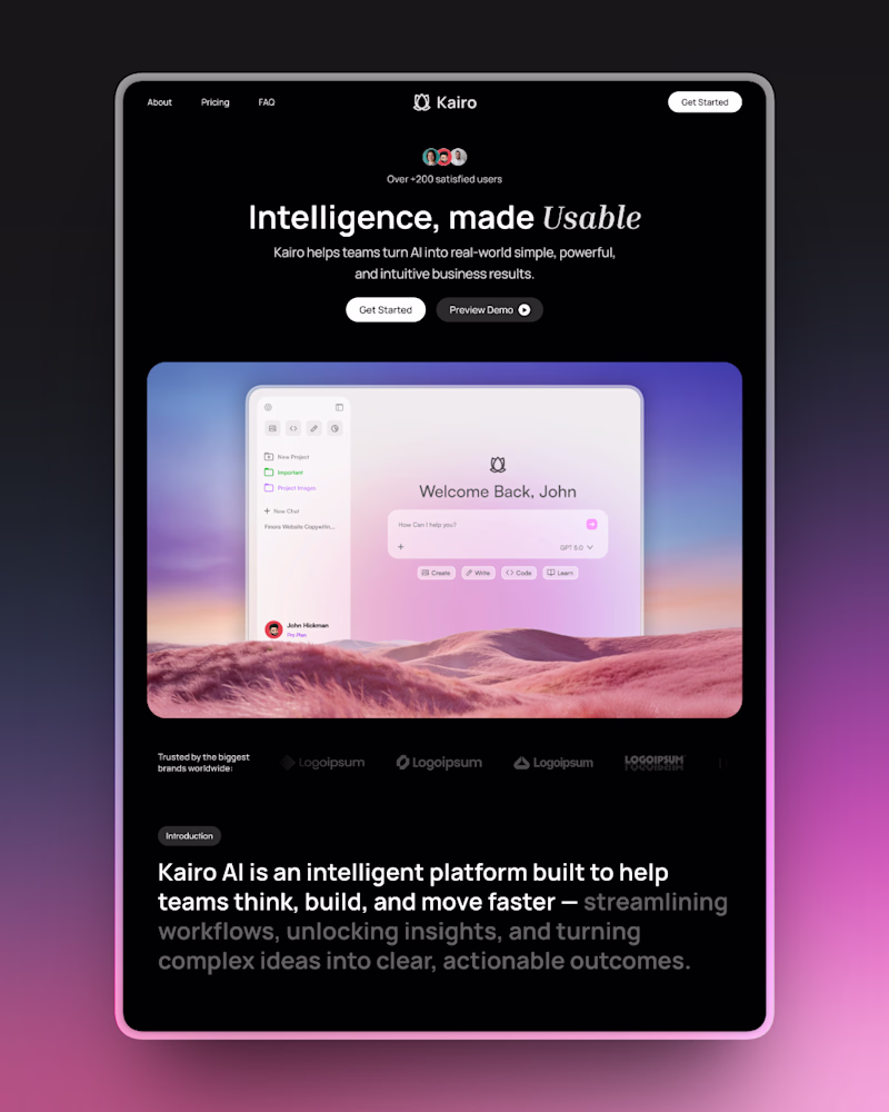
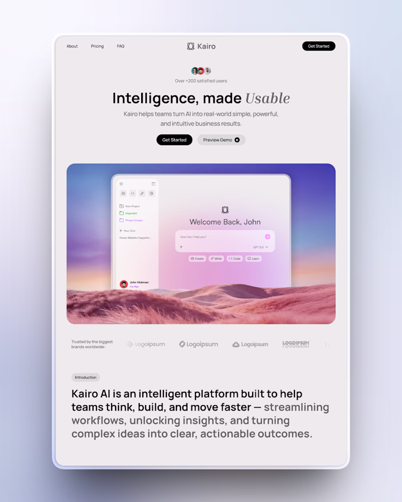
Taste Test


Cooked up two versions for a Framer development project.
Which version looks the best?


4 voted
33%
8 voted
67%
12 votes
Closed

Dynamic and high-impact.
Thank you Sahil!


No worries, thank you for the feedback!

Thanks for the feedback!

“Really clean 👏 The spacing makes the content much easier to digest.”
The network for creativity
Join 1.25M professional creatives like you
Connect with clients, get discovered, and run your business 100% commission-free
Creatives on Contra have earned over $150M and we are just getting started
Related posts


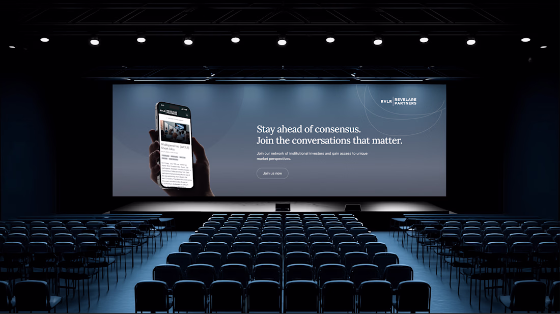
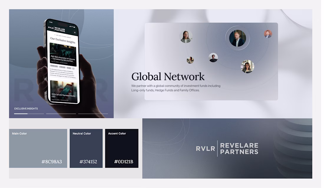
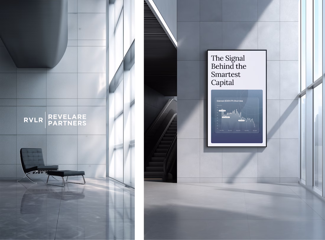
We partnered with RVLR Partners to define and design their brand and website.
We designed a system built on strong hierarchy, refined typography, and intentional spacing, ensuring every section communicates clearly.
The result is a premium experience that reinforces trust, highlights expertise, and supports how investors explore, evaluate, and engage.
See it live → rvlrpartners.com


Typography also adds a premium feeling 👍


I'll have to go with A.

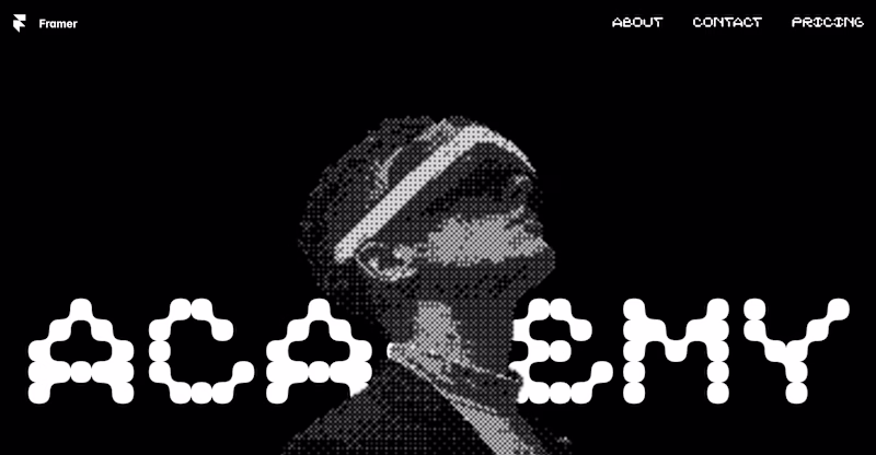
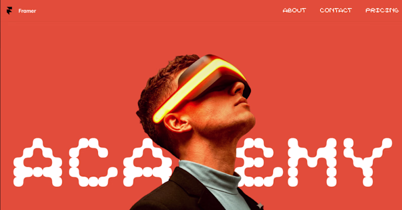
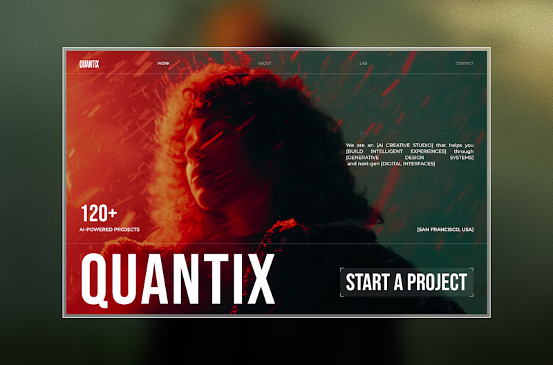
Exploring two directions for the same concept.
Which one feels stronger?👀
One leans into strong typography to grab attention instantly.
The other shifts focus to visual storytelling with a more immersive feel.
14 voted
16%
72 voted
84%
86 votes
Closed

other option?


Trending


FLORA
Reusable workflows are replacing one-off prompts in creative AI. Share what you're building in FLORA.

Contra University
Learn from expert creatives how to earn more using next-gen AI tools.
portfolioreview
The best portfolios tell a story, not just show a grid. Share yours for feedback.
freelancerlife
Freelancer life is wins, pivots, and everything in between. What’s yours right now?
aivideo
AI video tools are moving at warp speed. Which ones are you experimenting with?