The network for creativity
Join 1.25M professional creatives like you
Connect with clients, get discovered, and run your business 100% commission-free
Creatives on Contra have earned over $150M and we are just getting started
Back to feedPost


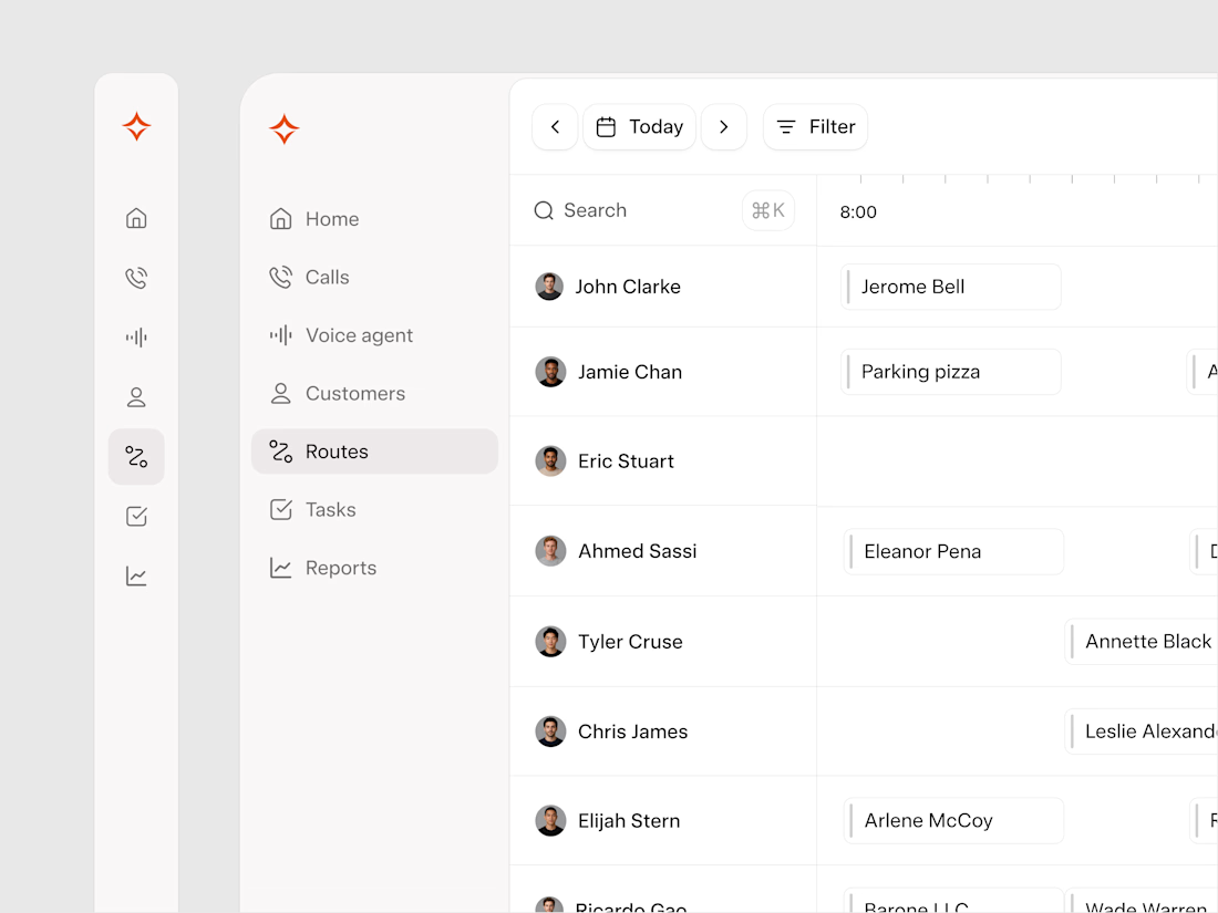
The route view is the most information-dense screen in the product.
Every technician, route and appointment are all on one screen at the same time. For operators managing large teams, every pixel of space matters and we worked around it.
We built a retractable navigation specifically for this screen. When a dispatcher needs full focus on the route view, they collapse the nav and get the space back. When they need to move between sections, they expand it.
It is a small interaction that reflects the same design system thinking applied throughout the product. Every component should serve the operator's workflow.
The network for creativity
Join 1.25M professional creatives like you
Connect with clients, get discovered, and run your business 100% commission-free
Creatives on Contra have earned over $150M and we are just getting started



Related posts

Designed Oculus, a crypto dashboard where every tile is double-outlined, flat and unapologetically colorful.
Warm paper canvas, ink black anchors, mono micro-type, and an eye that follows your cursor.
Built with GSAP + Framer Motion. Light mode only, on purpose.
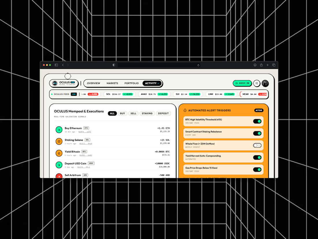
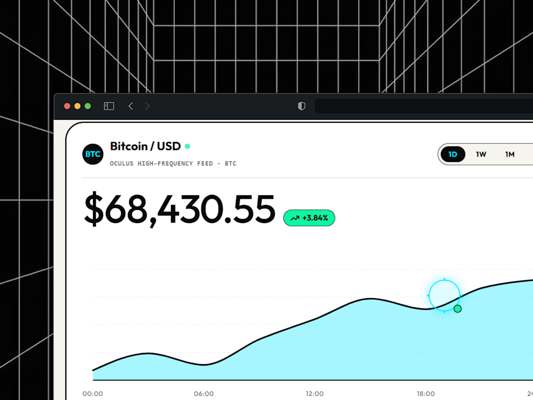
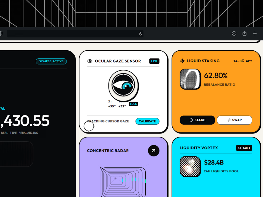

light mode only, on purpose. respect.


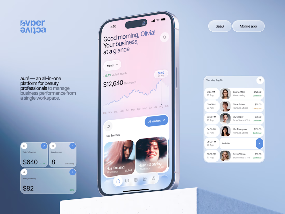
Finally wrapped up this project, and I’m excited to share the case study! 💅 A fresh product design concept for a beauty dashboard. Would love to hear your thoughts! ✨


A beauty dashboard is such a fun product design challenge, Oleksandra. The Good morning, Olivia! greeting in the header makes business metrics feel personal instead of clinical, which is exactly what a beauty professional would want.


Badge Placement: Consistency or Visual Balance?
Even a small indicator can change how the entire interface feels
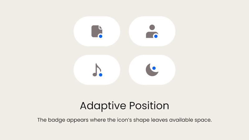
Adaptive Position
The badge placement changes depending on the icon’s shape and available space. The result feels more visually balanced but requires individual adjustments.
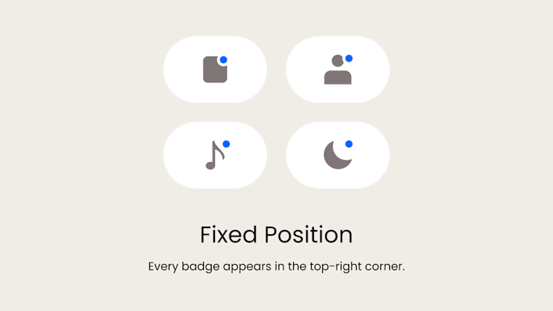
Fixed Position
The badge always appears in the top-right corner. This creates a consistent and predictable system, but on some icons it may feel disconnected or awkwardly placed.
What matters more in a design system: consistency or optical balance?
17 voted
43%
23 voted
57%
40 votes
Closed

Fixed for me. In a system, people learn where to look. I'd tweak the odd icons before breaking the rule.