The network for creativity
Join 1.25M professional creatives like you
Connect with clients, get discovered, and run your business 100% commission-free
Creatives on Contra have earned over $150M and we are just getting started
Back to feedPost
Taste Test

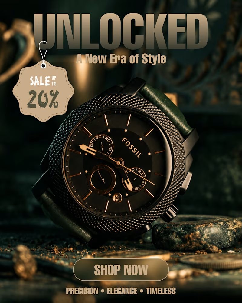
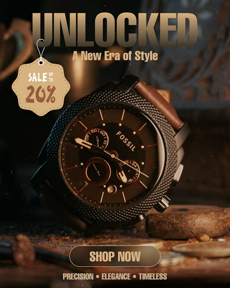
Which watch ad hits different? ⌚✨
Two colour moods. One timeless style.
I explored two visual directions for this luxury watch poster.
Which one would you choose?
Vote below! 👇
#GraphicDesign #PosterDesign #CreativeDesign #WatchDesign #UIDesign

2 votes
Ends in 1d


try another design style to stand out, it is very familiar

deep green
The network for creativity
Join 1.25M professional creatives like you
Connect with clients, get discovered, and run your business 100% commission-free
Creatives on Contra have earned over $150M and we are just getting started

Challenges
View all


Related posts

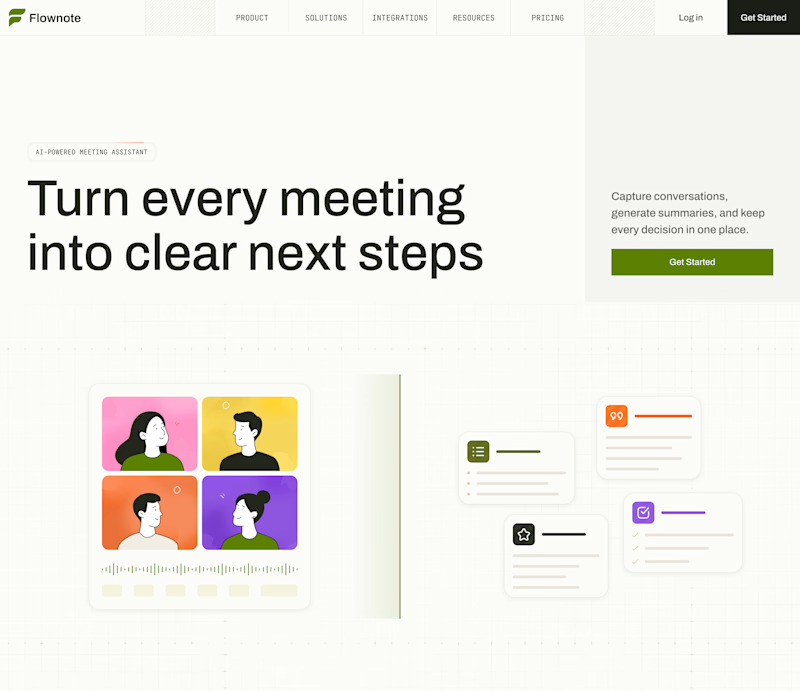
My previous poll showed unexpected results (I am very grateful to everyone who took the time to vote and comment 🤍).
Now I am curious about your opinion on the color mode for this hero section. I definitely like a light theme. What about you?
By the way, I made a nice animation for this design. You can see it on my profile
28 voted
54%
24 voted
46%
52 votes
Closed

To be honest the dark mode looks really good

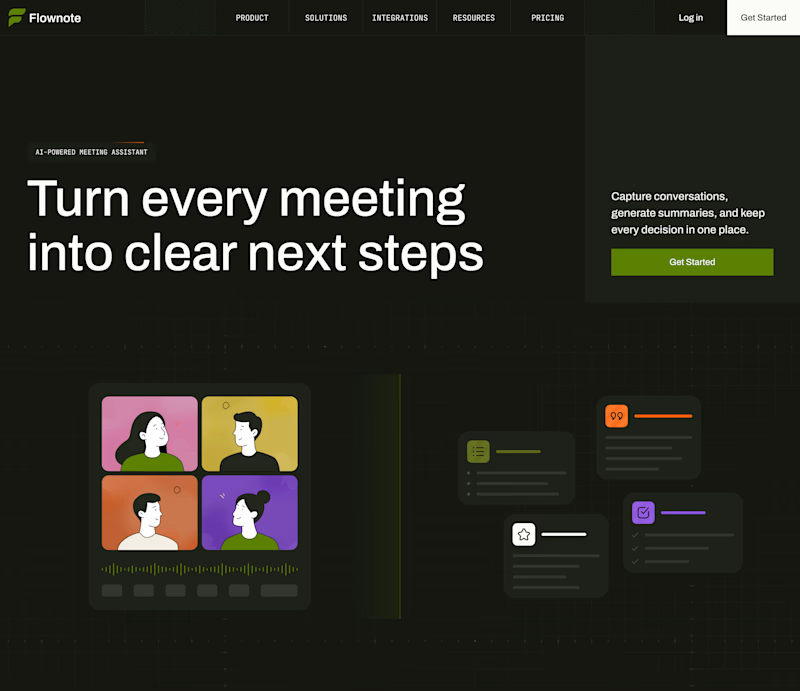
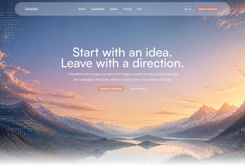
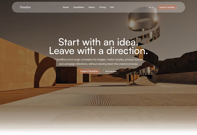
Explored two different visual directions for the same SaaS landing page.
The structure stays consistent, while the imagery, mood and art direction shift the overall brand feel.
Interested to know which direction feels stronger.
11 voted
73%
4 voted
27%
15 votes
Closed

Woww... What a precious design priyansh bro.😍 💯 🔥 🎉


Love this concept 🧡