The network for creativity
Join 1.25M professional creatives like you
Connect with clients, get discovered, and run your business 100% commission-free
Creatives on Contra have earned over $150M and we are just getting started
Back to feedPost

Sustainable brand identity project🌱
A brand can have great values, but if they aren’t communicated visually, they can easily get lost.
The goal of this project was to create a brand that feels natural, trustworthy, and distinctive on the shelf, while staying connected to the farm’s values.
The main challenge was finding the balance between looking organic and authentic without becoming visually generic.
This project taught me how much stronger a brand becomes when every visual decision has a purpose.
#brandidentity #branding #packagingdesign #logodesign #visualidentity



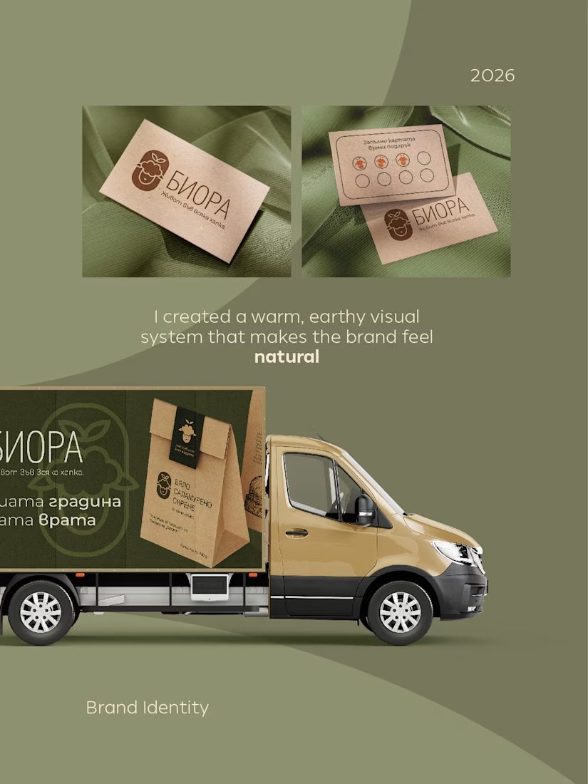
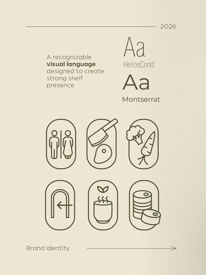

The line-drawn faces are what pull this out of the kraft-and-leaf default — a symbol you invented is ownable in a way a category cue never is. The thing I'd watch is stroke weight: those hairlines are the first detail to vanish on a small label or a printed sticker. Did you keep a heavier cut of the faces for the tiny formats?
The network for creativity
Join 1.25M professional creatives like you
Connect with clients, get discovered, and run your business 100% commission-free
Creatives on Contra have earned over $150M and we are just getting started
Challenges
View all


Related posts

A bold, cohesive fitness brand identity designed to bring energy, functionality, and modern aesthetics into one unified visual system.
The project spans branding, apparel, packaging, merchandise, and digital applications—creating a distinctive and scalable identity built for an active lifestyle.

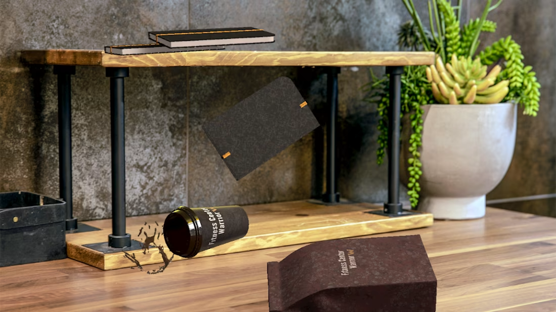
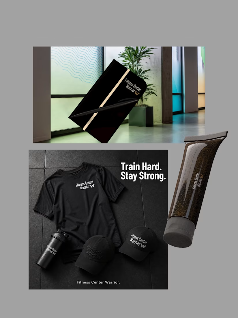

The restrained palette and tactile packaging make the fitness system feel premium without losing its energy. I especially like how the product photography carries the same confident rhythm as the identity.

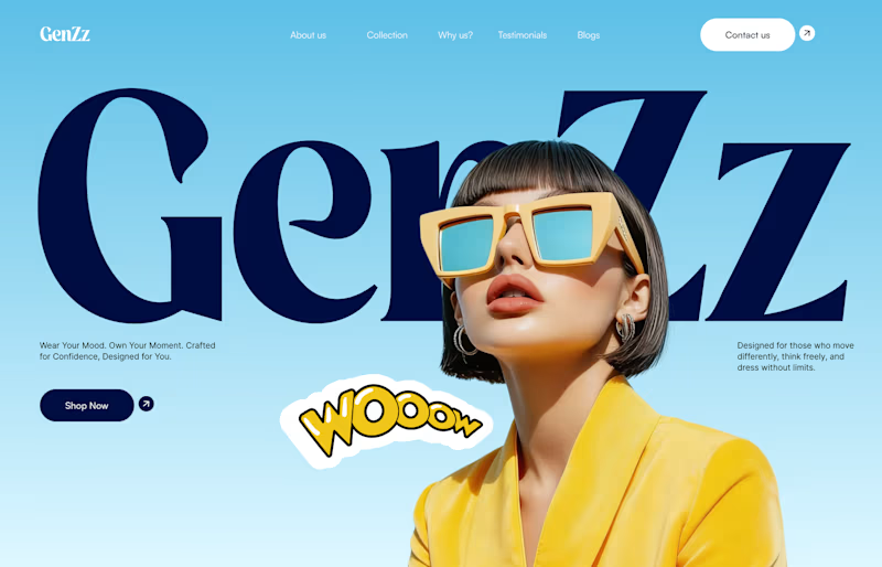
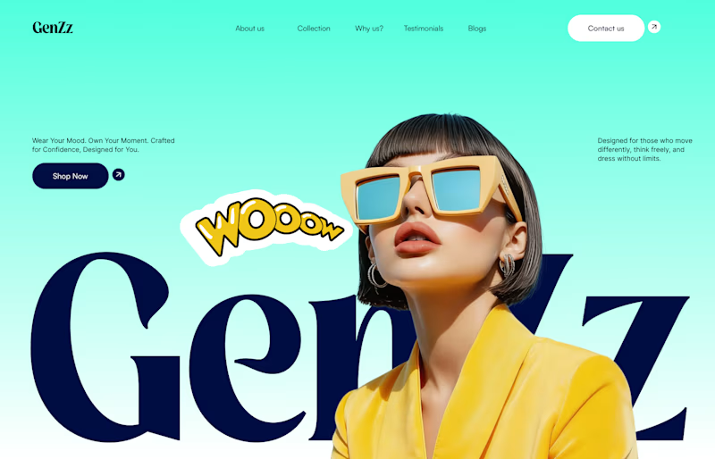
Working on a hero section for GenZz, a bold Gen Z eyewear and fashion brand. Testing two color directions for the landing page and honestly torn between them.
Version 2 has a mint to teal gradient background. Version 1 shifts it to a sky blue gradient. Same layout, same typography, same energy, just a different mood in the backdrop.
Which one pulls you in more and why. Curious if the mint feels more playful and on brand for Gen Z, or if the blue reads cleaner and more premium.
Would love your honest take before I lock this in with the client.


10 voted
59%
7 voted
41%
17 votes
Closed


cool, dmytro stands out. how long did this take?

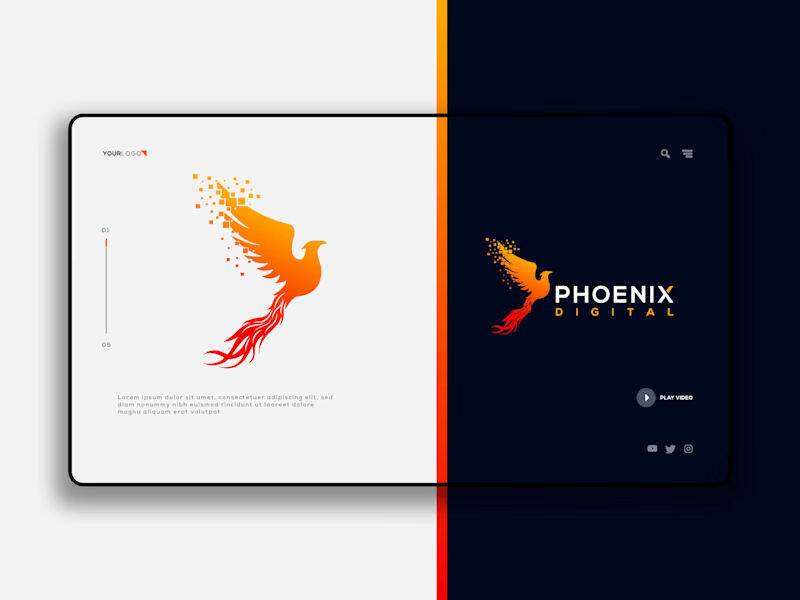
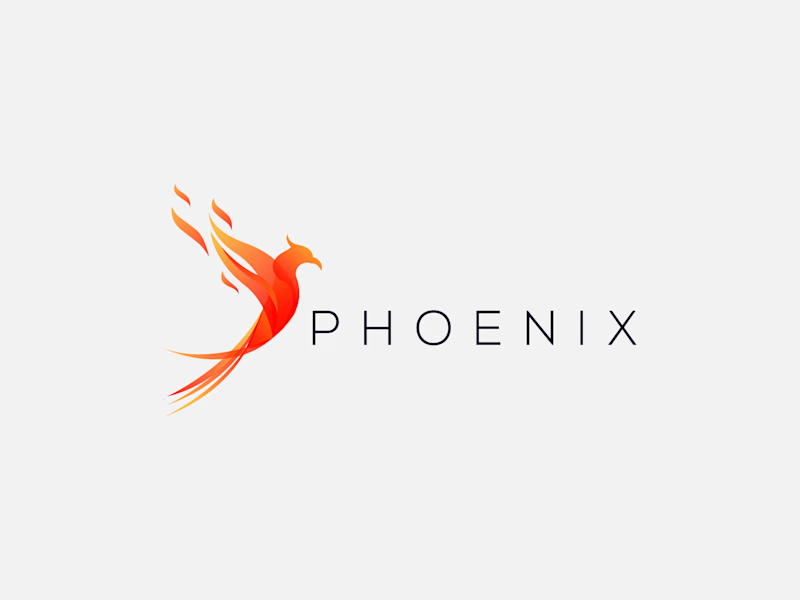
Which Phoenix Vector Logo You Guys Like Most?
These 100% Handmade Vector Logos Are Also Available For Purchase With Exclusive Copyrights Transfer Ownership, Feel Free To Contact Us.
5 voted
38%
8 voted
62%
13 votes
Closed

B has more life to it, that wing gradient gives it some motion the flat mark in A doesn't have. Are you pricing these as one-off logo packs or is there a bigger identity system behind them?