The network for creativity
Join 1.25M professional creatives like you
Connect with clients, get discovered, and run your business 100% commission-free
Creatives on Contra have earned over $150M and we are just getting started
Back to feedPost

Fevicol Ad Observation #01
I watched this Fevicol ad twice.
The first time, I watched it as a viewer.
The second time, I watched it like a copywriter.
And the second watch changed everything.
I started noticing things that had nothing to do with a headline.
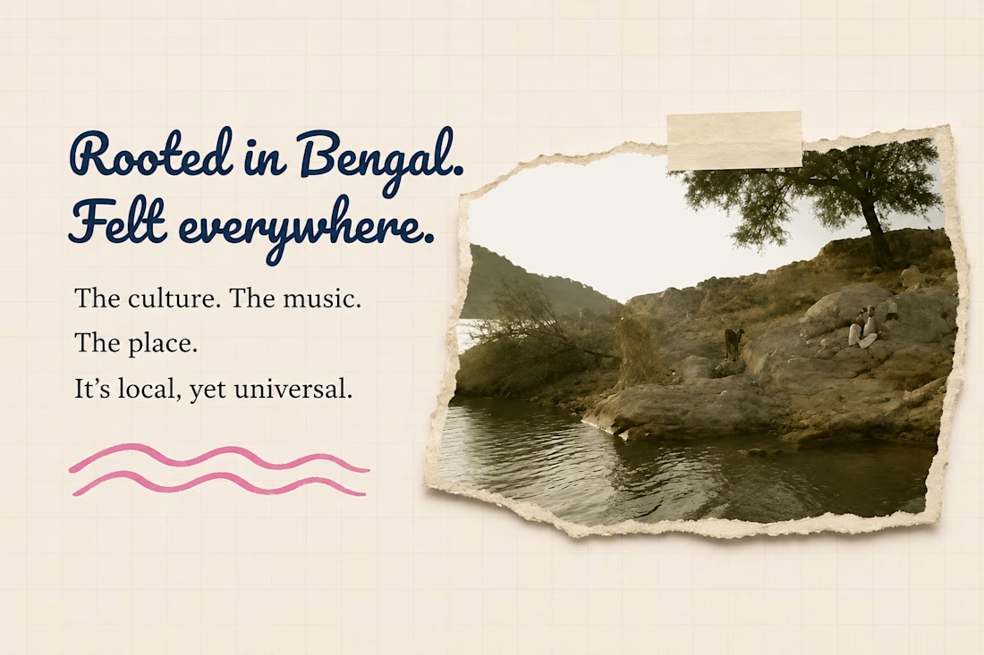
The Bengali folk music.
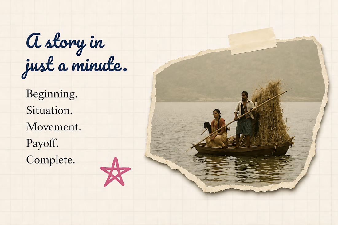
The river.
The boat.
The people.
The pace.
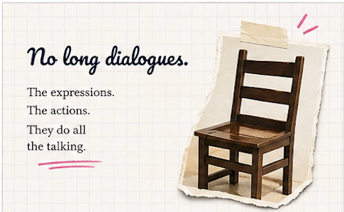
And most importantly — how little the ad tries to explain.
There isn't a voice screaming the product benefit at me.
There isn't a clever line fighting for my attention.
The story just keeps moving.
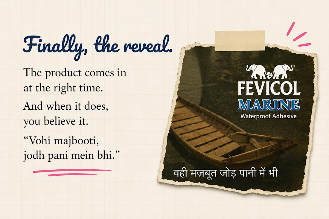
And Fevicol sits inside it.
That got me thinking:
What if good copy isn't always about finding the cleverest thing to say?
Sometimes it's about knowing what doesn't need to be said.
That's what I wanted to understand here.
So I took the ad apart frame by frame, not to tell you whether it's a “good ad”, but to figure out why it stayed in my head.
This is my first Ad Observation.
Not a campaign.
Not a client project.
Just me getting curious about an advertisement — and following that curiosity until I found something worth writing about.


The network for creativity
Join 1.25M professional creatives like you
Connect with clients, get discovered, and run your business 100% commission-free
Creatives on Contra have earned over $150M and we are just getting started





Related posts

I built KolaCuts, a premium mobile barber booking platform designed to make booking a grooming appointment simple, fast, and seamless.
The app lets customers explore barber services, view pricing, choose a preferred date and time, enter their location and contact details, review their appointment, and confirm their booking, all without calling or messaging the barber.
I focused on a clean, premium, mobile-first experience that feels like a real product, not just a landing page. The booking flow also includes availability, appointment confirmation, calendar integration, and options to reschedule or cancel.
The goal was to solve a real business problem: reducing booking friction for customers while giving a mobile barber a structured way to manage appointments and deliver a better customer experience.
Built with Lovable, with a focus on responsive design, intuitive UX, and functional booking logic.


Perfect work

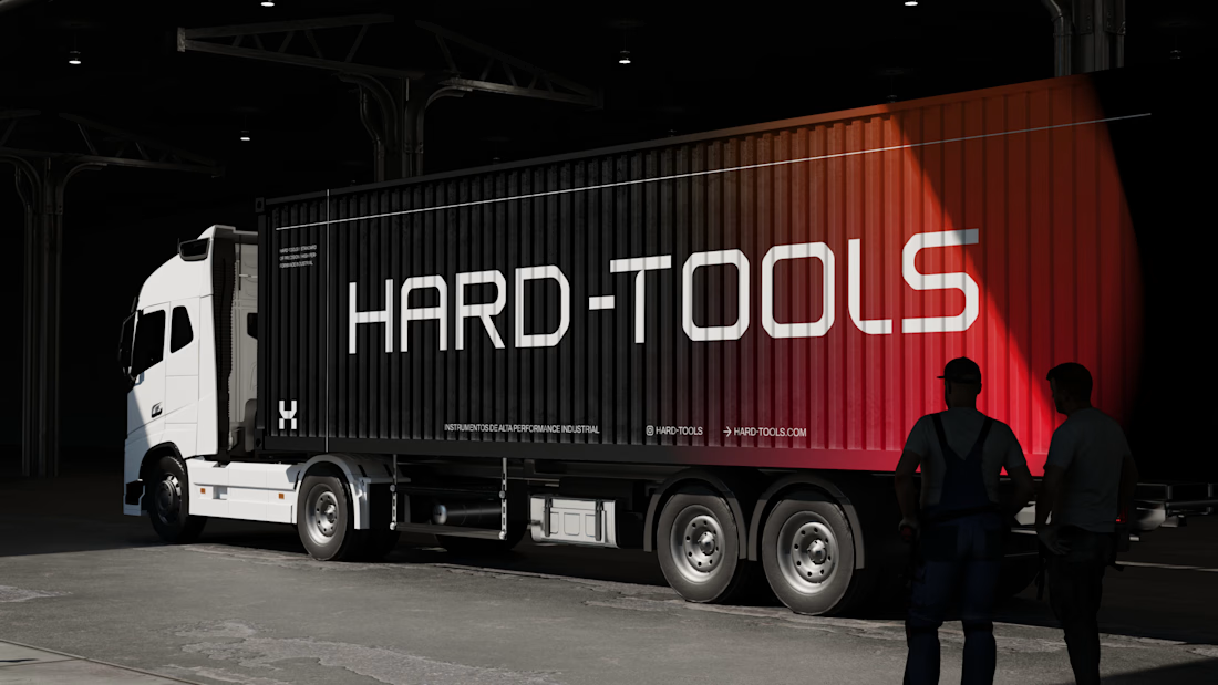
Hard-Tools needed to strengthen its brand presence and turn its communication into a clearer, more consistent, and more professional expression of the business.
The project started with a central question: how can a tools and equipment brand communicate strength, reliability, and expertise without falling into the generic visual language of the category?
The strategy focused on three main objectives:
01 — Strengthen perceived value
Build a visual communication system that conveys solidity, quality, and authority, bringing the brand’s perceived professionalism closer to the level it aims to occupy in the market.
02 — Create consistency across communication
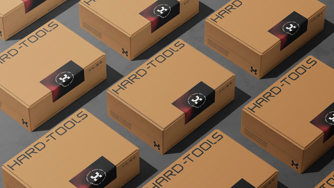
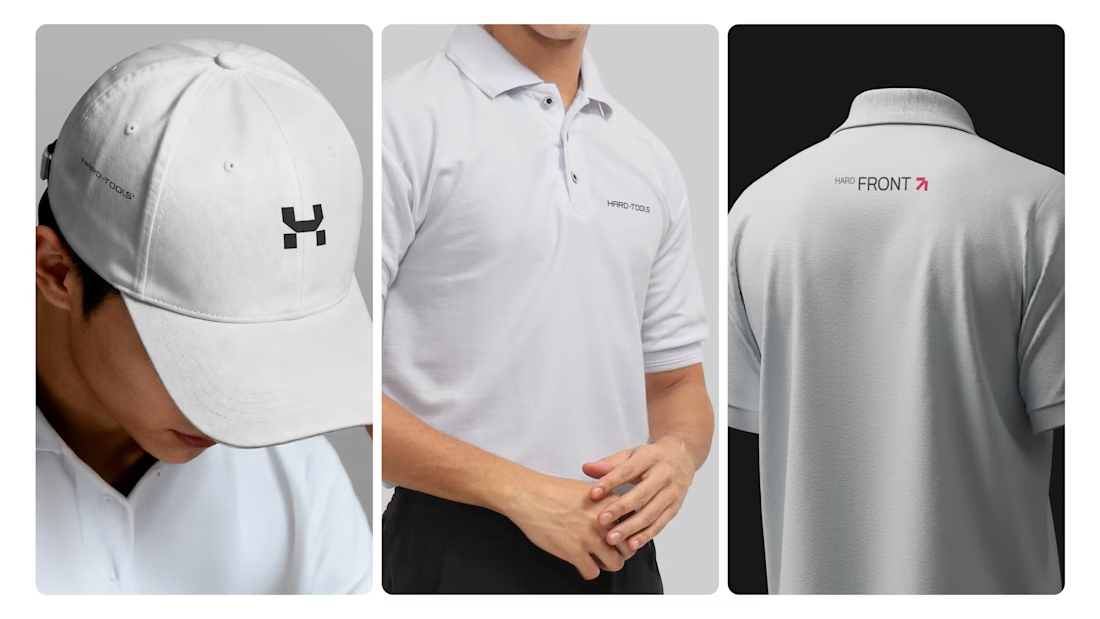
Develop a visual language that could work across different touchpoints — campaigns, commercial materials, social media, and promotional assets — while maintaining recognition and coherence.
03 — Turn products into brand communication
Rather than simply showcasing tools and products, the visual approach was designed to communicate the attributes behind the brand: performance, precision, durability, and reliability.
Based on this strategic direction, I developed the creative and visual direction and designed the communication materials, working across composition, hierarchy, typography, image treatment, identity application, and commercial layouts.



TOP!!

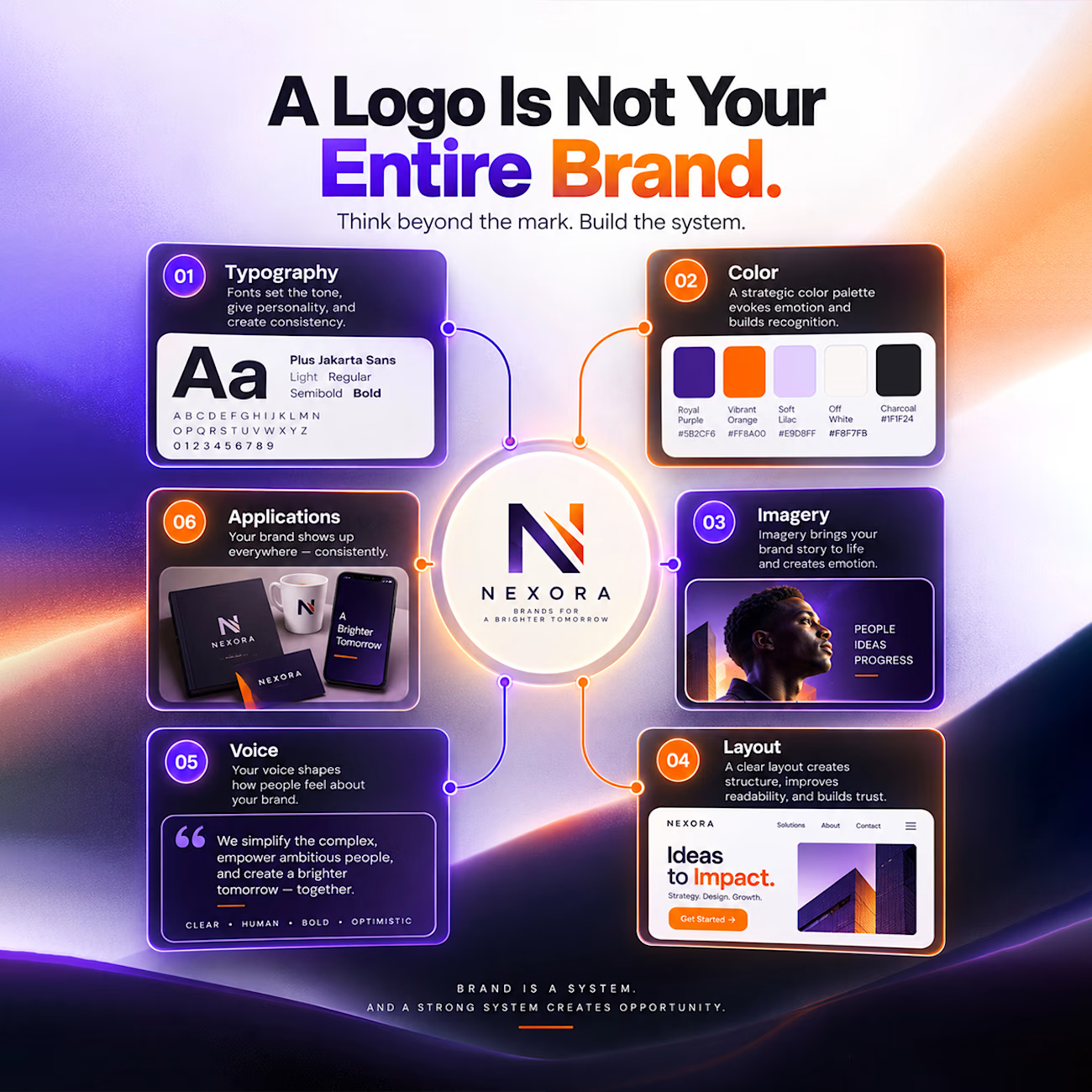
A logo is just the front door, not the entire house.
Too many founders invest in a clean logo mark and wonder why their brand still feels disjointed. Real recognition happens when every single piece of your identity works together as one unified system.
Here is what actually makes up a complete brand system:
• Typography: Custom font pairings that establish your tone and bring consistency.
• Color: A tailored palette that evokes the right emotion and sticks in memory.
• Imagery: Photography and graphics that tell your story with personality.
• Layout: Balanced spacing and structure that guide the eye and build trust.
• Voice: The exact words and messaging style that shape how people feel about you.
• Applications: Clean execution across web screens, product packaging, and merch.
Stop thinking about just the mark. Build the complete system, and the credibility will follow.

Great branding kit it's so vibrant and attractive 🎉🎉🔥🔥