The network for creativity
Join 1.25M professional creatives like you
Connect with clients, get discovered, and run your business 100% commission-free
Creatives on Contra have earned over $150M and we are just getting started
Back to feedPost

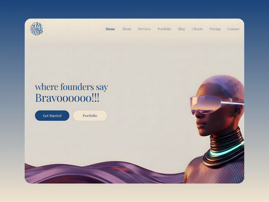
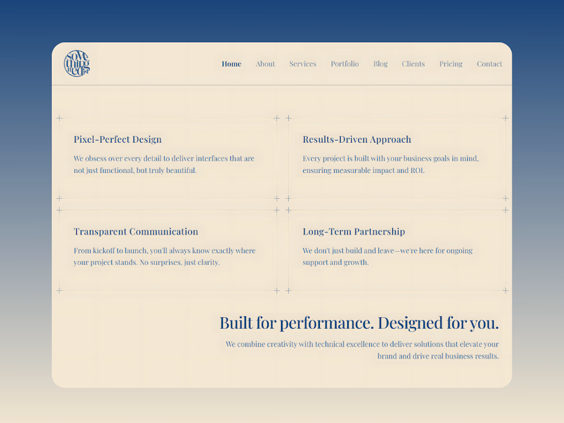
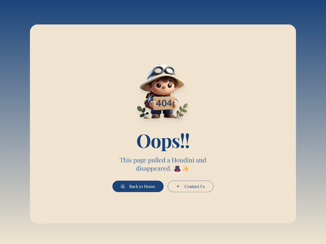
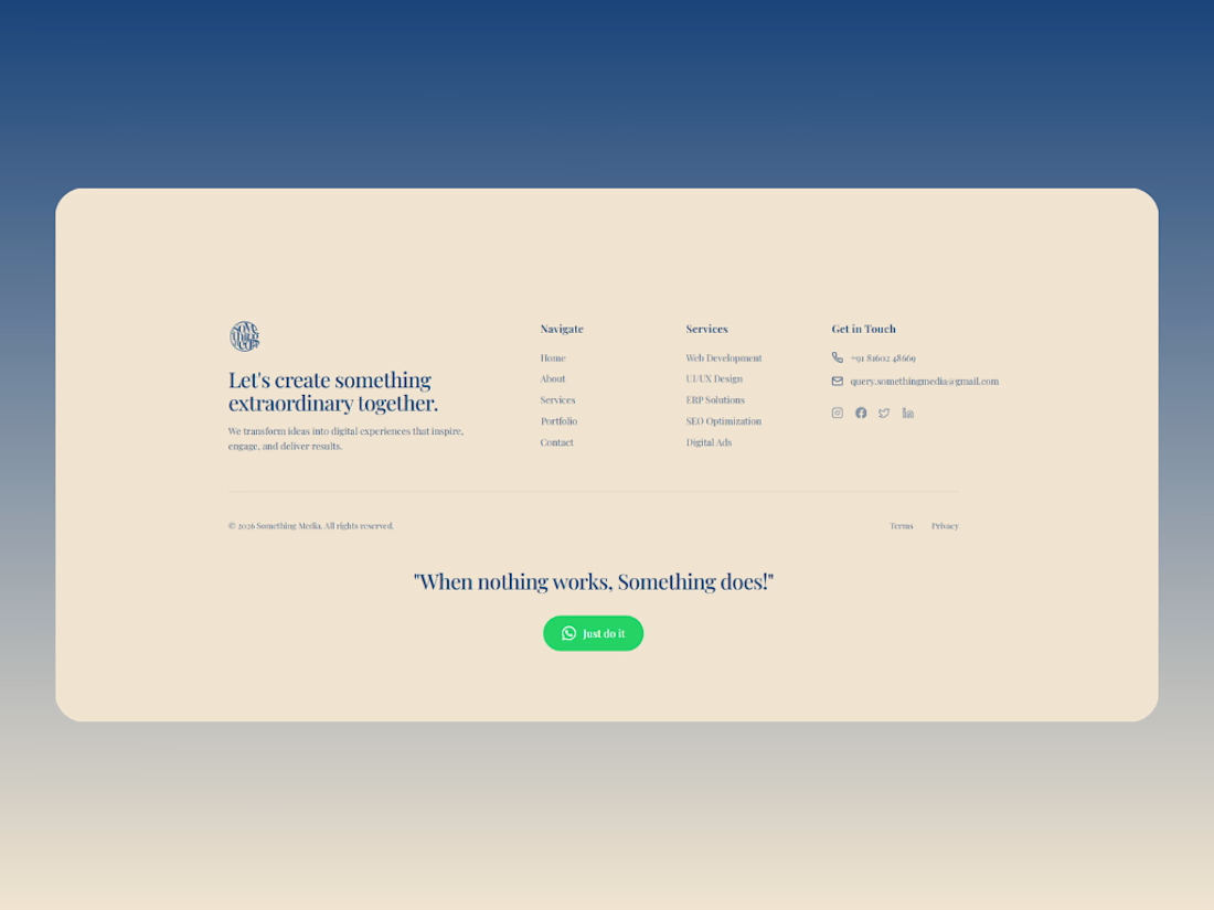
Designed and built our official website to showcase our expertise in custom software, websites, UI/UX, SEO, and GEO optimization 📈
Created a clean, premium interface that reflects our focus on performance, innovation, and results.
Structured the website to clearly communicate our services and help businesses understand the value of actual digital solutions 🚀


The network for creativity
Join 1.25M professional creatives like you
Connect with clients, get discovered, and run your business 100% commission-free
Creatives on Contra have earned over $150M and we are just getting started





Related posts

Most creative brands try to say everything at once.
More colour.
More shapes.
More visual noise.
But for this identity exploration, the idea was simpler:
Make creativity feel meaningful.
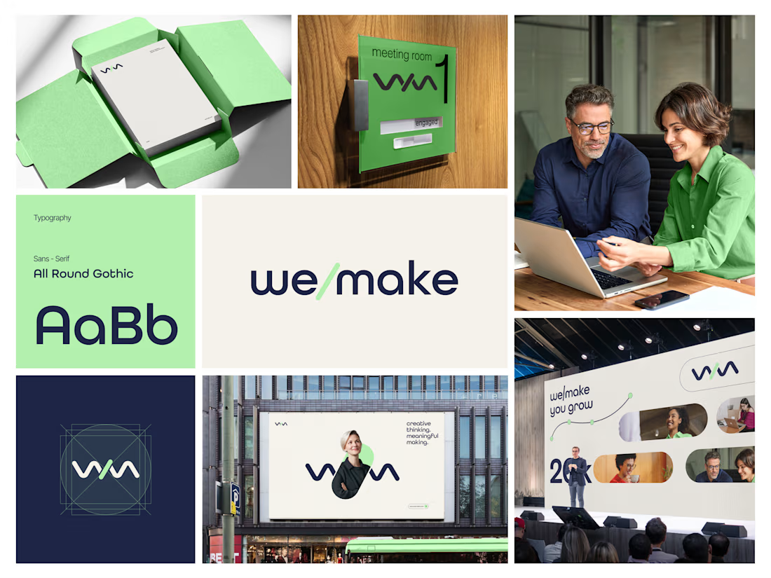
Introducing we/make, a bold, human-centred visual identity built around collaboration, growth, and purposeful making.
The mark is designed as a flexible expression of “we” and “make” coming together.
It represents:
• Ideas turning into action
• People creating together
• Growth through meaningful work
• A creative process that stays clear, warm, and confident
The visual system pairs a deep navy foundation with a fresh green accent, bringing together trust, focus, energy, and optimism.
Rounded typography and soft graphic elements keep the brand approachable, while the structured layouts give it a modern, professional feel.
From stationery and meeting-room signage to campaigns, billboards, and event spaces, the identity is built to work wherever creativity needs to show up.
Creative thinking. Meaningful making.
Would love to hear your thoughts on the visual direction.
What stands out to you first, the logo, colour palette, or overall brand feel?
#BrandIdentity #BrandDesign #CreativeDirection #VisualIdentity #GraphicDesign #LogoDesign


Great work it feels really minimalistic and professional great job ❤️❤️🔥🔥

Doppel — Threat Graph
Making complex cybersecurity concepts clear through motion.
For the Doppel Threat Graph product film, I contributed to the visual development and animation. The product connects digital threats across multiple channels, revealing how individual signals form part of a coordinated attack campaign.
The challenge was to translate this technical functionality into a clear visual narrative—showing why the connections between threats matter and how they help reveal the bigger picture.
My work covered storyboard and motion exploration, animation, and scene refinement throughout the feedback process. The focus was on introducing information progressively and guiding attention toward the relationships central to the product’s value.
The result is an animated product film that introduces Doppel Threat Graph and makes its core functionality easier to understand. The project demonstrates how motion design can bring clarity to a complex software product.
Services: Storyboard Exploration · Motion · Animation

That's unbelievable great job 🎉🎉🔥🔥

Personal Portfolio Website Design
A bold and visually expressive personal portfolio website crafted for creative professionals to build a memorable online presence, showcase their best work, and stand out with confidence.

Excellent work. I would like to hire you.