The network for creativity
Join 1.25M professional creatives like you
Connect with clients, get discovered, and run your business 100% commission-free
Creatives on Contra have earned over $150M and we are just getting started
Back to feedPost
Energy Monitoring Dashboard
Built this Energy Monitoring Dashboard for a manufacturing facility in the UAE. Tracks real-time electricity (kWh) and thermal energy (BTU) consumption, costs in AED, and asset-wise breakdowns with hourly trends. Designed for quick executive decision-making. Power BI + DAX.
Need a dashboard like this? Let's connect.😊


Thank you, @Ciro. I really appreciate it.😍
The network for creativity
Join 1.25M professional creatives like you
Connect with clients, get discovered, and run your business 100% commission-free
Creatives on Contra have earned over $150M and we are just getting started











Related posts

I designed and built a full website and team dashboard for an Austin heating and cooling company. Customers send a quote request in 3 steps and get a tracking code to follow their request. The team signs in to a dashboard to manage requests, update statuses, add notes and export reports. It’s built with a real database, secure login and photo uploads.
Web Design · UI/UX Design · Product Design · Web Development · Dashboard Design · Responsive Design · Supabase · Full-Stack Development


Slick and polished look...this is really good

Halden's fraud dashboard, on the phone.
The live stream and customer profiles, sized down without losing what matters.

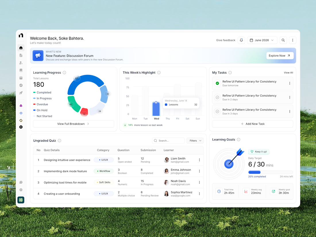
A modern learning platform dashboard designed to make education management, lesson tracking, and learning progress easier to monitor. The interface brings together course progress, weekly learning analytics, quiz submissions, task management, and daily learning goals in one organized workspace. With clean white layouts, colorful data visualization, intuitive navigation, and structured dashboard cards, this education SaaS UI creates a more focused, engaging, and efficient learning management experience.
📩 Collaborate with Us? Contra Cansaas Agency