The network for creativity
Join 1.25M professional creatives like you
Connect with clients, get discovered, and run your business 100% commission-free
Creatives on Contra have earned over $150M and we are just getting started
Back to feedPost
If your brand wants people to show up, be seen, and take up space, the identity should do the same.
That was the thinking behind SOLIKE.
A bold personal-brand and community-driven identity built around one core idea:
Visibility is not vanity. It is positioning.
The visual system combines:
🟠 High-energy orange for confidence and action
🟣 Deep purple for authority and individuality
🤍 Soft neutrals to keep the system balanced
💬 Conversational graphic elements that feel social and human
🔠 Bold typography designed to own attention
Then the identity was pushed across:
Social media
Website
Packaging
Merchandise
Stationery
Community content
Campaign graphics
The goal was not to make SOLIKE simply look modern.
The goal was to make the brand feel visible, confident, expressive and impossible to ignore.
Because strong branding should not whisper when the business is trying to grow.
SHOW UP.
BE SEEN.
TAKE UP SPACE.
Now I want your take:
What makes this identity feel strongest?
A. The orange + purple palette
B. The bold typography
C. The social-first direction
D. The overall brand energy
Drop A, B, C or D below.
If you are building a personal brand, community, coaching business or modern service brand and your visuals are not matching your ambition, send me a message.
I help brands become easier to notice, remember and trust.
#BrandIdentity #PersonalBranding #VisualIdentity #BrandDesign #CreativeDirection #SocialMediaDesign #LogoDesign #BrandStrategy


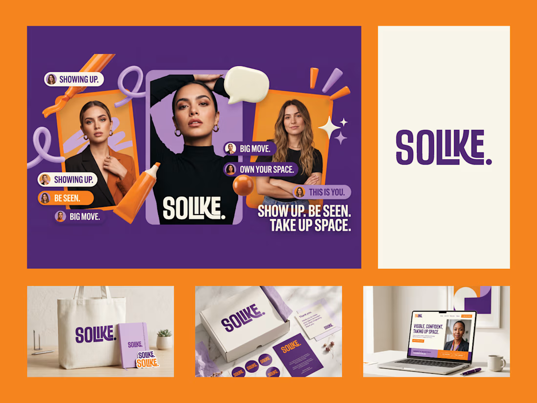

I'd go with D. The orange and purple could be borrowed, but the short imperative lines running across the tote, box and site are what make it read as one voice.

Exactly, that’s what I was going for. The colors help grab attention, but those short lines are what really tie everything together and give the brand one consistent voice. Glad you noticed that, Artur 🙌
The network for creativity
Join 1.25M professional creatives like you
Connect with clients, get discovered, and run your business 100% commission-free
Creatives on Contra have earned over $150M and we are just getting started



Related posts


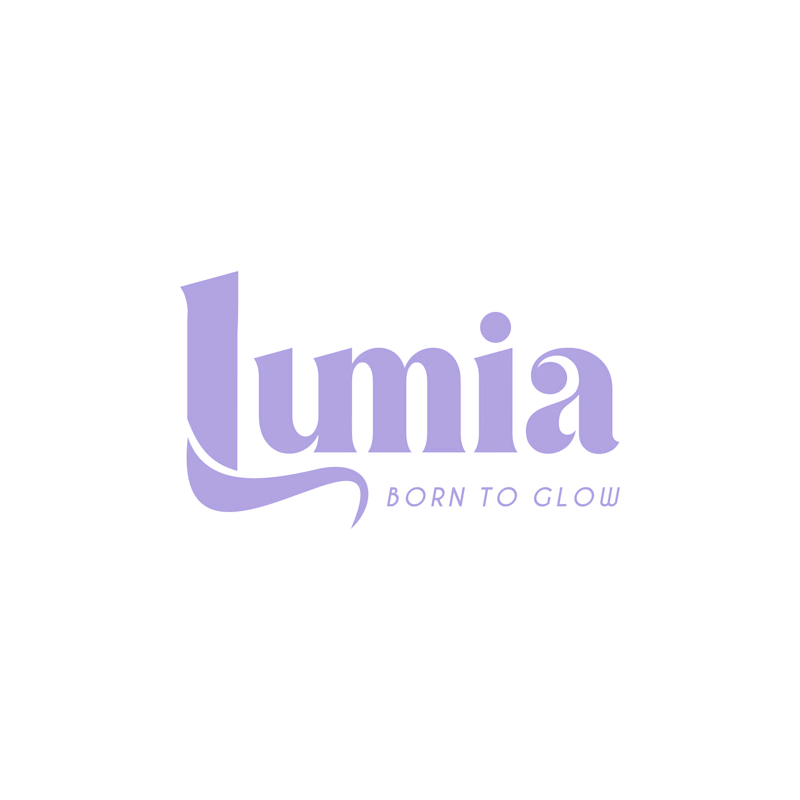
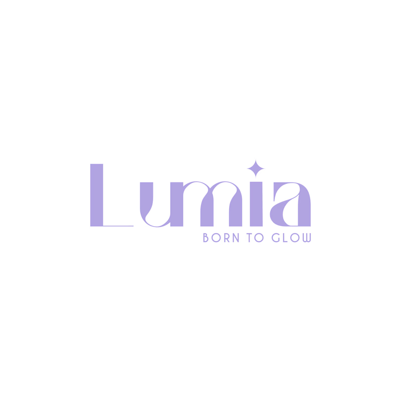
Which logo looks better for Lumia?
5 voted
56%
4 voted
44%
9 votes
Closed

Bold is heavy❤️

Bold Illustrations make an instant impact
See full case study here for the branding evolution and website redesign for a B2B SaaS startup!


I loved these colours. Looking Stunning 😍
Which logo looks better for Lumia?
4 voted
57%
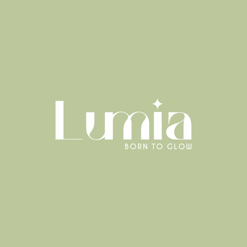
3 voted
43%
7 votes
Closed

Minimal and Elegant