The network for creativity
Join 1.25M professional creatives like you
Connect with clients, get discovered, and run your business 100% commission-free
Creatives on Contra have earned over $150M and we are just getting started
Back to feedPost
Taste Test


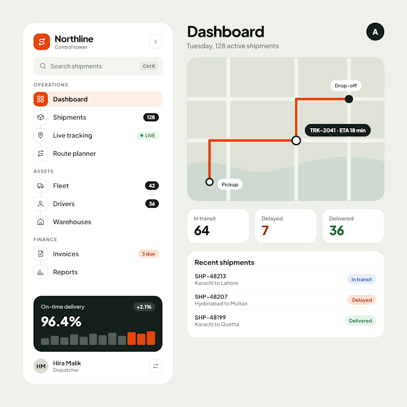
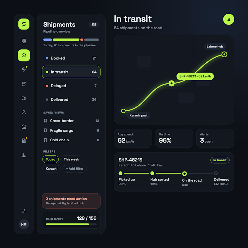
Logistics SaaS Dashboard | Light & Dark UI Exploration
A logistics management dashboard explored in two visual directions, taking a Vibe Coded interface through further UI/UX refinement.
Version A — Light UI
A clean operational dashboard focused on shipment visibility, route planning, delivery performance, and logistics analytics.
Version B — Dark UI
A data-focused interface featuring shipment pipelines, real-time tracking, delivery statuses, operational filters, and progress monitoring.
Key UI/UX Focus:
Logistics & Shipment Tracking Dashboard
SaaS Dashboard UI Design
Fleet & Operations Management
Data Visualization & Information Architecture
Which direction works better for a logistics SaaS product — Light or Dark?
#SaaSDesign #DashboardDesign #LogisticsSoftware #UIDesign #VibeCoding


4 votes
Ends in 1d
The network for creativity
Join 1.25M professional creatives like you
Connect with clients, get discovered, and run your business 100% commission-free
Creatives on Contra have earned over $150M and we are just getting started
Related posts


A great website should do more than look good, it should make choosing a business feel easy.
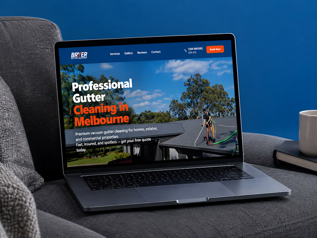
I recently completed a website project for Bryer, a Melbourne-based gutter and solar panel cleaning business.
The goal was to create a clean, professional online presence that communicates their services clearly, builds trust, and makes it easier for potential customers to request a quote.
Now, I’m curious:
When you visit a service-based business website, what matters most to you, the design, the information, or how easy it is to get in touch?
Let’s hear your thoughts! 👇
#WebDesign #Webflow #UXDesign #WebDevelopment #WebsiteDesign #Contra


this is amazing work

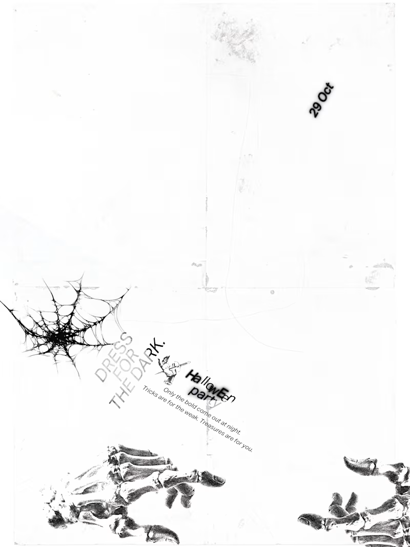
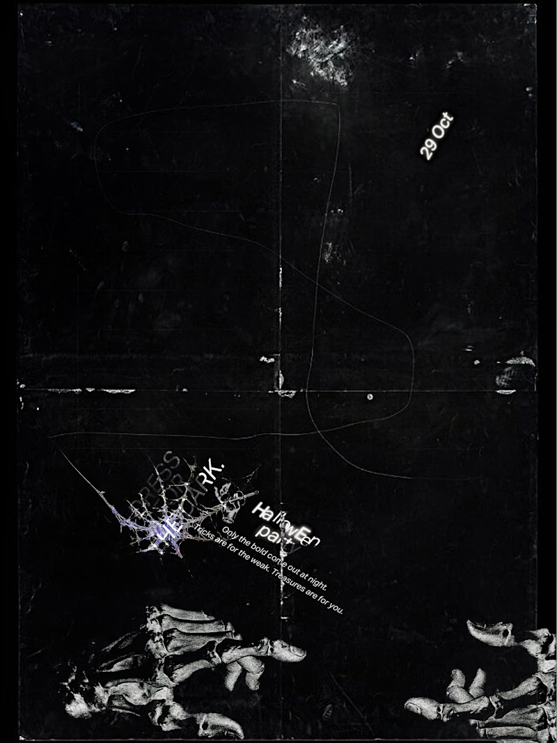
what you think of the experimental poster i just made.
A conceptual halloween party "Dress for the dark".
which one should we go for light or dark.
7 voted
50%
7 voted
50%
14 votes
Closed

Dark for me. The photocopy grain, cobweb and plant shapes feel like a scratched film print on black, perfect for a party in the dark. Would you bump the small type so it reads from across the room?

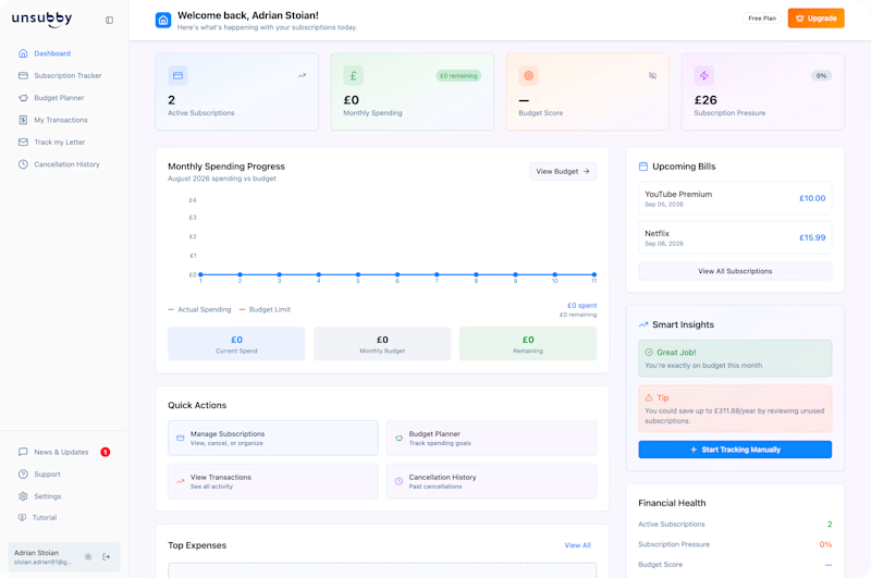
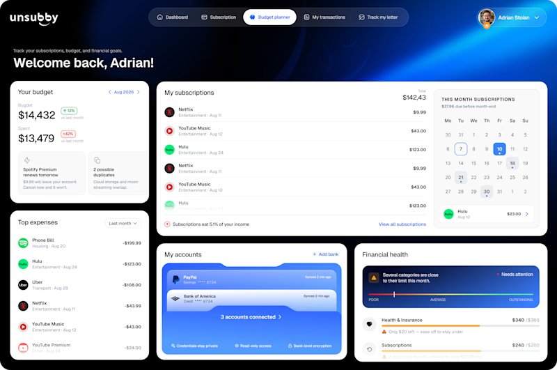
On the left is the original design. On the right is the redesign by Lunis Design Lab.
Which version would you prefer to use, and why? 👇🏻
1 voted
10%
9 voted
90%
10 votes
Closed
