The network for creativity
Join 1.25M professional creatives like you
Connect with clients, get discovered, and run your business 100% commission-free
Creatives on Contra have earned over $150M and we are just getting started
Back to feedPost

Ad Creatives for Nissan Magnite | Performance Campaign
Designed a series of high-impact ad creatives for Nissan Magnite to support a festive + price-led performance campaign.
The goal was simple:
Stop the scroll. Communicate value instantly. Drive enquiries.
What I worked on:
🎯 Performance-first ad creatives (Meta & digital placements)
💥 Strong price anchoring & urgency messaging (Diwali / Last Call offers)
🚘 Premium automotive visual treatment
🌃 Dynamic city, motion & power-driven concepts
📞 Clear CTAs optimized for lead generation
These creatives were built to balance brand appeal + conversion intent, ensuring the car feels aspirational while the offer feels irresistible.


The network for creativity
Join 1.25M professional creatives like you
Connect with clients, get discovered, and run your business 100% commission-free
Creatives on Contra have earned over $150M and we are just getting started



Related posts


A fresh digital identity, a premium workspace designed for creative professionals.
From an elegant, editorial-style website to a functional mobile app for bookings and studio management, the goal was to make every interaction feel as refined as the space itself.
Clean layouts, timeless typography and a deep green palette bring the whole experience together.


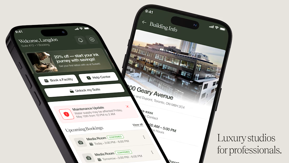
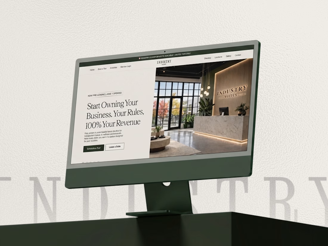

This looks super premium Kabir! Love how you carried the same refined, editorial feel from the website to the mobile app. The clean layouts and booking flow feel exactly like a high-end creative studio should - elegant but functional. The desktop + mobile mockups show the consistency really well. Great execution!

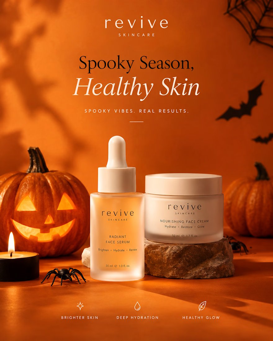
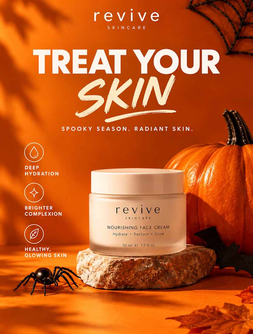
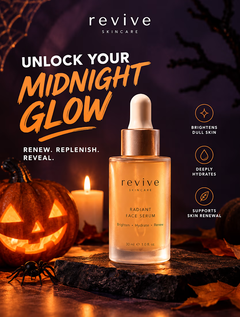
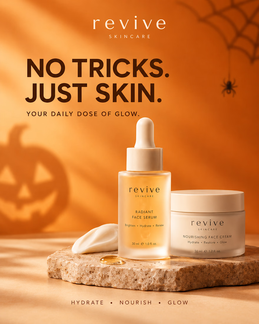
REVIVE SKINCARE | Halloween Campaign Design 🎃
A little spooky, a lot of glow. 🧡
This six-design Halloween skincare campaign for REVIVE SKINCARE blends seasonal creativity with premium beauty branding, warm pumpkin-orange tones, deep plum accents, elegant typography, and realistic skincare product photography.
From bold product advertisements to self-care lifestyle visuals, every design is crafted to maintain brand consistency while capturing attention and giving the brand a polished, luxurious feel.
The campaign combines Halloween-inspired details with modern skincare aesthetics, creating scroll-stopping visuals perfect for Instagram marketing, seasonal promotions, and beauty brand storytelling.
Design highlights:
Six cohesive Instagram campaign designs
Premium skincare product advertising
Consistent brand identity and packaging
Halloween-inspired art direction
Product-focused layouts and lifestyle photography
Social media-ready visual storytelling
Designed to show how seasonal creativity can help a skincare brand stand out while keeping its identity elegant, recognizable, and memorable.
Which design is your favorite? 🎃
#SkincareBranding #SocialMediaDesign #InstagramDesign #GraphicDesign #BeautyBranding #SkincareMarketing #HalloweenCampaign #HalloweenDesign #BeautyAdvertising #ProductPhotography #InstagramMarketing #CreativeDesign #BrandIdentity #CanvaDesign #PortfolioDesign



Revive might be the solution to reviving my skin you know

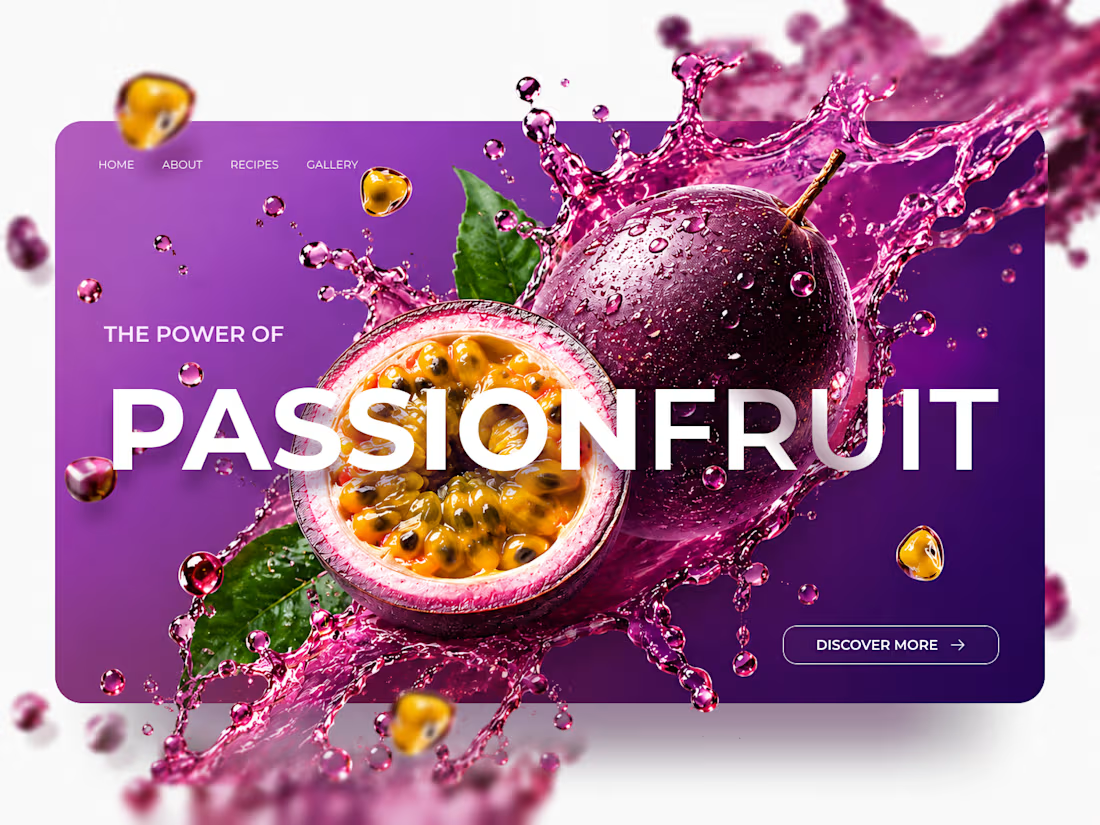
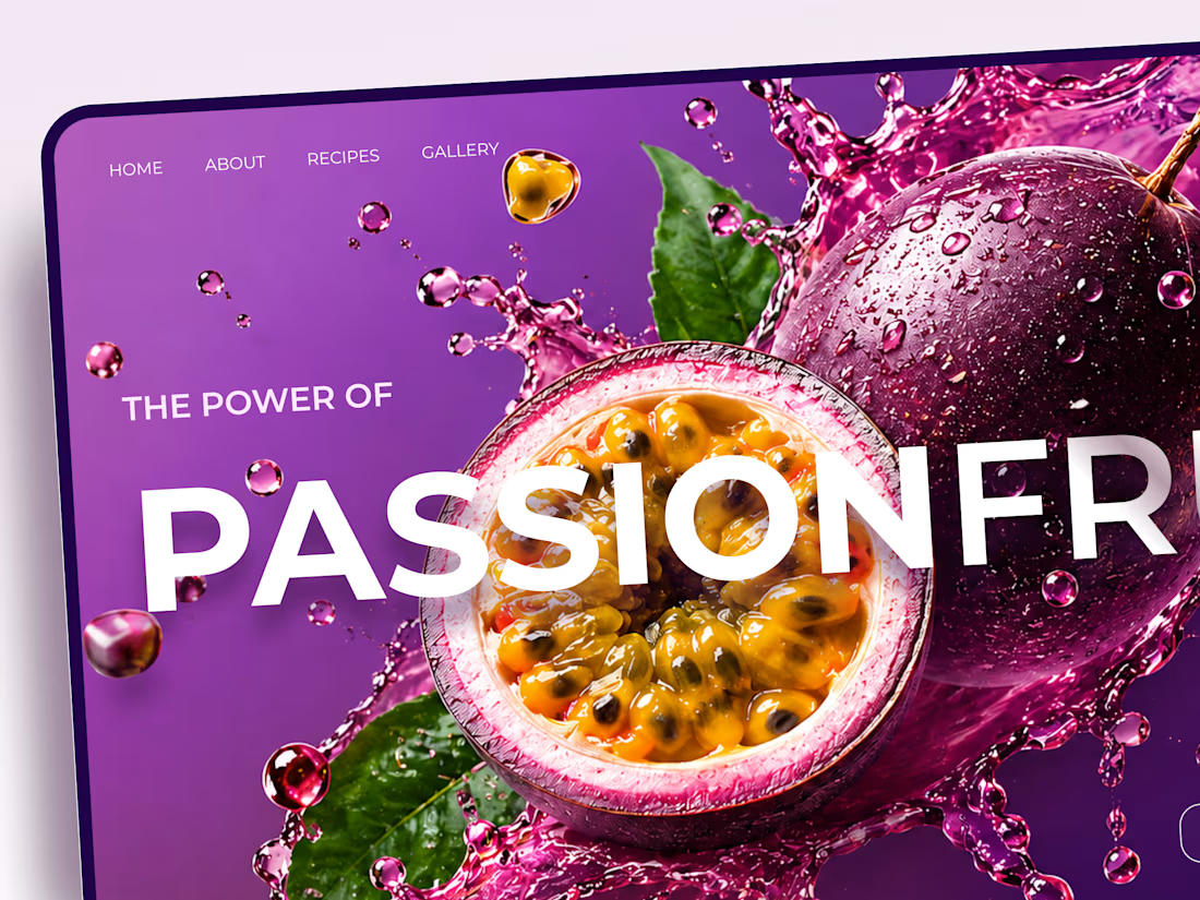
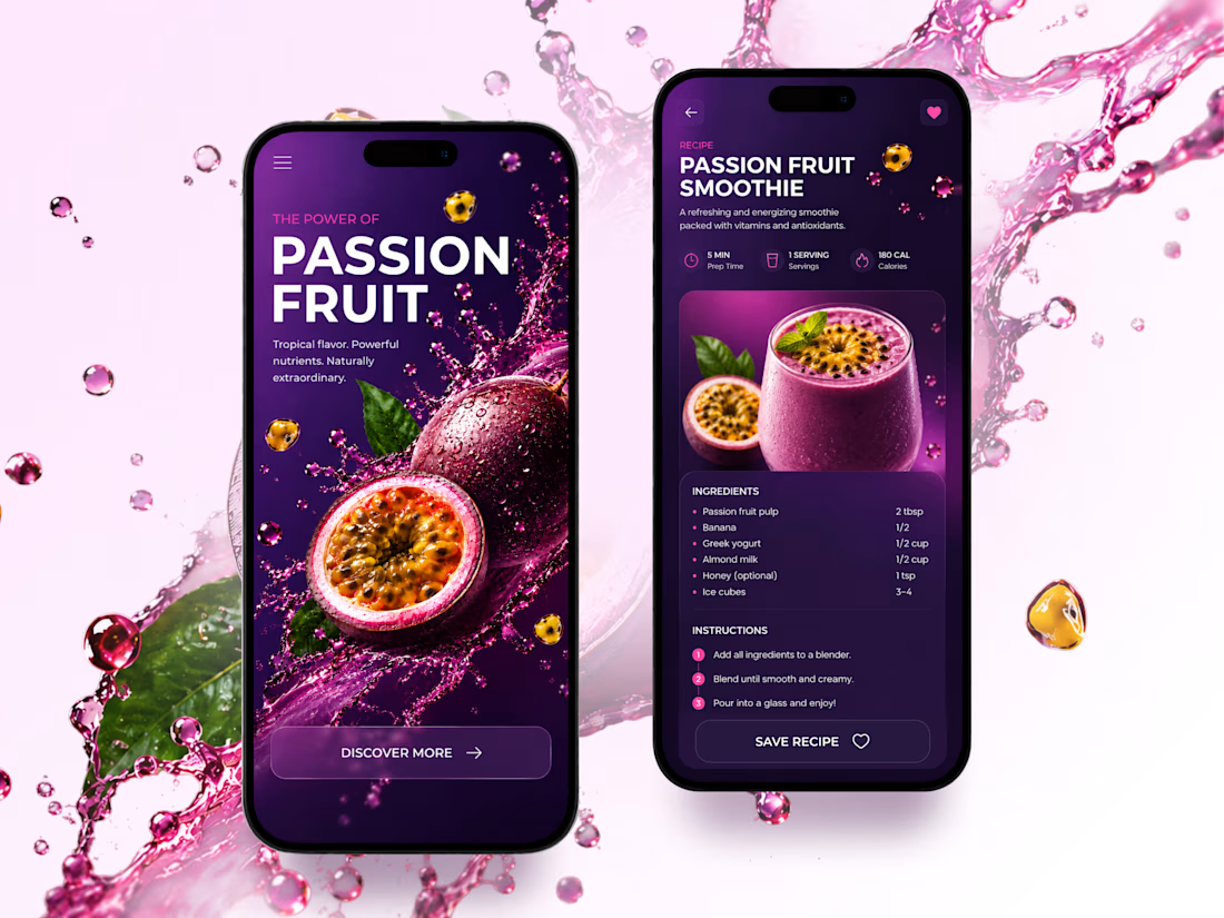
Passion Fruit — Vibrant Food & Beverage Landing Page 🍹
A bold, colorful landing page concept inspired by the freshness and tropical energy of passion fruit.
The design combines juicy fruit visuals, dynamic liquid splashes, oversized typography, and rich purple tones to create an eye-catching digital experience.
Special attention was given to:
• Bold hero section with oversized typography
• Vibrant purple and pink color palette
• Dynamic fruit and liquid splash compositions
• Strong visual hierarchy and clear CTA
• Responsive desktop and mobile layouts
• Smooth transition from product storytelling to recipes
• Clean recipe page with ingredients and instructions
The result is a fresh, energetic website concept that makes the product the center of attention while keeping the experience simple and engaging.
Looking to create a bold website for a food, beverage, or lifestyle brand? Let's connect 🚀

Great work