The network for creativity
Join 1.25M professional creatives like you
Connect with clients, get discovered, and run your business 100% commission-free
Creatives on Contra have earned over $150M and we are just getting started
Back to feedPost

Brief
Serenity Spa & Massage needed a calming and elegant brand identity that reflects relaxation, wellness, and self-care. The goal was to create a visual style that feels peaceful, natural, and welcoming to clients seeking a tranquil spa experience.
Solution
I designed a clean and elegant logo using refined typography and a delicate floral illustration to represent calmness and nature. The deep green color palette helps create a serene and balanced identity that works across spa signage, products, and marketing materials.


The network for creativity
Join 1.25M professional creatives like you
Connect with clients, get discovered, and run your business 100% commission-free
Creatives on Contra have earned over $150M and we are just getting started
Related posts

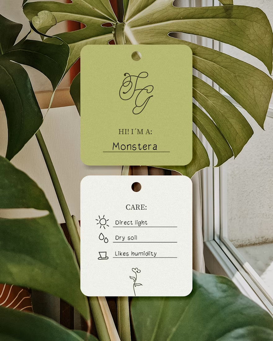
A cozy botanical shop that not only sells beautiful plants, but also takes care of yours while you’re away on a trip!
For the logo, I customized the typography to give it a soft, fluid effect inspired by growing branches and leaves.🌱

I like this calligraphy style.


A little throwback to one of our favorite collaborations with Lion Pose! 🧡
We worked with the founders to bring their vision to life through core brand identity, logo, and packaging design, creating a bold, playful visual language that feels fresh in the skincare space.
So lovely to see Lion Pose grow from its early days to the shelves of Sephora, with our packaging work recognized at the 2024 Dieline Awards!


Nice work

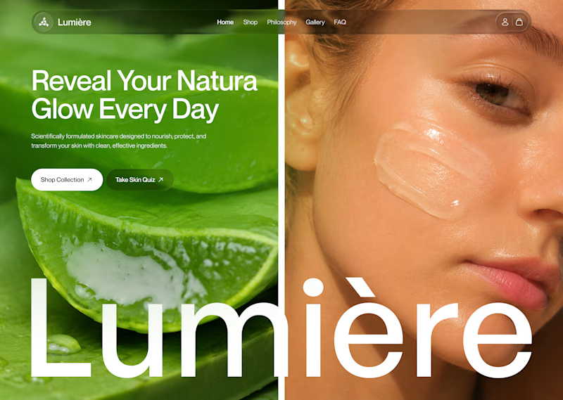
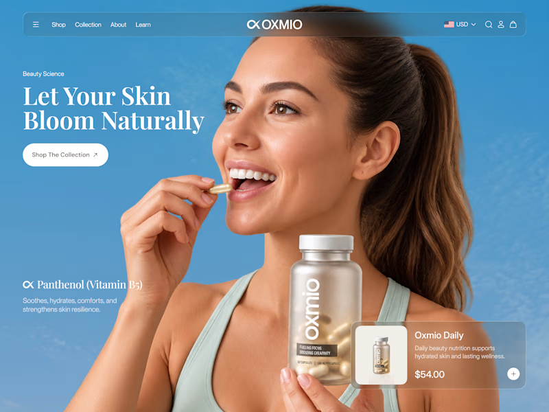
Your design has 3 seconds to earn attention. Which skincare brand wins?
A leads with confidence, energy, and aspiration. B builds trust through nature, freshness, and simplicity.
Great design doesn’t just look good. It makes people feel the brand before they read a word.
A or B? Which would make you stop scrolling?


30 voted
52%
28 voted
48%
58 votes
Closed


B without questions


