The network for creativity
Join 1.25M professional creatives like you
Connect with clients, get discovered, and run your business 100% commission-free
Creatives on Contra have earned over $150M and we are just getting started
Back to feedPost

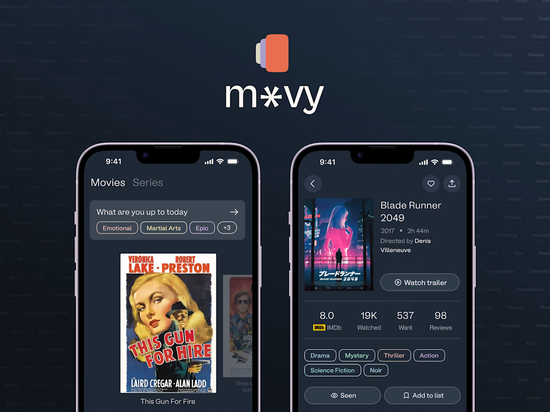
🍿 Speaking about the branding of the app: the Movy logo is a metaphor for flipping through a list of movies, searching for the right one. It also echoes the main section on the Home screen, where users scroll through handpicked films.
I skipped the expected black-and-red cinema palette on purpose, but kept the background dark, mostly to make late-night scrolling easier on the eyes.
The color palette is inspired by neon cinema signs, billboards, and glow-in-the-dark screens, but the neon remains muted rather than saturated. It hints at cinema without being overwhelming, creating a calm atmosphere for leisurely viewing, rather than quickly scrolling through the film.
What do you think?

The network for creativity
Join 1.25M professional creatives like you
Connect with clients, get discovered, and run your business 100% commission-free
Creatives on Contra have earned over $150M and we are just getting started





Related posts


The thing I keep relearning: a design is never finished because someone ran out of ideas. It's finished because someone decided to stop. Knowing when to stop is the hardest part.


Damn.... Crazy colors 👏😍


Does an AI brand still need to look like an AI brand?
Lupr helps small and growing businesses adopt AI without the complexity, so the identity needed to do the same.
We built a clean, approachable system around movement, connection and continuous improvement, without leaning on the usual futuristic tech clichés.
The idea was simple: make AI feel like useful business infrastructure, not something you need to be an expert to understand.
As AI becomes part of everyday business, do you think brands still need to visibly signal “AI”?
Full case study below 👇


Great design it feels alive 🎉🎉❤️❤️

Next intelligence. A brand you can feel.
Ice blue, deep black and refracted glass bring texture, depth and a sense of touch to an invisible technology. An identity designed to be recognised. And felt.
Brand identity and visual direction for Niwos, a platform that brings AI agents together as a digital workforce.
Five modules. One W. A simple idea at the heart of the identity: working as one.
I’ve really enjoyed working on this project with Muhammed. His trust in my design judgement and openness to new ideas gave me the creative freedom to explore fully.
Here’s hoping this is just the first chapter of an exciting journey with him and his team.


👍 nicely done


