The network for creativity
Join 1.25M professional creatives like you
Connect with clients, get discovered, and run your business 100% commission-free
Creatives on Contra have earned over $150M and we are just getting started
Back to feedPost

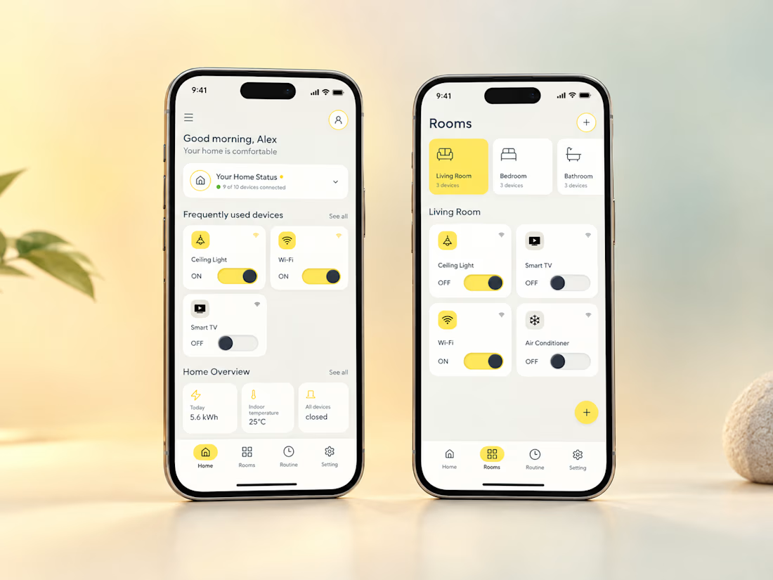
Introducing Haven — A Simpler Way to Manage Your Smart Home
I’ve been working on a self-initiated UX/UI design project focused on making smart home device control simpler.
The concept includes room-based navigation, quick device controls, and dedicated interfaces for lights and air conditioning.
Designed in Figma, from user flows and wireframes to the final UI and interactive prototype.
Always learning and improving! ✨

The network for creativity
Join 1.25M professional creatives like you
Connect with clients, get discovered, and run your business 100% commission-free
Creatives on Contra have earned over $150M and we are just getting started



Related posts

Crypto Portfolio Dashboard
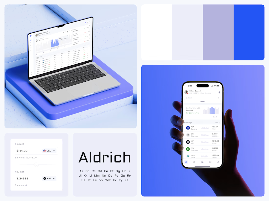
Blue means one thing here: the range you are looking at.
The value chart is a row of thin gray bars, and only the selected date range fills in blue. You read the period that matters and keep the months around it as context.
The phone carries the same chart above the holdings list. Each coin gets its own small bar chart between the name and the amount, so you can scan the whole portfolio for movement without opening a single coin.
Trading screens get busy fast. This one stays light and calm, so the numbers lead: total value, realized and unrealized P&L and open positions, all on one screen.
Designed by the Hue & Machine team.
#Crypto #Fintech #DashboardDesign #TradingPlatform #DataVisualization #UIDesign #ProductDesign #WebApp #MobileDesign #FigmaDesign



Nice Ui Dmytro

A fashion storefront needs to show the outfit and make its individual pieces easy to find.
For FORM, I paired a warm, editorial lookbook with clearly grouped product names, prices, and size choices.
Cream surfaces, charcoal typography, and consistent product cards connect the homepage with the desktop and mobile screen concepts.
One useful design principle from this project: give campaign imagery and shopping details their own readable zones. The collection can have a strong visual presence while the next product decision stays clear.
Explore the complete design case study:
https://contra.com/p/rNPRqooQ-form-fashion-e-commerce-website-design
When exploring a clothing collection, what helps you most: a styled outfit or an individual product grid?

Adorable

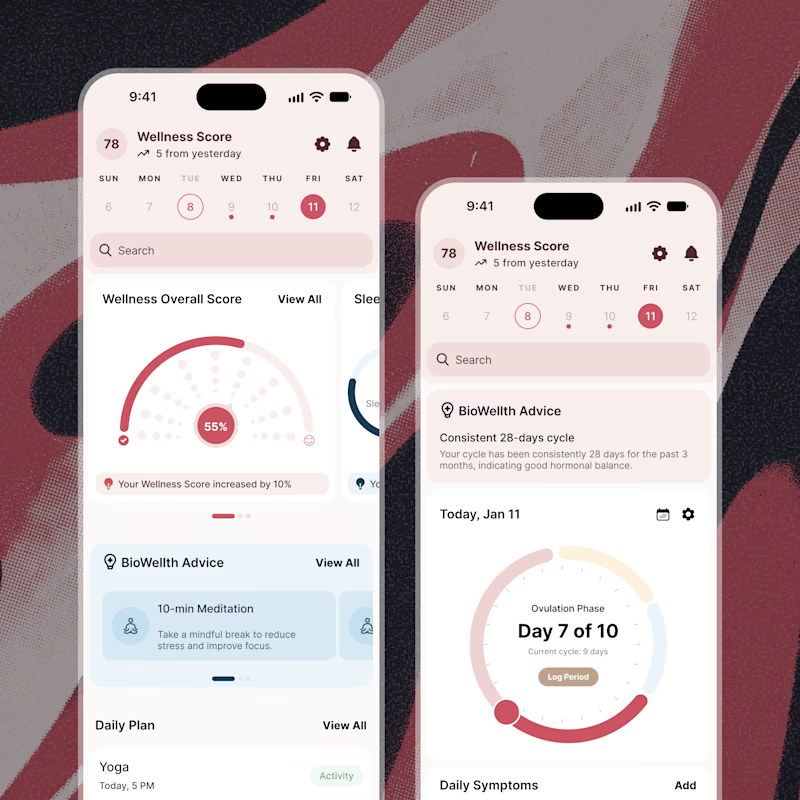
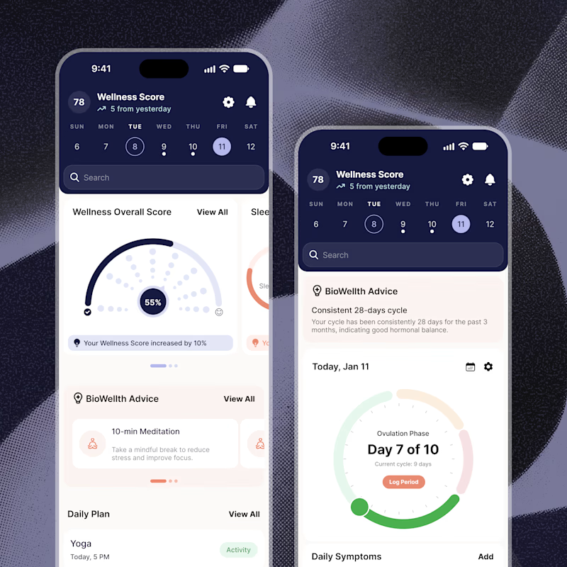
Exploring two color palette directions for a women’s health app. Which one feels right to you? 👀
32 voted
56%
25 voted
44%
57 votes
Closed

Both are amazing! The purple definitely has better contrast, but I’d still go with the berry one, purely a personal preference