The network for creativity
Join 1.25M professional creatives like you
Connect with clients, get discovered, and run your business 100% commission-free
Creatives on Contra have earned over $150M and we are just getting started
Back to feedPost

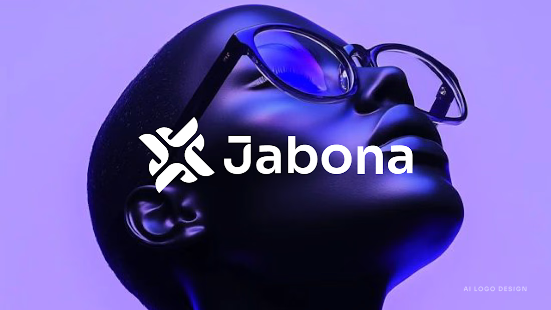
I designed Jabona as a logo for a fast-moving AI product that still needed to feel calm.
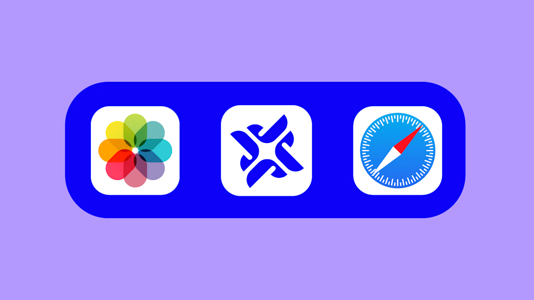
The mark is built from four rounded J shapes. They rotate around a small gap in the center, which makes a spark. It looks like motion, but it's balanced and steady. I wanted it to feel quick without feeling rushed.
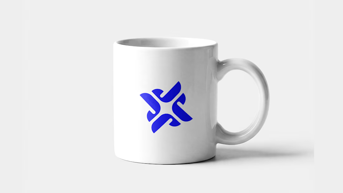
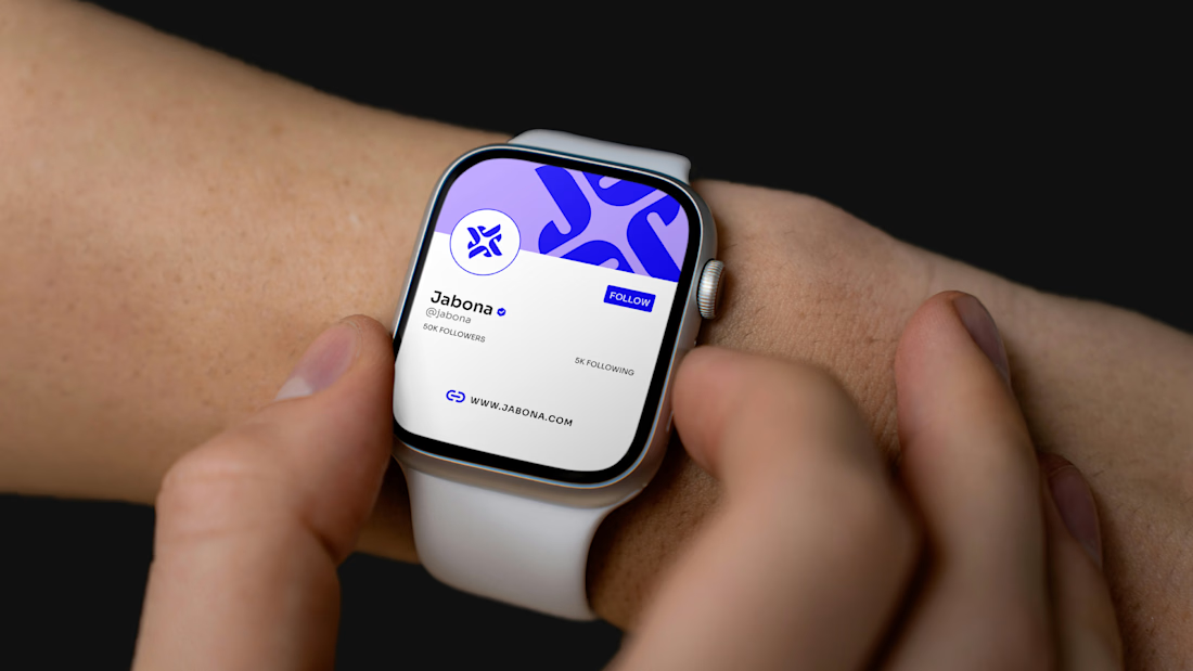
I kept the wordmark clean and bold, with a small bar over the J that echoes the symbol. The mark works as a mug print, an app icon, and a tiny smartwatch avatar, because it stays readable when it's small.
If you're building something in AI or tech and want a mark that feels fast and calm at once, message me.


The network for creativity
Join 1.25M professional creatives like you
Connect with clients, get discovered, and run your business 100% commission-free
Creatives on Contra have earned over $150M and we are just getting started





Related posts


Does an AI brand still need to look like an AI brand?
Lupr helps small and growing businesses adopt AI without the complexity, so the identity needed to do the same.
We built a clean, approachable system around movement, connection and continuous improvement, without leaning on the usual futuristic tech clichés.
The idea was simple: make AI feel like useful business infrastructure, not something you need to be an expert to understand.
As AI becomes part of everyday business, do you think brands still need to visibly signal “AI”?
Full case study below 👇


Great design it feels alive 🎉🎉❤️❤️

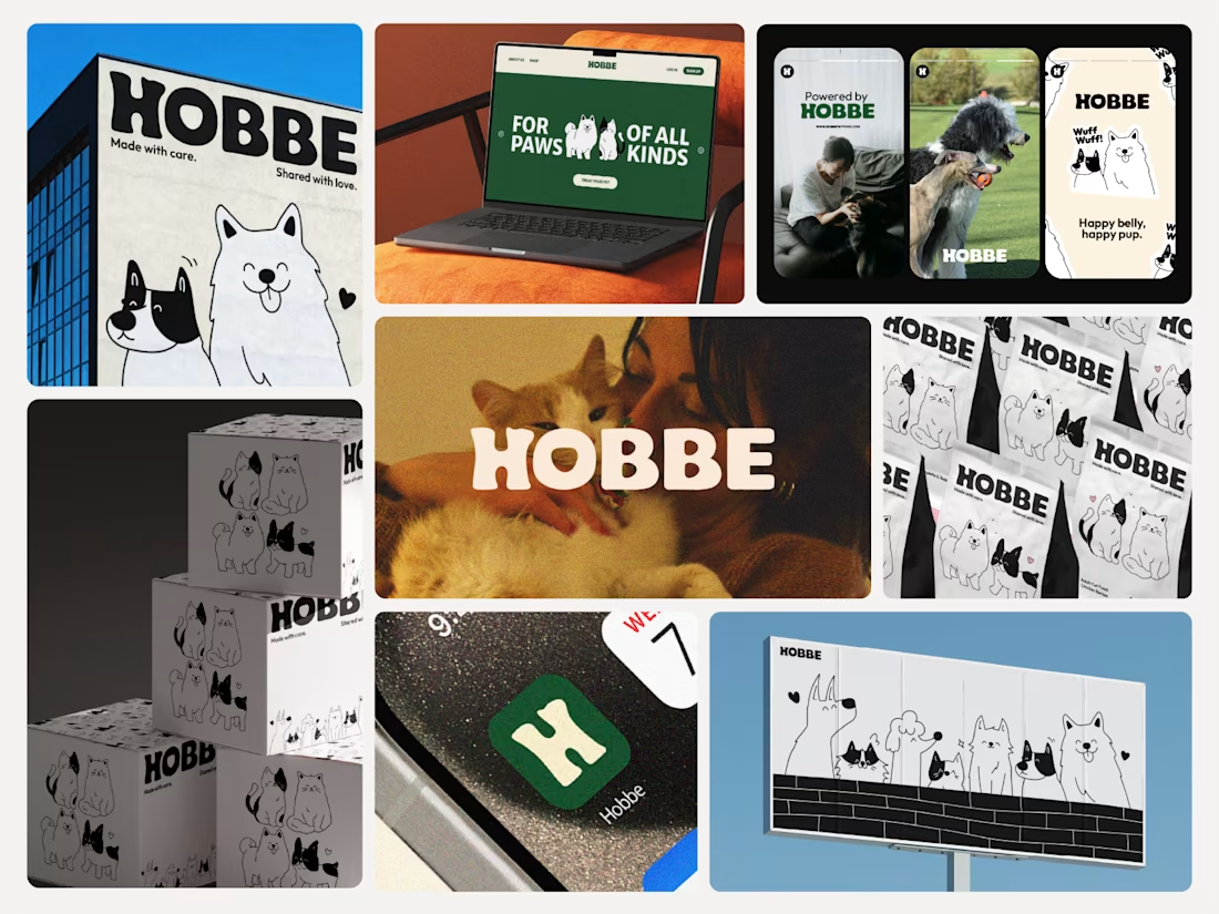

Like the branding and illustrations

Brand Motion Reel
Logos fail to capture attention in environments where brand feel dictates user engagement.
I built these kinetic typography sequences using After Effects to establish brand recognition. The motion physics map directly to each distinct brand identity, ranging from rigid automotive reveals to fluid typography transitions.
This video perfectly captures the brand's interfaces by defining the foundational motion language developers will deploy for loading states and brand interactions.


Matching the motion to each logo's personality works well. The stiff reveal on Ford against the loose one on Spott shows the range.


