The network for creativity
Join 1.25M professional creatives like you
Connect with clients, get discovered, and run your business 100% commission-free
Creatives on Contra have earned over $150M and we are just getting started
Back to feedPost

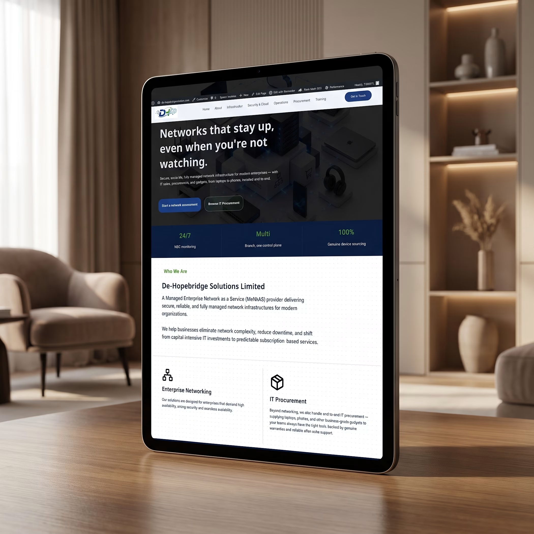
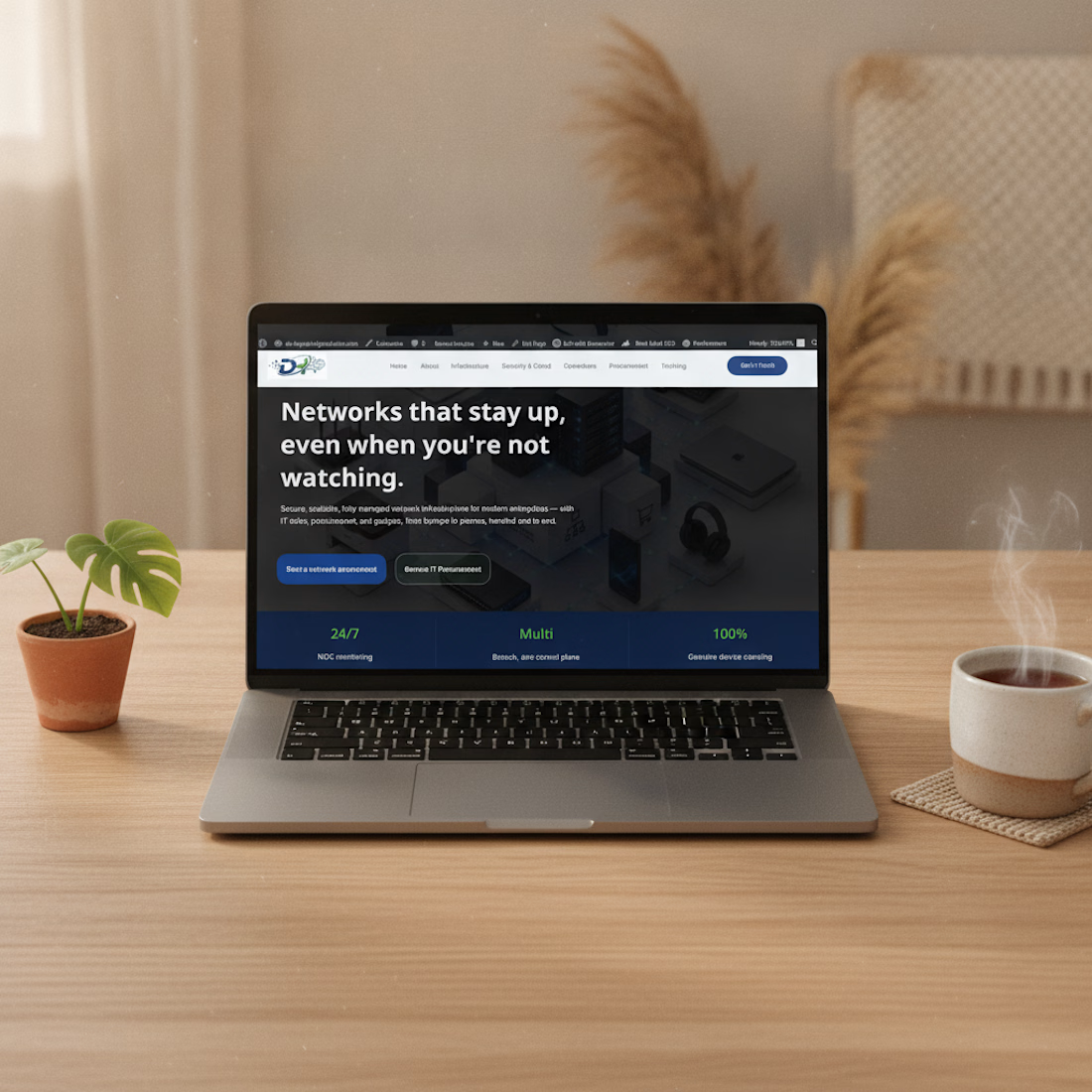
Just wrapped a site redesign for a managed network services & IT procurement company, and I'm pretty happy with how it turned out.
The old challenge: they offer two pretty different services (network monitoring + hardware procurement) and the site wasn't making that clear. So I built the homepage around two clear paths right at the top, book a network assessment, or browse their IT procurement catalog so visitors aren't left guessing.
Mobile was a priority too, a lot of visitors will hit this site from their phone first, so it had to hold up there just as well as desktop.


The network for creativity
Join 1.25M professional creatives like you
Connect with clients, get discovered, and run your business 100% commission-free
Creatives on Contra have earned over $150M and we are just getting started



Related posts





cool

Made a Hero section for a hotel that doesn’t exist.
The sea and sky change with the actual time in Greece, so it looks different every time you open it. scroll and the sun goes down
if you run a hotel and want something like this, message me.

Great job 🎉🎉