The network for creativity
Join 1.25M professional creatives like you
Connect with clients, get discovered, and run your business 100% commission-free
Creatives on Contra have earned over $150M and we are just getting started
Back to feedPost

Access Atlas
Reimagining how people understand accessibility.
Every day, people with different accessibility needs choose not to visit places they want to explore because they are uncertain whether those spaces will actually work for them.
Not because they do not want to go.
But because they do not have enough confidence to know if they can.
Access Atlas was created to reduce that uncertainty.
It is a personalized accessibility platform that helps users understand how accessible a place will be for their specific needs before making the effort to visit.
Through personalized accessibility profiles, accessibility snapshots, AI-assisted discovery, and immersive accessibility previews, Access Atlas transforms accessibility from a generic label into something personal and actionable.
Building with the Figma Ecosystem
This project became an opportunity to explore how different parts of the Figma ecosystem can work together as one connected workflow.
Figma MCP → Research & Discovery
The process started with understanding the problem before designing the solution.
Using Figma MCP, I gathered references, researched accessibility patterns, explored existing experiences, collected inspiration, and organized insights into a structured discovery process.
This phase helped identify an important gap:
Accessibility information exists, but it is often fragmented, generic, and rarely personalized.
That insight became the foundation of Access Atlas.
Figma Design Agent → Design Exploration & Iteration
Design Agent became my creative companion throughout the project.
I used it across the entire workflow:
• Converting rough sketches and low fidelity wireframes into polished interfaces
• Generating and exploring multiple design directions
• Building and expanding the design system
• Applying visual changes across multiple screens simultaneously
• Replacing placeholders with actual visual content
• Accelerating iteration while maintaining intentional design decisions
Rather than designing for me, Design Agent allowed me to spend more time refining ideas and less time repeating tasks.
Figma Weave → Workflow Acceleration & Visual Creation
Figma Weave unlocked an entirely new way of creating.
I used Weave to build AI-powered workflows that made the process significantly faster and more flexible.
Using Weave, I:
• Created a complete icon system from scratch
• Generated graphical assets and supporting visual elements
• Experimented with multiple creative directions simultaneously
• Refined compositions and visual details
• Improved lighting and polish across graphical elements
• Explored outputs across different LLM workflows to accelerate decision-making
Instead of interrupting momentum with repetitive production work, Weave allowed me to stay focused on creating and iterating.
Figma Make → Turning the Concept into an Experience
Once the design system and flows were established, Figma Make helped transform the idea into something interactive.
Using Figma Make, I created a working concept that moved beyond static screens and into a more tangible product experience.
This allowed me to validate interactions, communicate the vision more clearly, and prototype how personalized accessibility could feel in practice.
Access Atlas started as a question:
What if people could understand accessibility before they arrived?
And evolved into a product vision focused on confidence, inclusion, and helping more people experience the world on their own terms.
Built for Config Makeathon ✨
Live Prototype - https://bone-upload-19206385.figma.site
Figma Make - https://www.figma.com/make/xmqLxan90ZlzkArGzT6FTw/Access-Atlas?t=atxpp7BmtS08txUN-1&preview-route=%2Flocation%2Fp1%2Fexperience
Figma File - https://www.figma.com/design/jDsm0EfkC6qJngxqJB3EZm/Config-Makeathon?node-id=27-2&t=nkWof38p08ZuxVa9-1
#Config2026 #ConfigMakeathon #Figma
:


Loved it !!


Great work!

The core reframe is smart. Accessibility right now is a binary label, a place either 'is' or 'isn't' accessible. But that's useless if you don't know what features matter for your specific needs. Personalizing the profile so users know what to expect for them specifically is a much more actionable design approach.
The network for creativity
Join 1.25M professional creatives like you
Connect with clients, get discovered, and run your business 100% commission-free
Creatives on Contra have earned over $150M and we are just getting started





Related posts

Post
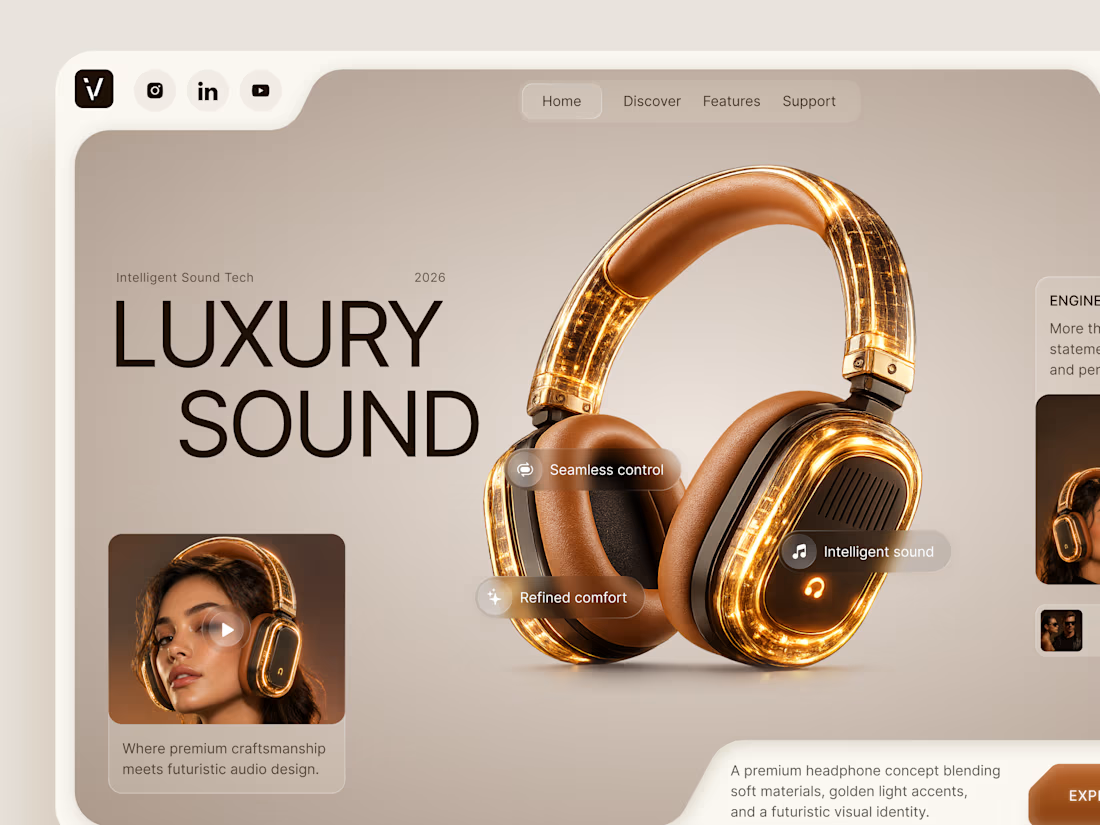
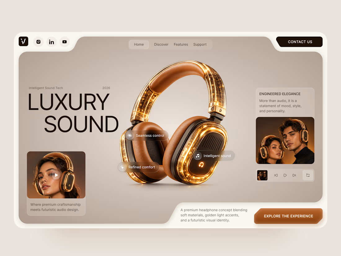
Luxury Sound — Premium Headphones Landing Page 🎧✨
A premium landing page concept for a luxury audio brand, built around a bold headphone design and a refined visual experience
The design combines warm neutral tones, glowing details, oversized product visuals, and minimal typography to create a futuristic yet elegant feel
Special attention was given to:
• Product-first composition
• Premium visual direction
• Feature highlights
• Lifestyle imagery
• Clear CTA placement
• Responsive mobile experience
The result is a clean, immersive product experience that makes the headphones feel like more than tech — they become part of the lifestyle 🔥


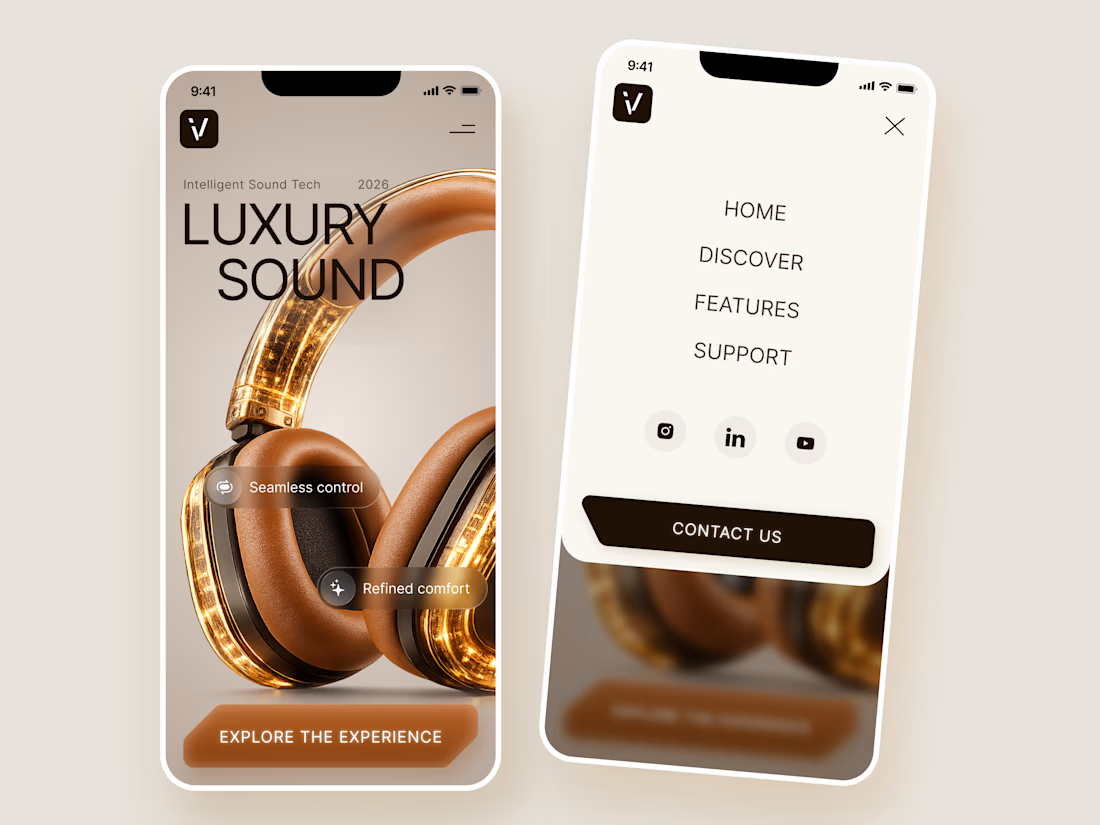
The amber glow on the headphones against that warm beige is lovely. How does the mobile menu handle the product image?


Collage

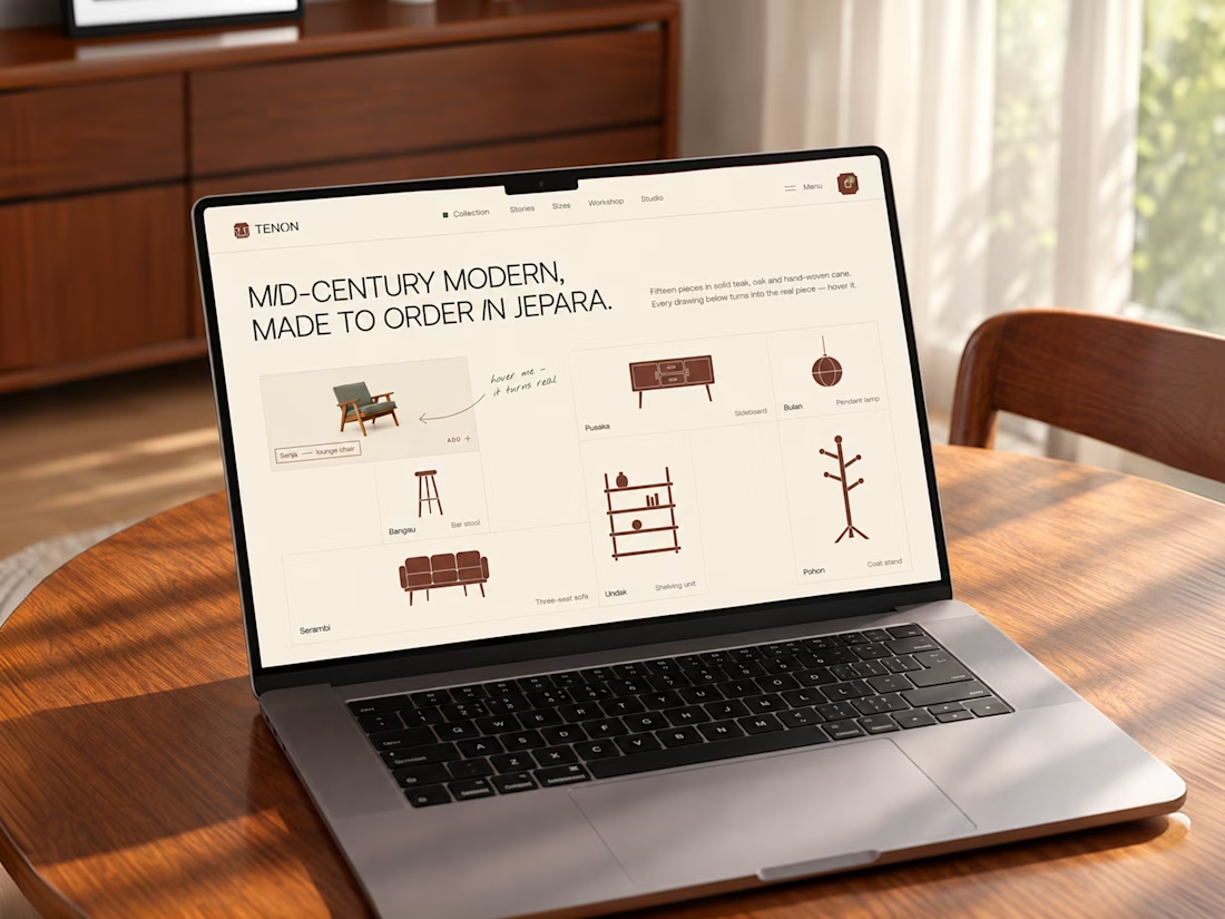
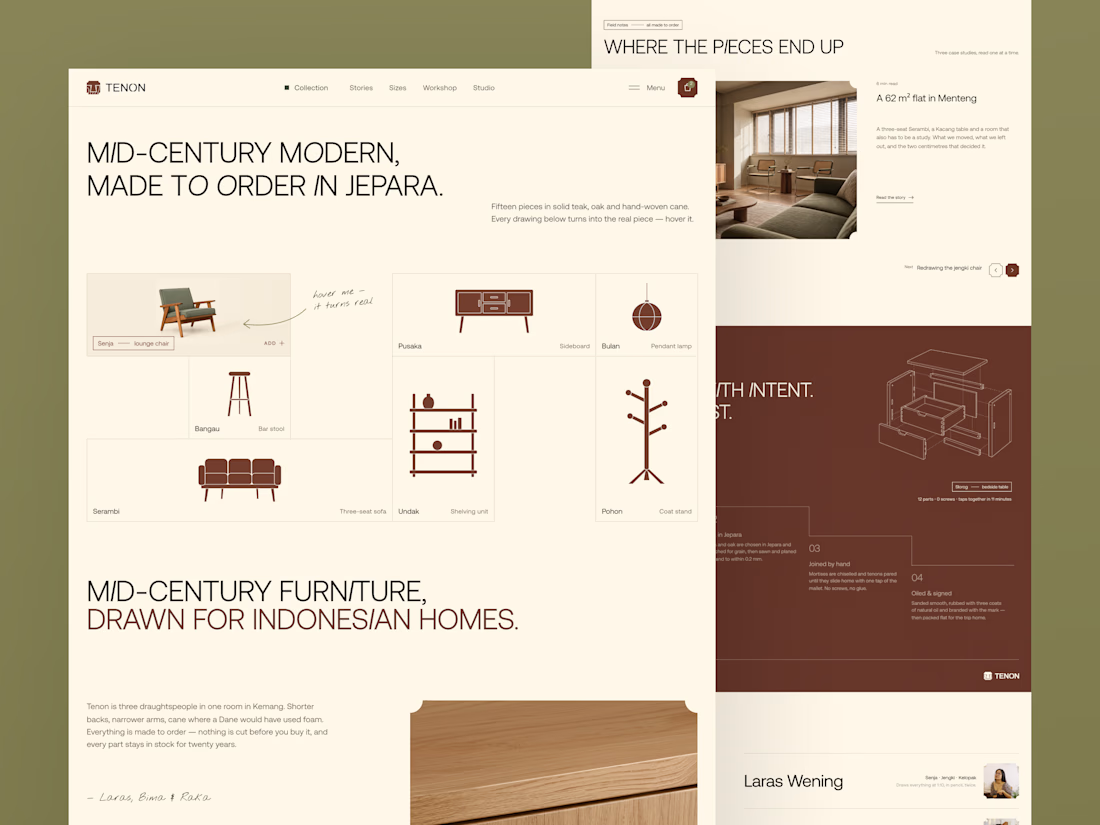
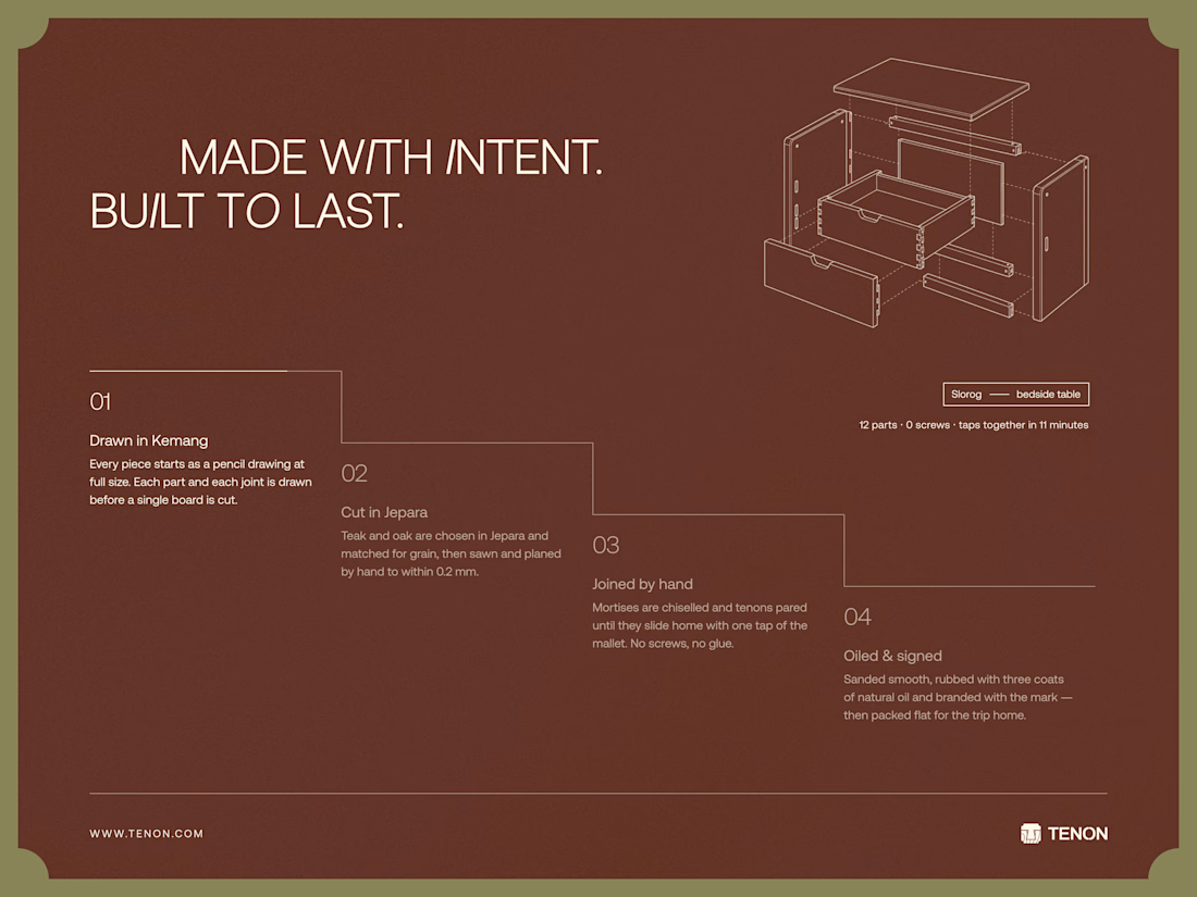
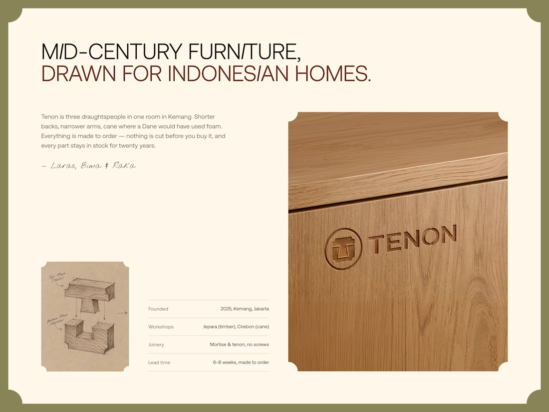
Tenon is Furniture Website Design
Exploring a digital experience for an Indonesian furniture brand inspired by mid-century modern design.
The website brings together product discovery, storytelling, and visual direction to make the digital experience feel as considered as the furniture itself.
Made to order. Made to last.

Love the color choice used