The network for creativity
Join 1.25M professional creatives like you
Connect with clients, get discovered, and run your business 100% commission-free
Creatives on Contra have earned over $150M and we are just getting started
Back to feedPost

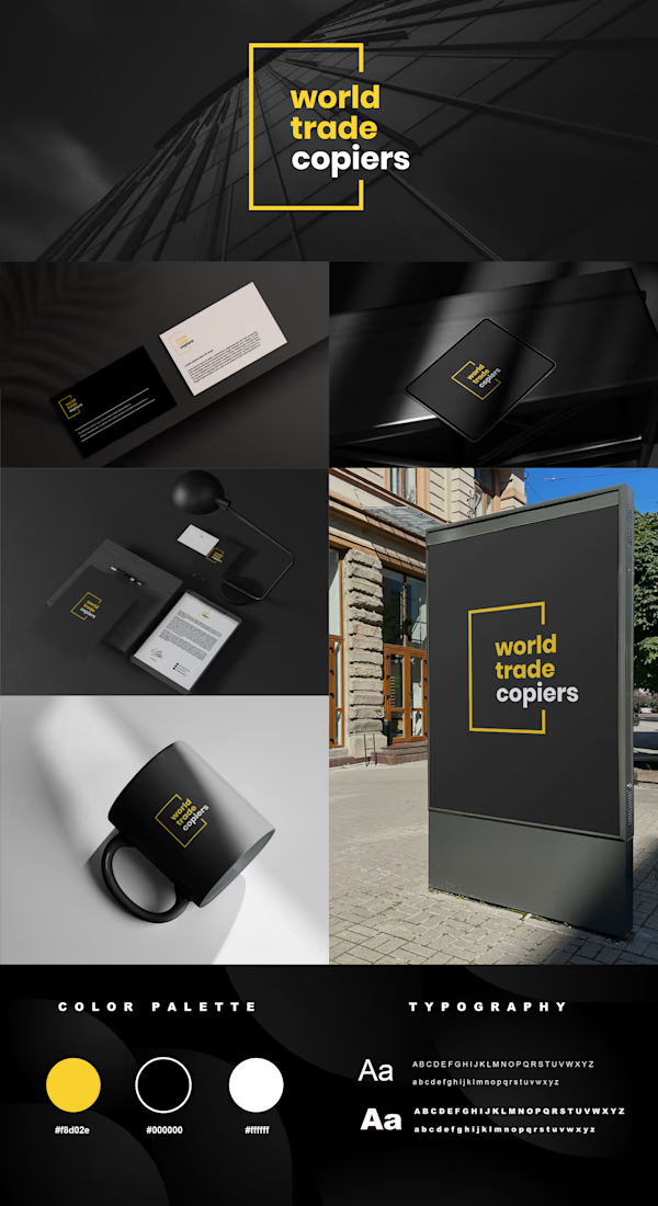
Logo Concept — World Trade Copiers
The World Trade Copiers identity was designed to communicate precision, reliability, technology, and a strong international presence through a clean and highly recognizable visual system.
The core of the logo is built around a minimal geometric frame, inspired by the structure and precision of architectural forms. The open-ended square creates a sense of connection, movement, and expansion, subtly reflecting the company’s role within the global business and technology environment.
The typography is intentionally bold, modern, and straightforward, giving the brand a confident corporate character while remaining highly legible across different applications. The name is divided into three lines to create a compact, distinctive composition and to give each word a clear visual presence.
The color palette combines deep black, white, and a vivid yellow accent. Black communicates professionalism, authority, and technology, while white introduces clarity and balance. The yellow element adds energy and becomes the brand’s recognizable visual signature, drawing attention to the key parts of the identity without overwhelming the minimalist aesthetic.
The result is a modern corporate identity that feels sophisticated, functional, and memorable, with a visual language that can translate naturally across stationery, business cards, packaging, signage, digital platforms, and other branded materials.


The network for creativity
Join 1.25M professional creatives like you
Connect with clients, get discovered, and run your business 100% commission-free
Creatives on Contra have earned over $150M and we are just getting started




Related posts

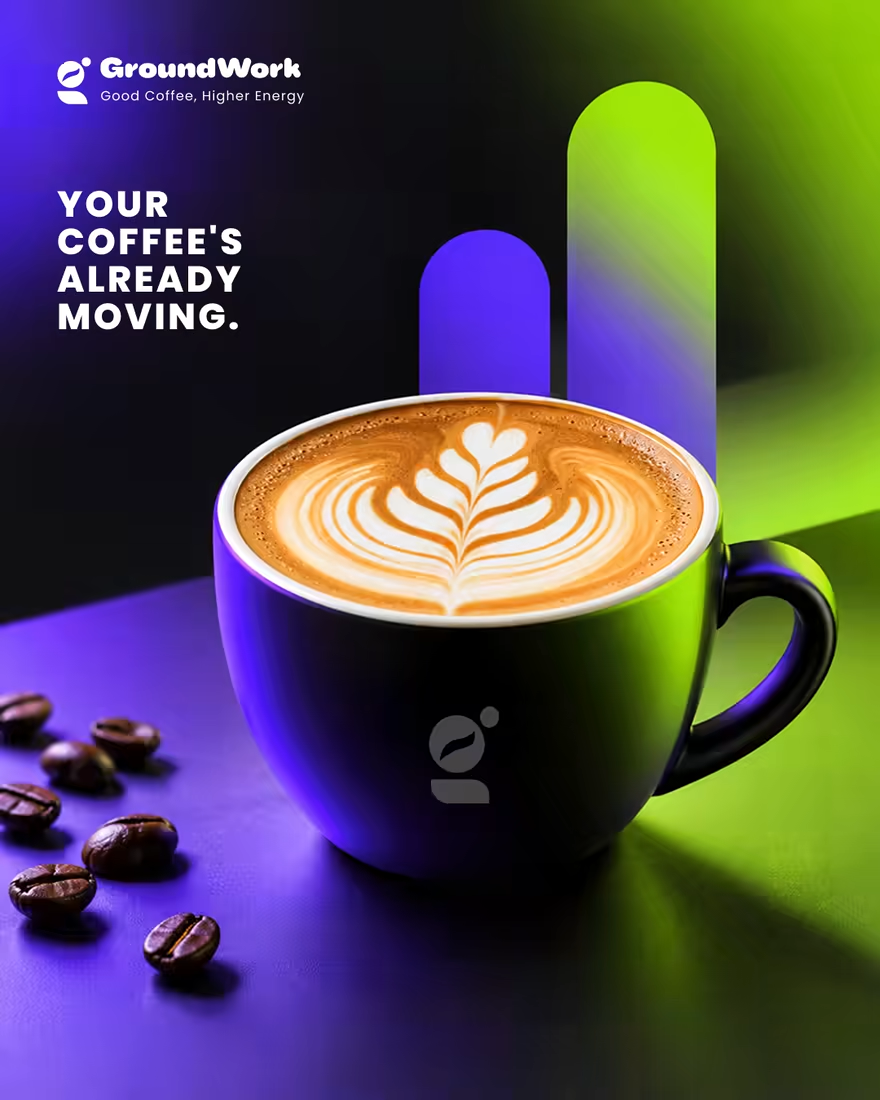
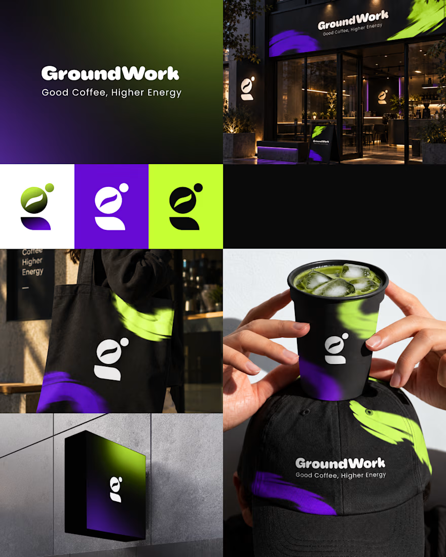
☕ GroundWork — Good Coffee, Higher Energy.
🎨 Brand Identity · 📱 UI/UX · 📦 Packaging
A modern coffee brand built around energy, creativity, and momentum. ⚡
💡 The Idea
I wanted to create a coffee brand that feels as energetic as the first cup of the day.
🎨 Visual Direction
🖤 Charcoal — premium foundation
💜 Electric Violet — creativity
💚 Neon Lime — energy & freshness
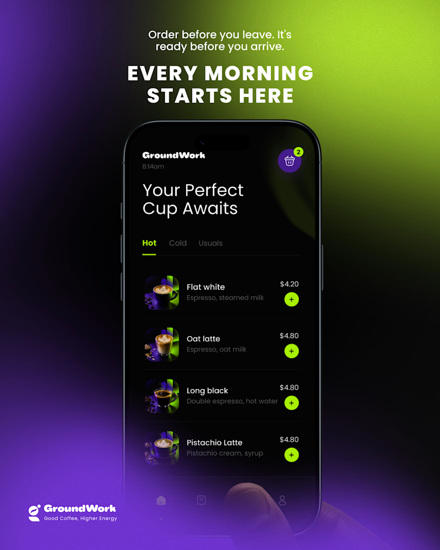
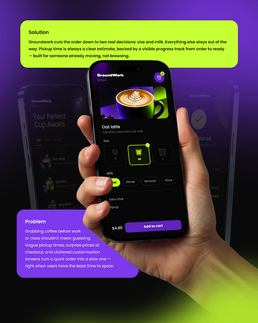
📱 Digital Experience
A clean mobile ordering experience designed to make getting coffee simple, fast, and engaging.
☕ Brand Experience
I extended the identity across cups, caps, totes, packaging, and storefronts — creating one consistent visual system.
✨ The Result
A bold coffee identity that connects digital + physical experiences under one idea:
Good Coffee, Higher Energy. ⚡
What’s your first impression of GroundWork? 👀☕


I personally don't like the colors intensity or shade

Wonder -- Brand Expressions


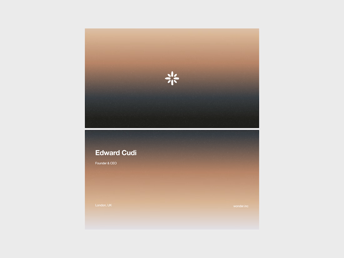
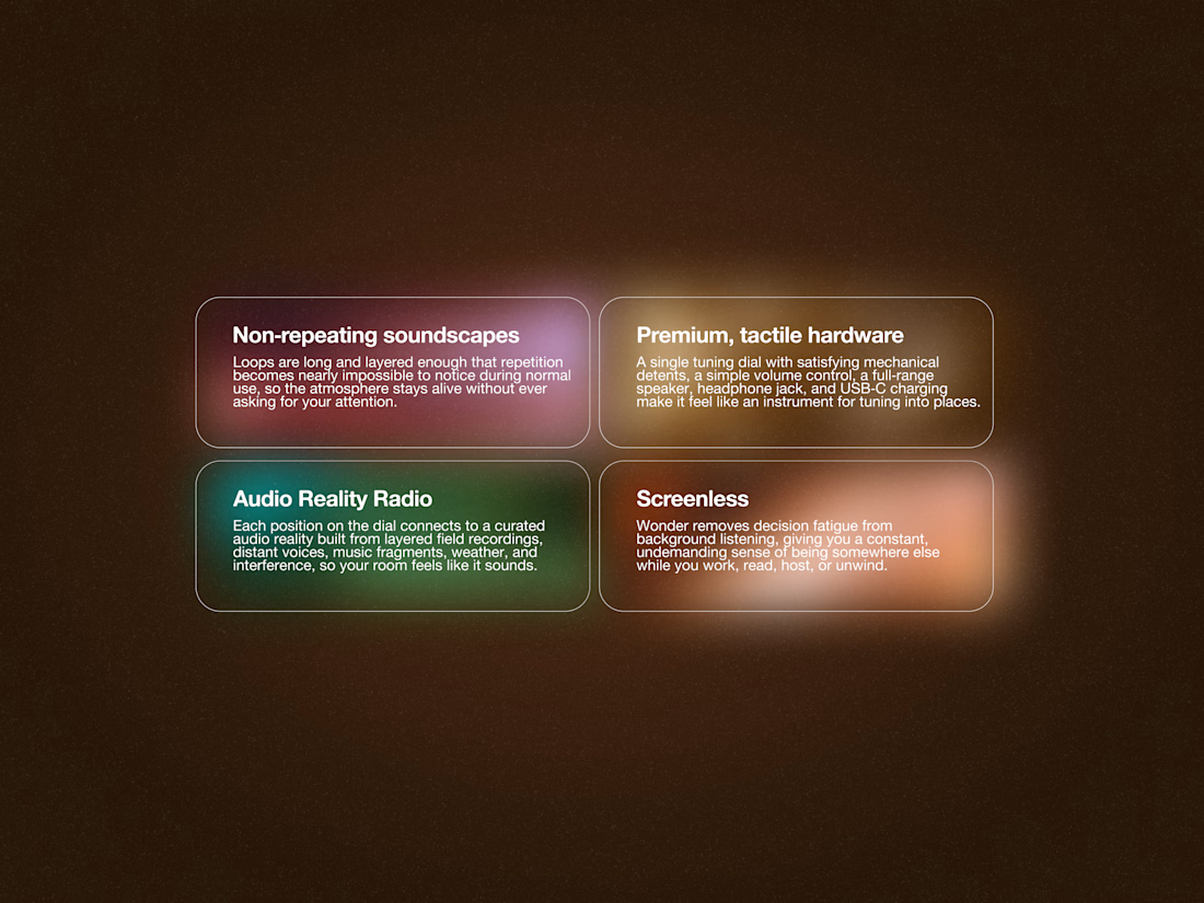
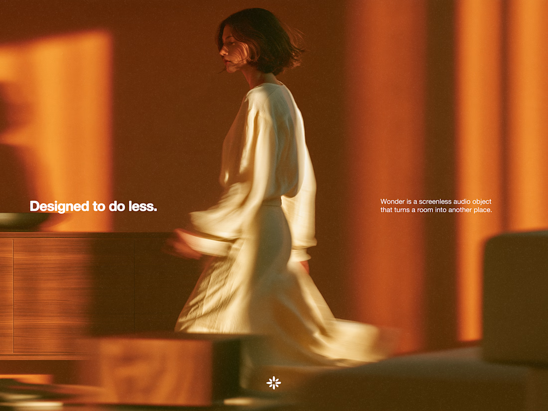


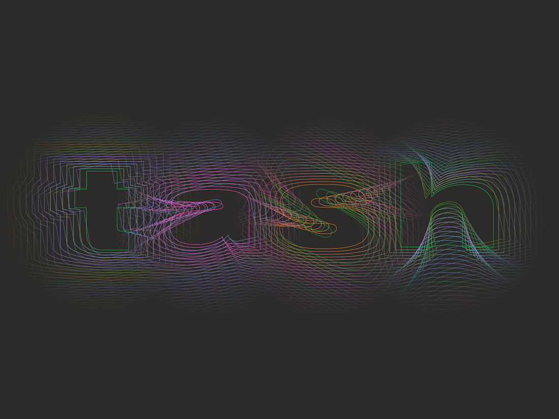
Tash rendered in a custom holographic alphabet, built from patterned letterforms in Figma.

The holographic effect makes it really stand out.