The network for creativity
Join 1.25M professional creatives like you
Connect with clients, get discovered, and run your business 100% commission-free
Creatives on Contra have earned over $150M and we are just getting started
Back to feedPost

ALETRA Lab · Experiment Nº 01: The Night Baker
Every bakery website shows the same thing: a croissant on white. But nobody falls in love with a bakery because of a croissant. They fall in love at 7 a.m., when the door opens and the warmth hits them before the smell does.
So I asked: what if a bakery's website sold that moment, not the product?
→ Contrast: it starts at 4 a.m., one lit window in a sleeping street.
→ Ritual: the brand is someone awake while the city sleeps.
→ Participation: you don't watch the baker, you knead with him.
→ Senses: glowing oven, soft light. A screen can't smell, but it can make you imagine it.
→ Peak-end: it ends on a person and warm bread, not a product.
Not a client project. It's how I think before I design anything: the feeling first, the pixels last.
Concept & creative direction: ALETRA, Berlin. Crafted with AI. © 2026


The network for creativity
Join 1.25M professional creatives like you
Connect with clients, get discovered, and run your business 100% commission-free
Creatives on Contra have earned over $150M and we are just getting started






Related posts


Love the direction! Feels clean and the product offering comes through nicely.


How far can you take a logo beyond the first draft?
I started with Recraft's Logo Maker and a fictional idea: Bibu's Paws, a cosy little dog rescue and adoption shelter.
I wanted the identity to feel warm, homely and full of character, so I explored a few logo directions before settling on the little dog tucked inside a house.
From there, I took the idea further, building out the visual identity with an earthy colour palette, typography, illustrations and a few real-world applications: the shelter space, dog merchandise and an adoption welcome kit.
I enjoyed seeing how a small starting point could grow into a brand with its own personality and world.
Now I'm curious: if you were building a brand around this logo, what would you create next?






It turned out so cozy, you did great

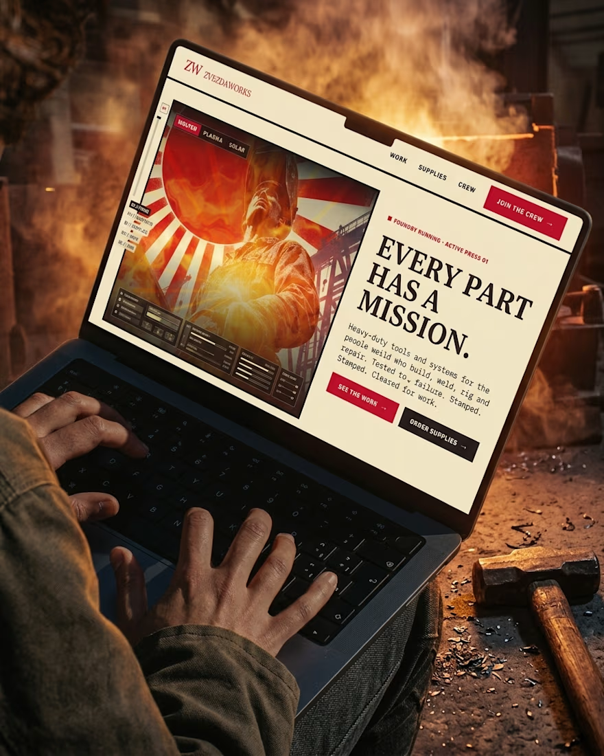
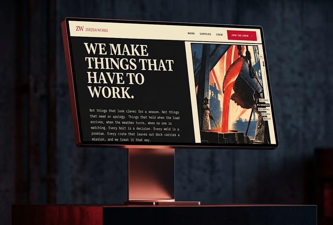
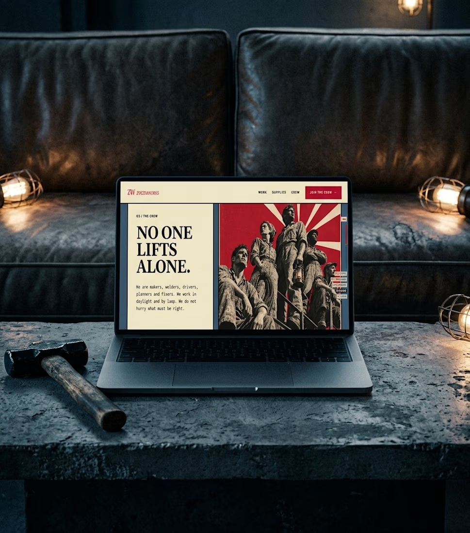
Ever wondered what a space-race poster would sell if it sold hammers?
The Zvezda Works case study answers that, and it’s nearly here.
Watch this space.