The network for creativity
Join 1.25M professional creatives like you
Connect with clients, get discovered, and run your business 100% commission-free
Creatives on Contra have earned over $150M and we are just getting started
Back to feedPost


The network for creativity
Join 1.25M professional creatives like you
Connect with clients, get discovered, and run your business 100% commission-free
Creatives on Contra have earned over $150M and we are just getting started



Related posts


What happens when one website has to talk to two different people?
A client of ours teaches two audiences at once: expecting mothers who want a calm pregnancy, and women who want to become doulas. One brand, one site, two very different reasons to visit.
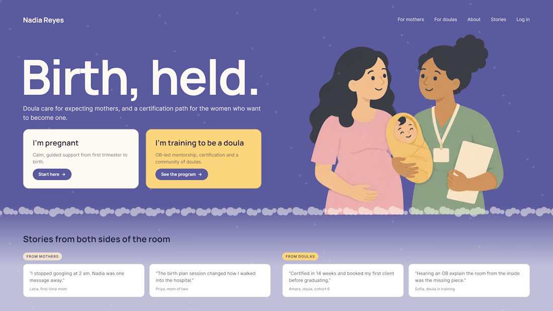
The usual fix is a hero that speaks to "everyone" and lands with no one. We designed it as a fork in the road instead:
1. Two doors in the hero. "I'm pregnant" and "I'm training to be a doula", side by side, equal weight. The visitor picks a path in one click, and the headline above them stays about the shared value.
2. One voice, two tones. The mothers' path is softer: fewer words, more room, gentle photos. The doula path is more structured: modules, certification, dates. Same fonts, same colors, different rhythm.
One proof section, split in two. Testimonials from mothers on the left, from doulas on the right. Each visitor sees people like them before the price.
Writing for everyone is writing for no one. Give each reader a door.
Have you ever designed a page for two audiences at once? How did you split it?


Really great point! Designing for two distinct audiences under one brand is always a challenge. Excited to see your approach to solving it.

Denty — From Consultation to Signed Consent. Built with Base44.
For this #Base44Challenge, I wanted to showcase something beyond a landing page or a beautiful prototype.
A real product. Solving a real problem.
Meet Denty, an AI-powered dental platform designed to simplify clinical documentation and patient consent workflows.
Here's what makes it different.
Instead of manually preparing everything after a consultation, a dentist can upload a transcript and let AI extract the relevant patient information.
The clinician remains in control, reviewing and editing the extracted details before preparing documents.
From there, Denty supports treatment planning, consent form generation, clinical document management, secure signature requests, and downloadable signed PDFs.
It also supports multi-clinic operations, team management, and activity tracking.
Why Base44?
I wanted to move quickly without compromising the product experience.
Base44 helped with application development, data integration, and AI features. But building a usable product required much more than prompts: thoughtful UX, careful design, testing, debugging, and repeated improvements.
Why a 6-minute video instead of 30 seconds?
Because I wanted to demonstrate the product rather than simply show it.
30 seconds can introduce an idea. It cannot meaningfully demonstrate every step of a workflow like this.
In the full recording, you'll see Denty create structured information from a consultation, generate documents, send a signature request, and demonstrate the patient signing process.
This is a functional product, developed for a real-world use case, shared with my client's approval.
We're preparing to launch on Monday.
Full product walkthrough:
https://www.tella.tv/video/startup-design-and-development-project-fo5h9gwr
Built with @Base44.
#Base44Challenge
I'd love feedback from the Contra community, especially on the product experience and clinical workflow.

tella.tv
Startup Design and Development Project 🚀 — Tella
Ans, a designer and developer helping startups build digital products, introduces a very special new project.

Incredible project great job Ans
𝗠𝗼𝘀𝘁 𝗔𝗜 𝗱𝗲𝗺𝗼𝘀 𝘀𝘁𝗼𝗽 𝗮𝘁 “𝗚𝗲𝗻𝗲𝗿𝗮𝘁𝗲.”
𝗢𝘂𝗿𝘀 𝗲𝗻𝗱𝘀 𝘄𝗶𝘁𝗵 𝗮 𝗽𝗮𝘁𝗶𝗲𝗻𝘁’𝘀 𝘀𝗶𝗴𝗻𝗮𝘁𝘂𝗿𝗲.
Meet Denty — a real AI-powered dental platform built with Base44.
And this is my entry for the Base44 × Contra Challenge. 🚀
𝗧𝗛𝗘 𝗣𝗥𝗢𝗕𝗟𝗘𝗠
Dentists spend hours on clinical notes, treatment documentation, consent forms, and paperwork.
We wanted to change that.
𝗛𝗢𝗪 𝗗𝗘𝗡𝗧𝗬 𝗪𝗢𝗥𝗞𝗦
→ A consultation transcript goes in.
→ AI extracts patient information, medical history, treatment risks, and costs.
→ The dentist reviews and edits everything.
→ Treatment documents and consent forms are generated.
→ Patients receive secure signature requests.
→ A completed, signed document is ready to download.
𝗢𝗻𝗲 𝗰𝗼𝗻𝗻𝗲𝗰𝘁𝗲𝗱 𝘄𝗼𝗿𝗸𝗳𝗹𝗼𝘄. 𝗙𝗿𝗼𝗺 𝗰𝗼𝗻𝘀𝘂𝗹𝘁𝗮𝘁𝗶𝗼𝗻 𝘁𝗼 𝘀𝗶𝗴𝗻𝗮𝘁𝘂𝗿𝗲.
Not a Figma concept.
Not a one-prompt prototype.
𝗔𝗻 𝗮𝗰𝘁𝘂𝗮𝗹 𝘄𝗼𝗿𝗸𝗶𝗻𝗴 𝗽𝗿𝗼𝗱𝘂𝗰𝘁.
Base44 helped us move faster, but getting here took real design decisions, testing, iterations, and plenty of problem-solving.
𝗪𝗛𝗬 𝗔 𝟲-𝗠𝗜𝗡𝗨𝗧𝗘 𝗗𝗘𝗠𝗢?
30 seconds might be enough to show a beautiful interface.
𝗕𝘂𝘁 𝗶𝘀 𝗶𝘁 𝗲𝗻𝗼𝘂𝗴𝗵 𝘁𝗼 𝗽𝗿𝗼𝘃𝗲 𝗮 𝗿𝗲𝗮𝗹 𝗽𝗿𝗼𝗱𝘂𝗰𝘁 𝗮𝗰𝘁𝘂𝗮𝗹𝗹𝘆 𝘄𝗼𝗿𝗸𝘀?
I don't think so.
So I recorded a complete 6-minute walkthrough.
No fancy promises. No static mockups.
Just a real product solving a real problem.
𝗪𝗮𝘁𝗰𝗵 𝘂𝗻𝘁𝗶𝗹 𝘁𝗵𝗲 𝘀𝗶𝗴𝗻𝗮𝘁𝘂𝗿𝗲 𝘄𝗼𝗿𝗸𝗳𝗹𝗼𝘄 𝗻𝗲𝗮𝗿 𝘁𝗵𝗲 𝗲𝗻𝗱. That's where everything comes together.
We're launching Denty on Monday, and I'm sharing this project with my client's approval.
𝗠𝘆 𝗼𝗳𝗳𝗶𝗰𝗶𝗮𝗹 #Base44Challenge 𝘀𝘂𝗯𝗺𝗶𝘀𝘀𝗶𝗼𝗻. 🏆
I'd genuinely love your feedback.
If you were building this for a real dental practice, what would you improve?
🎥 𝗪𝗔𝗧𝗖𝗛 𝗧𝗛𝗘 𝗙𝗨𝗟𝗟 𝗣𝗥𝗢𝗗𝗨𝗖𝗧 𝗗𝗘𝗠𝗢:
https://www.tella.tv/video/startup-design-and-development-project-fo5h9gwr
@Base44 @Contra
#Base44Challenge #BuildInPublic #HealthTech
That's really great 🔥🔥🔥