The network for creativity
Join 1.25M professional creatives like you
Connect with clients, get discovered, and run your business 100% commission-free
Creatives on Contra have earned over $150M and we are just getting started
Back to feedPost
🥥 A Fresh Look for a Bold Beverage Brand! 💚
Introducing Cocopista — a refreshing visual concept combining coconut and pistachio in a vibrant, tropical-inspired design.
From the bold green colours to the floating ingredients and dynamic splash effects, this concept was designed to make the product stand out and grab attention.
✨ Have a beverage brand, food product, or drink business that needs eye-catching packaging and promotional designs?
I'd love to help bring your next idea to life!
📩 Let's work together. Send me a message to discuss your next design project.
#PackagingDesign #BeverageBranding #ProductDesign #GraphicDesign #BrandIdentity

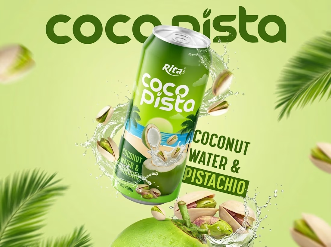

The splash with pistachios and coconut mid-air and the bold green wordmark is a proper summer pack shot, and coconut plus pistachio is a pairing that makes people curious. One flag: the can carries a small Rita mark above the Cocopista name. If this is a concept for your own...

Thank you so much 😊
The network for creativity
Join 1.25M professional creatives like you
Connect with clients, get discovered, and run your business 100% commission-free
Creatives on Contra have earned over $150M and we are just getting started



Related posts

Bold Illustrations make an instant impact
See full case study here for the branding evolution and website redesign for a B2B SaaS startup!


I loved these colours. Looking Stunning 😍


Which logo looks better for Lumia?

5 voted
56%

4 voted
44%

9 votes
Closed

Bold is heavy❤️


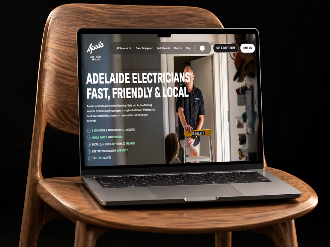
A strong service business needs a website that builds trust in seconds.
Just wrapped up this Webflow project for Aquila Electrical, designed to make a wide range of electrical services feel simple to explore for homeowners, commercial clients, and industrial customers.
I focused on clear service pathways, strong project showcases, responsive layouts, trust signals, and a straightforward quote journey that helps visitors move from “I need an electrician” to taking action.
Curious to hear your thoughts, does the website feel clear and trustworthy enough for a service business like this?
#Webflow #WebDesign #UIDesign #UXDesign #WebDevelopment #ElectricianWebsite #LocalBusiness #ServiceBusiness #ResponsiveDesign #PortfolioProject #Contra


Simple, refined, and very well executed.