The network for creativity
Join 1.25M professional creatives like you
Connect with clients, get discovered, and run your business 100% commission-free
Creatives on Contra have earned over $150M and we are just getting started
Back to feedPost
Taste Test
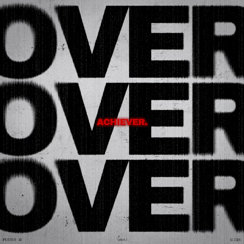
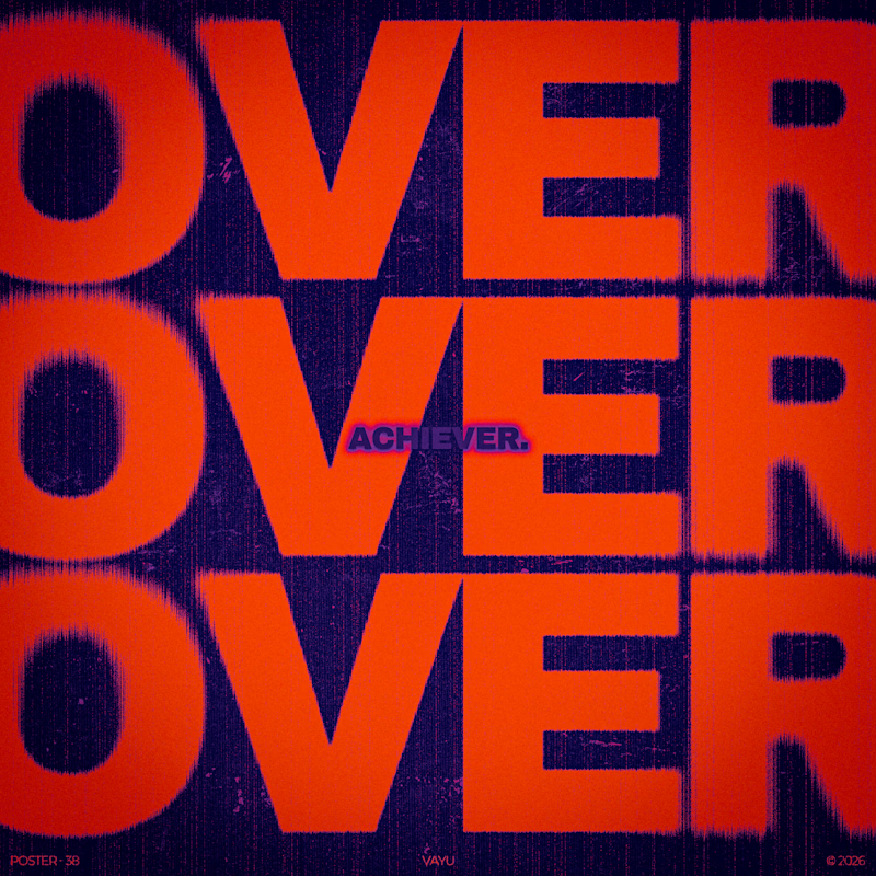
Monochrome(V1) vs Orange/Purple(V2) which version hits harder?
14 votes
Ends in 1d


It's hard. Both looks great. But personally color combo of orange and purple is plus 😅

Monochrome feels more powerful ❤️

Both are great; it's hard to choose

Monochrome. The red tag stands out more when everything else is black and white.

Voted Monochrome. The grain and the single red tag give it tension, while the orange and purple version is loud everywhere so nothing stands out. When the word is OVER three times, restraint hits harder.

Thanks for sharing your views!
The network for creativity
Join 1.25M professional creatives like you
Connect with clients, get discovered, and run your business 100% commission-free
Creatives on Contra have earned over $150M and we are just getting started





Related posts

Just created a Framer website preloader with 2 options to choose from. The difference is the sequence of what appears first and the reveal animation. I made two options because I can’t choose which is best lol. What’s your favorite, Option 1 or 2?
BTW if you want this for free (normally $12), like it on the Framer Marketplace (on this link) and comment here so I know, and I’ll send it to your DM.

20 voted
48%
22 voted
52%
42 votes
Closed

Option 1 feels better than Option 2 for me

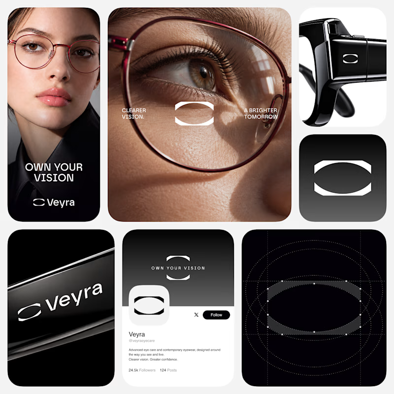
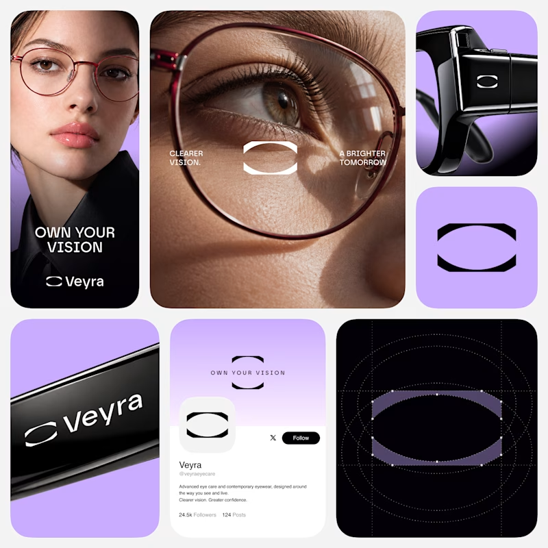
Which direction feels more Veyra?
Exploring two visual directions for Veyra - a contemporary eye care & eyewear brand.
01 - Monochrome
02 - Violet
Same identity. Different energy.
Which direction would you choose - 01 or 02?
6 voted
55%
5 voted
45%
11 votes
Closed


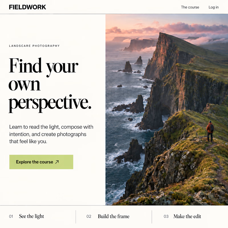
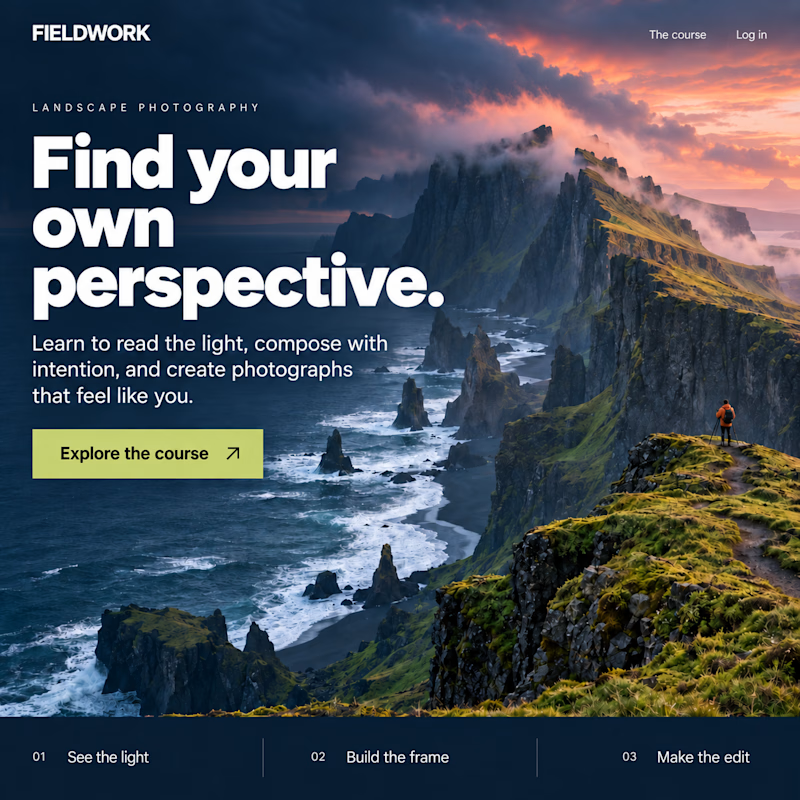
Which Kajabi homepage makes you want to explore the course?
Same offer. Two first impressions.
Editorial split or immersive hero? Vote below.

11 voted
33%
22 voted
67%
33 votes
Closed

Immersive!