The network for creativity
Join 1.25M professional creatives like you
Connect with clients, get discovered, and run your business 100% commission-free
Creatives on Contra have earned over $150M and we are just getting started
Back to feedPost

A sommelier won't accept "this wine tastes bad." They make you find the actual word — too much oak, not enough acid, finish drops dead after two seconds. Vague complaint in, specific defect out.
I used to get "it's just not popping" from a client and translate that into nothing. Add a shadow. Bump the contrast. Hope. Round two, same note, worse mood on both sides.
Now vague feedback gets the same treatment. What specifically — hierarchy, motion timing, whitespace? Sometimes I hand the raw note to Claude first and ask which concrete lever the client's probably pointing at, then check that guess against what I actually know about the project before touching anything.
Half of "let's do another round" turns into a five-minute fix once someone names the actual defect instead of the feeling.
What's the vaguest feedback you've ever had to decode?
The network for creativity
Join 1.25M professional creatives like you
Connect with clients, get discovered, and run your business 100% commission-free
Creatives on Contra have earned over $150M and we are just getting started







Related posts

What services actually get me such cool feedback?
🔽
https://pitch.com/v/devlina-work-8fd92x
Happy growing :)



Hey everyone 👋
Been working on something for a while and finally want to share it here.
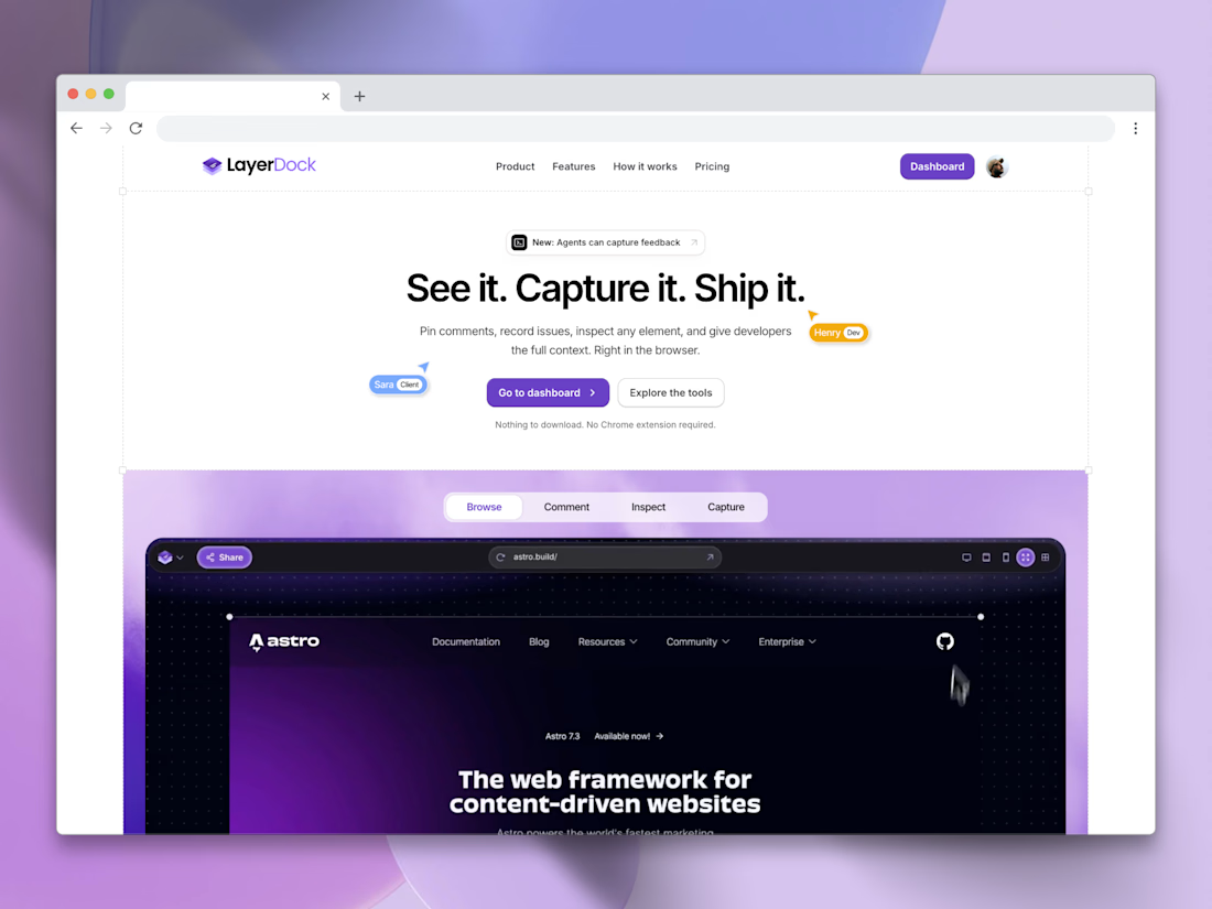
I've built sites for clients for years and the feedback part always drove me crazy. Screenshots over email, voice notes on WhatsApp, or just "can you fix the thing on the homepage". Half my time went into figuring out what they actually meant.
Got tired of it and built Layerdock. You open the site, click on whatever needs fixing and leave a comment on it. It grabs a screenshot and the info your dev needs. Your client just gets a link, nothing to install.
It's in beta right now and I'd really like a few of you to try it on an actual project. Poke around, break it, tell me what's annoying. Even the small stuff.
Free to start at layerdock.io
Comment here or DM me, I'll get back to everyone!
Zain



What do you think of when you say, “this design doesn't feel premium”?
I've heard this kind of feedback from clients countless times. You know that “premium” can mean different things depending on the person, the product, and what they are comparing it against.
Recently, though, I found myself on the other side of a very similar conversation.
We've been developing a brand identity for one of our own projects, and I caught myself giving exactly the kind of feedback I've spent years receiving from clients.
“This doesn't feel right.”
“This isn't quite what I had in mind.”
There was a very specific image in my head. I just didn't have a neat explanation for it.
I was comparing what I was seeing against a pre-existing perception of what the brand should be. The gap was obvious to me because I could see both things at once: the design in front of me and the image in my head.
And that made me think back to all those conversations about making something feel more like “premium”, or trustworthy, sophisticated, playful, serious, whatever the brief happens to call for.
A client may have a very specific perception in mind that doesn't necessarily match what a designer would know to associate with that quality. They may be comparing the design against something the designer can't see yet.
The designer is checking against something too: years of seeing how visual choices, combinations and conventions tend to communicate, plus the context of the product, audience and brand.
The client is checking against the idea in their head. They may not always be able to articulate it, but they can still tell when what they're seeing doesn't match it.
So what are you actually checking against when you decide a design feels premium?

To me this would mean one thing - there was no strategic work done before touching visuals. Hence it's shooting in the dark and trying to magically match the client taste.
Strategy makes decisions informed, and put both parties on the same page way before the design work starts.