The network for creativity
Join 1.25M professional creatives like you
Connect with clients, get discovered, and run your business 100% commission-free
Creatives on Contra have earned over $150M and we are just getting started
Back to feedPost


What do you think of when you say, “this design doesn't feel premium”?
I've heard this kind of feedback from clients countless times. You know that “premium” can mean different things depending on the person, the product, and what they are comparing it against.
Recently, though, I found myself on the other side of a very similar conversation.
We've been developing a brand identity for one of our own projects, and I caught myself giving exactly the kind of feedback I've spent years receiving from clients.
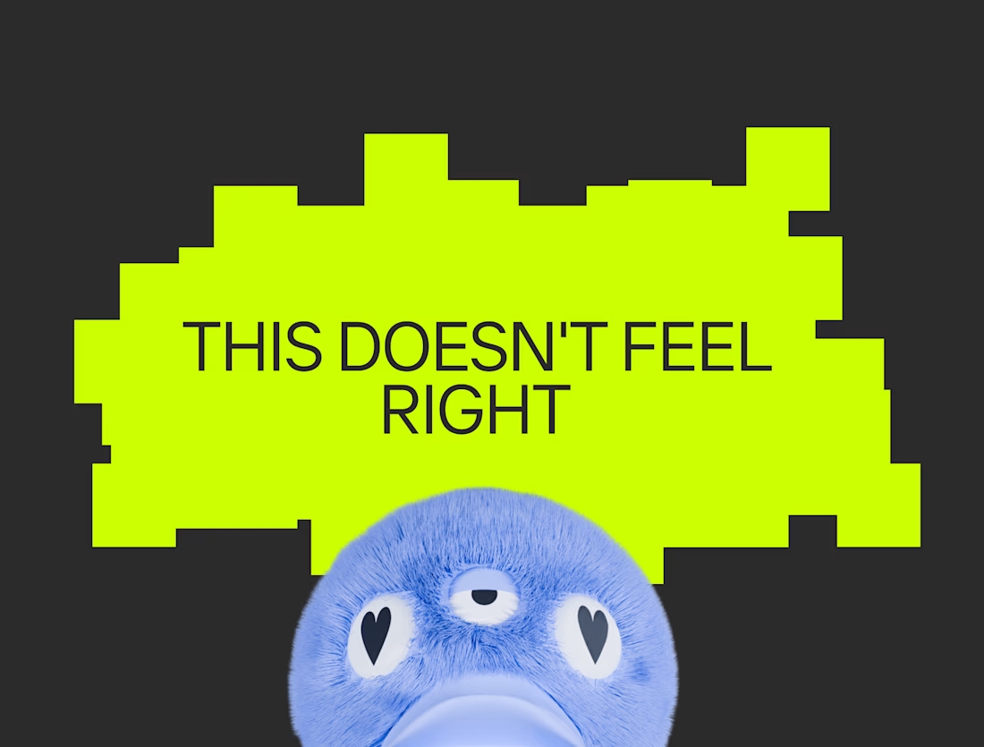
“This doesn't feel right.”
“This isn't quite what I had in mind.”
There was a very specific image in my head. I just didn't have a neat explanation for it.
I was comparing what I was seeing against a pre-existing perception of what the brand should be. The gap was obvious to me because I could see both things at once: the design in front of me and the image in my head.
And that made me think back to all those conversations about making something feel more like “premium”, or trustworthy, sophisticated, playful, serious, whatever the brief happens to call for.
A client may have a very specific perception in mind that doesn't necessarily match what a designer would know to associate with that quality. They may be comparing the design against something the designer can't see yet.
The designer is checking against something too: years of seeing how visual choices, combinations and conventions tend to communicate, plus the context of the product, audience and brand.
The client is checking against the idea in their head. They may not always be able to articulate it, but they can still tell when what they're seeing doesn't match it.
So what are you actually checking against when you decide a design feels premium?

For me premium means that you remember it and connect it directly to a brand. The style has less to do with "premium", in my opinion 😊

To me this would mean one thing - there was no strategic work done before touching visuals. Hence it's shooting in the dark and trying to magically match the client taste.
Strategy makes decisions informed, and put both parties on the same page way before the design work starts.
Agreed, without strategy it's guesswork!
My point was narrower, though. Even with a solid strategy, words like "premium" still have to become visuals, and people picture them differently. Strategy is necessary but not sufficient. The other half is showing the mental image...
Strategy solves exactly that - usually these words come pre-strategy as a broad explainer of what client expects. Then through strategy you uncover what client may mean by premium or else.
E.g. during strategy you discover that client is trying to appeal to an audience of 35 year old women who act rebellious, buy natural products and stand for the earth. They are ready to pay the higher price tag if the product is made with clean ingredients, and packaging can be...

Do you ask clients upfront to share products outside their own industry that they consider premium just to calibrate expectations before starting?
Love that you brought this up, the outside-industry question is one of my favourite parts of discovery! Inside their own category, clients usually point at the market leader. Outside it, they show what they actually value, and sometimes that's far more useful. Interesting thing,...

Mostly restraint. Generous spacing, tight type and fewer effects. I also ask clients to send two brands they think feel premium.
The network for creativity
Join 1.25M professional creatives like you
Connect with clients, get discovered, and run your business 100% commission-free
Creatives on Contra have earned over $150M and we are just getting started











Related posts

As a business owner, your product deserves a packaging system that communicates quality, consistency, and value at every touchpoint.
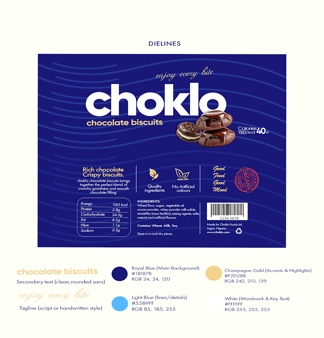
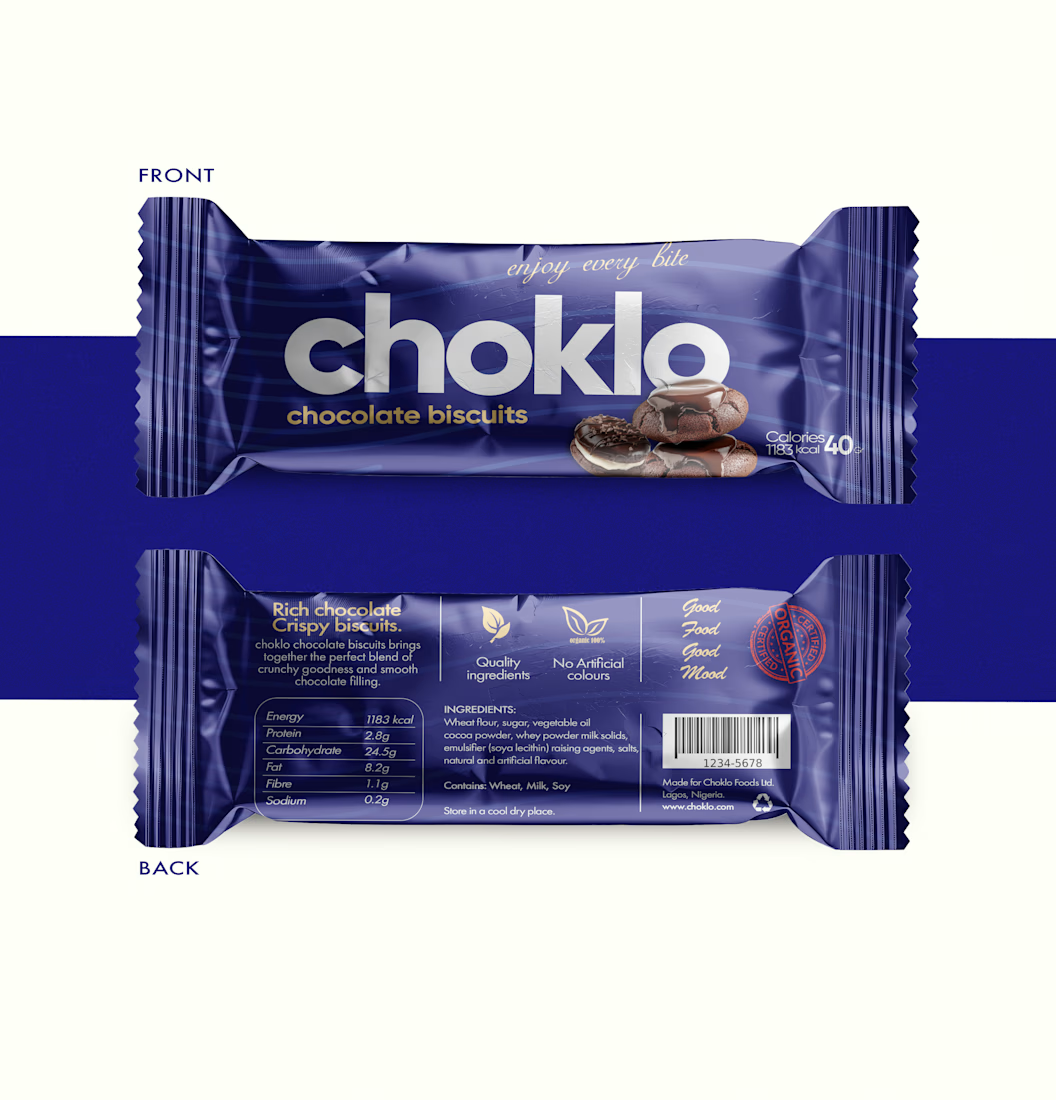
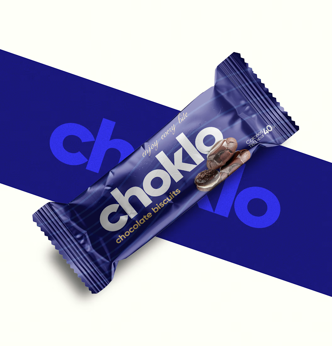
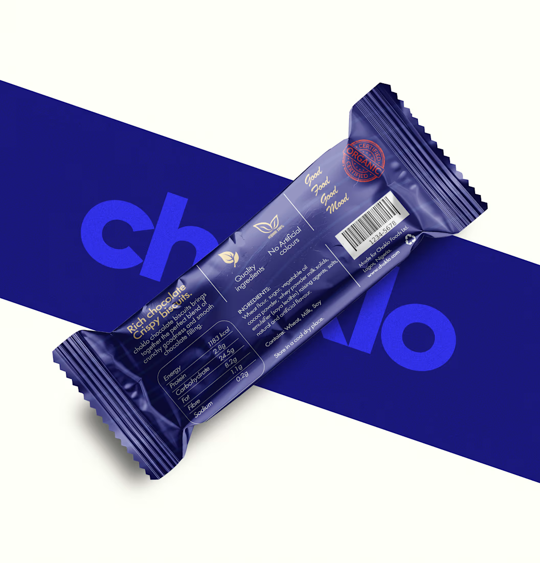
I designed choklo as a premium chocolate biscuit packaging concept built around bold geometric typography, a distinctive royal-blue palette, and a cohesive visual identity.
From the front-of-pack presentation to the back-of-pack information layout, every element is designed to work together as one considered system, balancing shelf appeal with functional clarity.
Because premium packaging isn’t just about making a product look expensive. It’s about building a brand that looks credible, feels intentional, and is ready to compete.
Looking to elevate your product with packaging that reflects the value of your brand? Let’s talk.
#PremiumPackaging #PackagingDesign #BrandIdentity #ProductBranding

A hot take in branding: Should premium always play it safe?
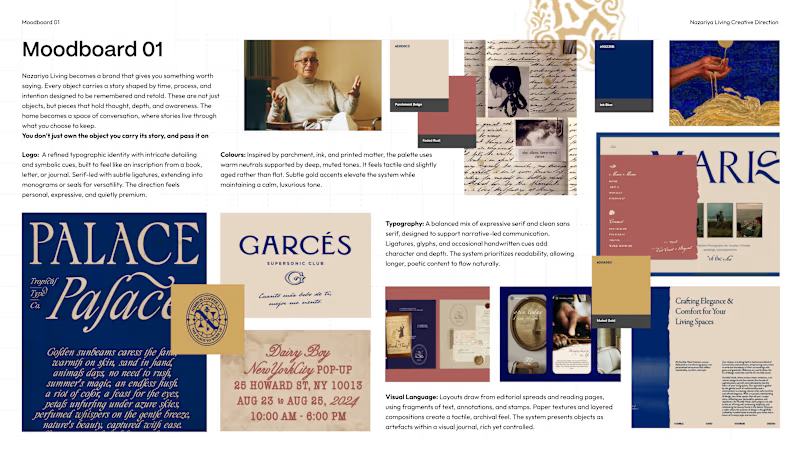
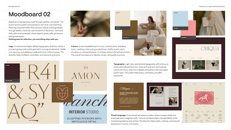
We recently explored two contrasting creative directions for a premium carpet and home décor brand based in Jaipur, India.
Moodboard 01: Challenges category conventions with a maximalist, editorial approach. Inspired by visual journals, printed matter and the stories objects carry.
Moodboard 02: Embraces familiar premium codes. Neutral colours, conventional logo forms and spacious layouts that let the products take centre stage.
Both serve a purpose, but the brand's core idea is “Stories Worth Keeping.”
Which direction would you remember for a brand that sells more than objects, but the stories behind them?
01 or 02?


6 voted
75%
2 voted
25%
8 votes
Closed

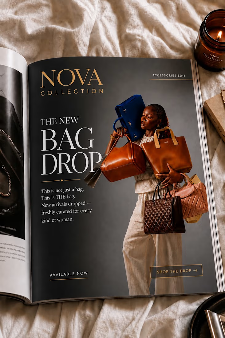
Designed a luxury magazine advertisement featuring elegant layouts, premium visuals, and sophisticated typography to create a high-end brand appeal. Focused on visual storytelling, strong composition, and refined aesthetics to capture attention, communicate brand value, and leave a lasting impression.