The network for creativity
Join 1.25M professional creatives like you
Connect with clients, get discovered, and run your business 100% commission-free
Creatives on Contra have earned over $150M and we are just getting started
Back to feedPost

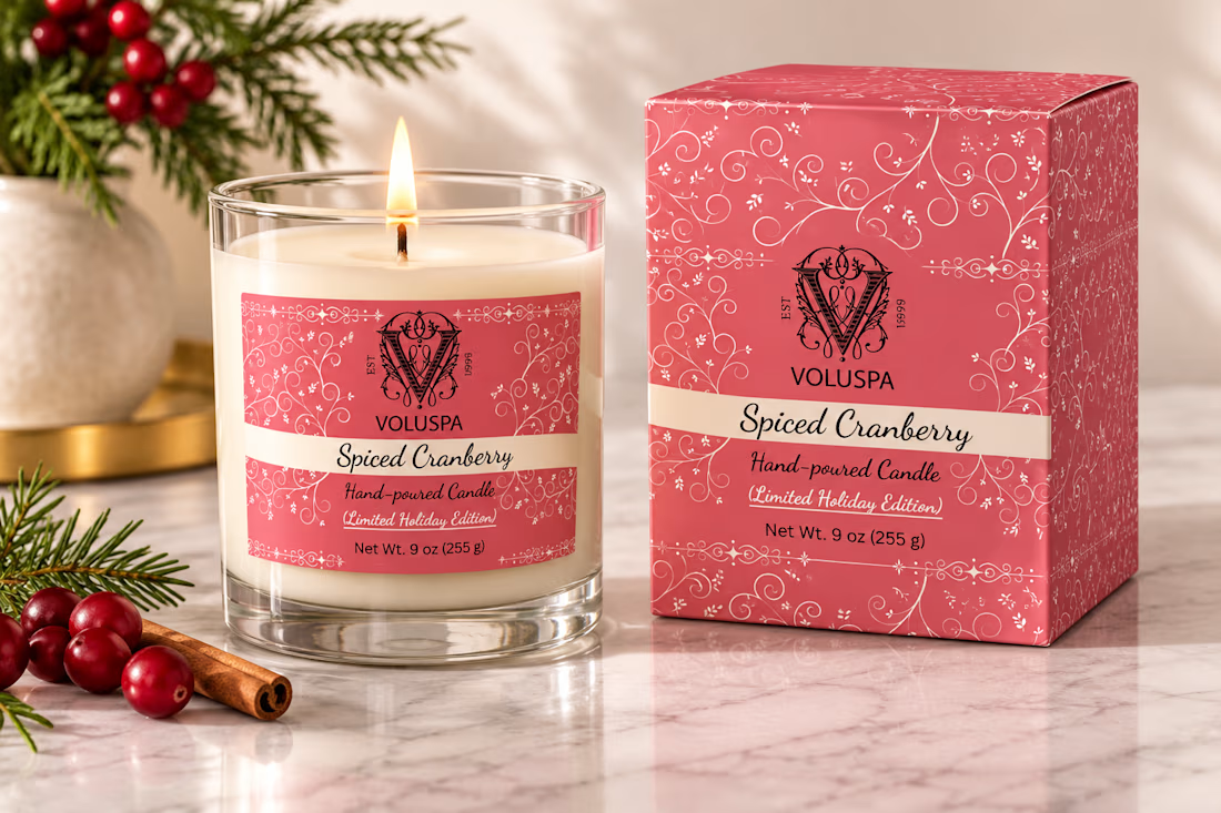
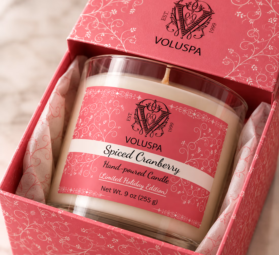
I designed Christmas themed label and packaging for Voluspa🕯️💫 (unofficial)
I was bored of watching and creating uncrowded designs, so I designed fully crowded antique styled packaging. The warm pink colour with cream colour gives the essence of festive + calm + vintage vibe.
What I focused on-
🎀Colour: Warm cranberry pink with cream, it feels festive without the usual red.
🌿Pattern: Delicate swirls and tiny florals that wrap around both the jar and box.
✍️Typography: An elegant script for the scent name, with a clean sans for the details like weight and edition.
📦Consistency: The same layout on the label and the box, so the brand is recognisable at a glance.
Did you get the vintage feeling or not?🤔
#christmas

yes, got the vintage feeling 🙂 the script name with tiny florals does most of it, and cranberry pink instead of the usual christmas red keeps it festive without shouting
The network for creativity
Join 1.25M professional creatives like you
Connect with clients, get discovered, and run your business 100% commission-free
Creatives on Contra have earned over $150M and we are just getting started


Related posts

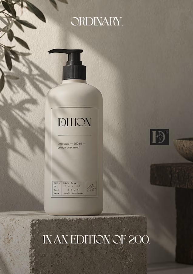
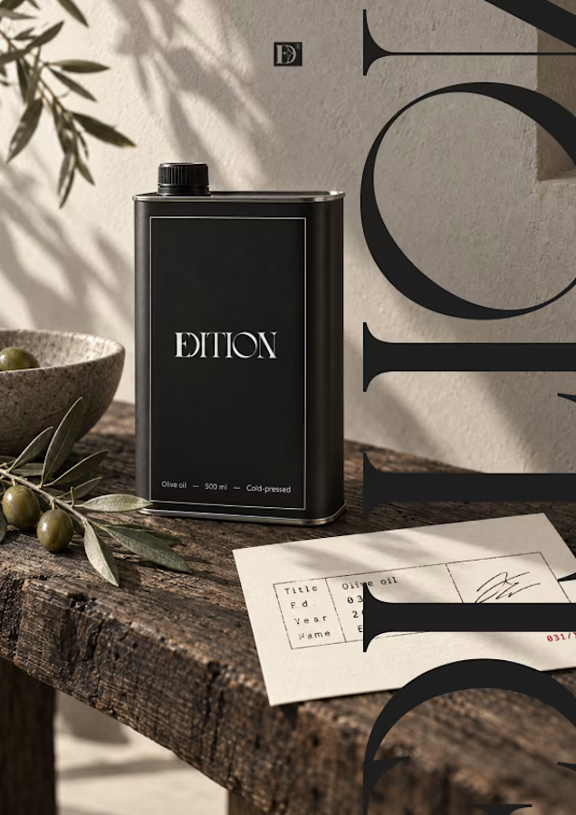
Ever signed for a pack of pasta? Soon you will.
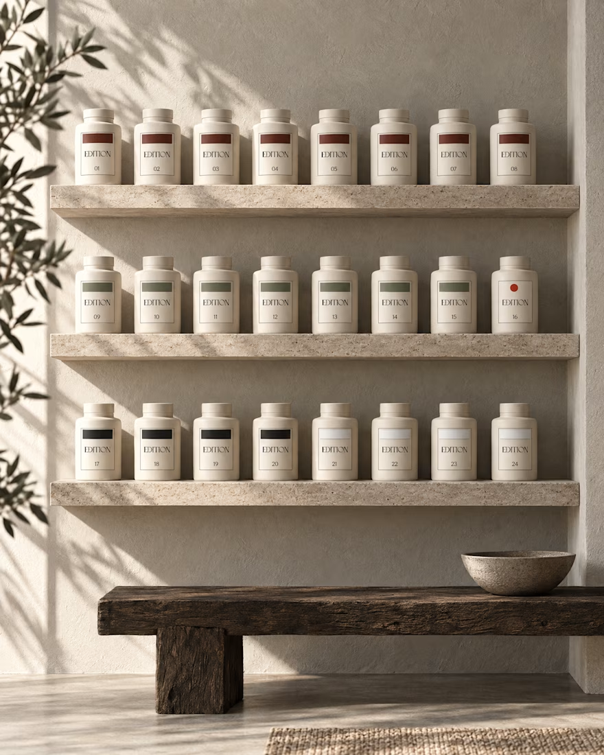
EDITION is a brand where nothing is decorative and everything is numbered.
Case study landing very soon.





The glossy chair looks like someone just got up from it 😄 Love how the effect keeps the shapes readable instead of turning everything into noise. Will it work on video in aftrglo too?

Craft Meets Heritage: Which M0U Packaging Wins?
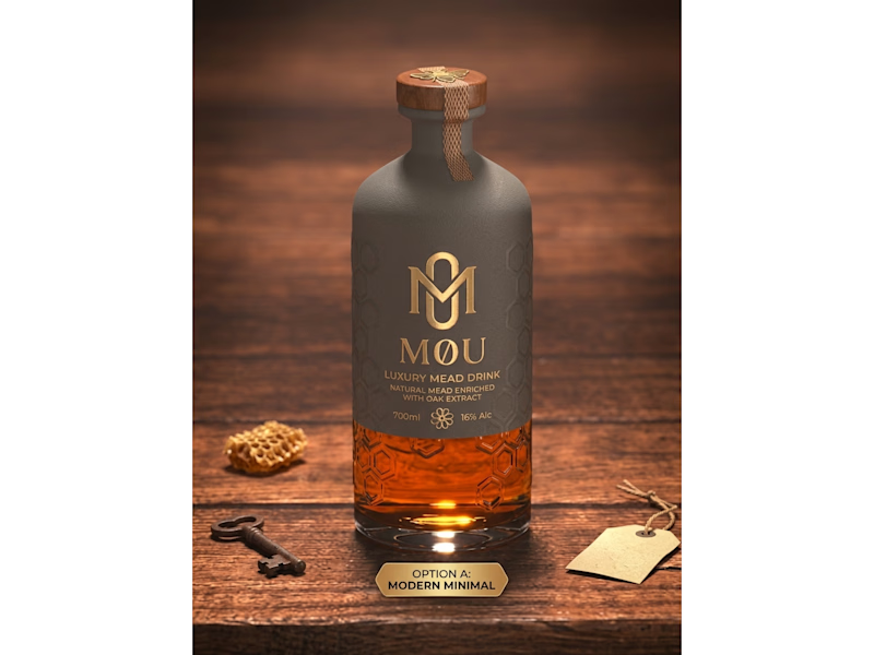
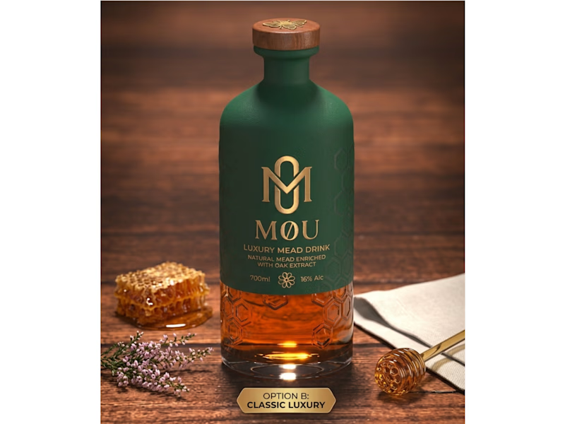
I created two distinct packaging concepts for M0U, a luxury oak-enriched honey mead brand. Both designs keep the custom geometric gold monogram and embossed honeycomb glass intact while testing two different visual directions:
Option A (Modern Minimal): Features a matte slate-grey wrap and a textured neck seal for a contemporary, understated shelf presence.
Option B (Classic Luxury): Uses a deep forest-green finish paired with warm gold foil accents to highlight natural botanical heritage.
Which packaging direction grabs your attention first—A or B? Drop your vote below!
Looking to elevate your brand with custom logo systems and standout packaging design? Let’s connect and bring your vision to life.
0 voted
0%
4 voted
100%
4 votes
Closed

Went with Classic Luxury. The gold foil on that deep green feels right for a heritage mead.