The network for creativity
Join 1.25M professional creatives like you
Connect with clients, get discovered, and run your business 100% commission-free
Creatives on Contra have earned over $150M and we are just getting started
Back to feedPost

Good design is about more than making things look pretty. It’s about finding the right feeling, giving ideas room to breathe, and making every little detail count.
That’s what we had in mind when designing the website for Sanfang. We played with visual hierarchy, typography, layouts, and the overall flow to create a digital experience that feels clear, considered, and true to the brand.
Every section has its own purpose, every detail has a reason to be there, and everything works together to tell one consistent story. We wanted the design to feel polished without being cold, functional without being boring, and distinctive without trying too hard.
Because a good website shouldn’t just look the part. It should feel right, too.


The network for creativity
Join 1.25M professional creatives like you
Connect with clients, get discovered, and run your business 100% commission-free
Creatives on Contra have earned over $150M and we are just getting started

Challenges
View all


Related posts


Working on apple watch experience. How else do I keep myself from getting bored when there’s interaction design involved? That’s honestly one of my top priorities.
Can’t wait to share the full case study for this project. For now, here’s a little sneak peek at some of the animated screens I’ve been working on for the fitness experience. ⌚️

This deserves only praise. wonderful execution

Factory × Slack - Product Integration Video
Created a product video showcasing Factory’s Slack integration, combining UI animation, motion design, and visual storytelling to clearly demonstrate how the integration works and fits into the user’s workflow.


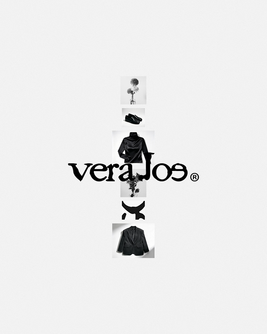
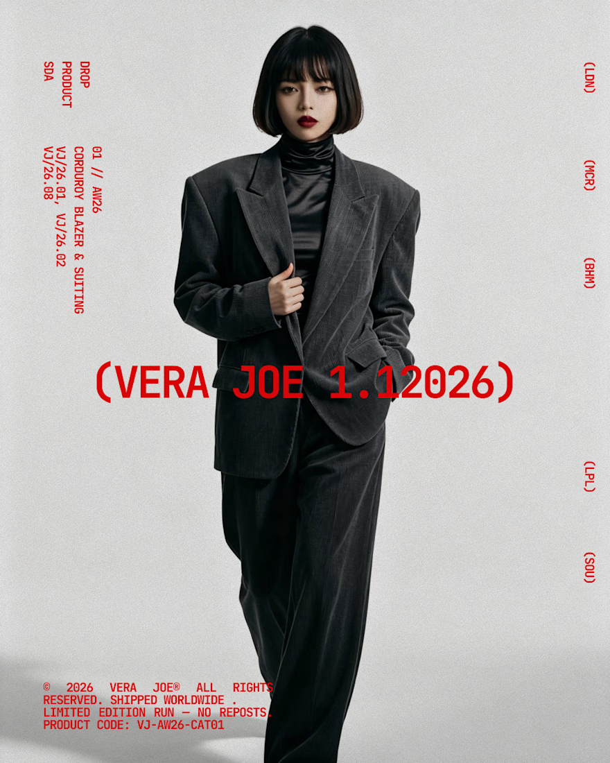
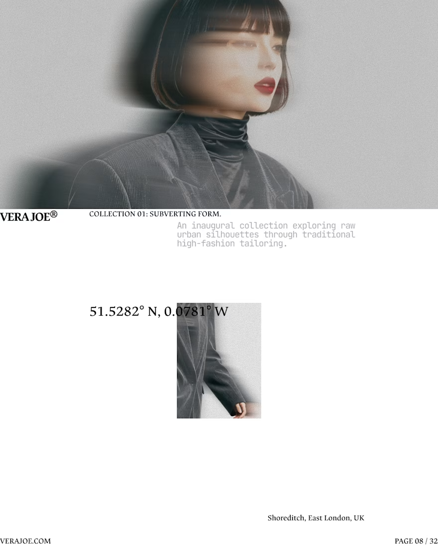
An editorial exploration for VERA JOE® Autumn/Winter 2026.
Exploratory Brand Identity & Visual Campaign.
Like the art direction