The network for creativity
Join 1.25M professional creatives like you
Connect with clients, get discovered, and run your business 100% commission-free
Creatives on Contra have earned over $150M and we are just getting started
Back to feedPost

Flora Museum Challenge: The Stirrup-Spout Vessel
Somewhere in northern Peru, more than fifteen hundred years ago, someone shaped a man out of clay and gave him a small cat to wear on his forehead.
He sits with his knees drawn up and his hands resting on them. The double spout above him arcs like a saddle stirrup, a form potters in that region used for roughly twenty-five hundred years. It may have been designed to keep the liquid inside from evaporating. The feline headdress was not decoration. It marked rank.
The Concept:
Flora as a modern luxury home retailer. The Ancient Americas Collection.
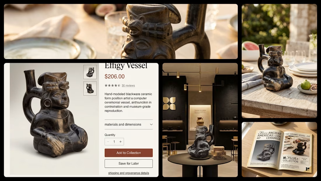
An object positioned the way a design house positions a $200 piece: given space, silence, and good light. A ceremonial vessel that ends up on a summer table between the figs and the wine glasses, doing what it was made to do.
The Build:
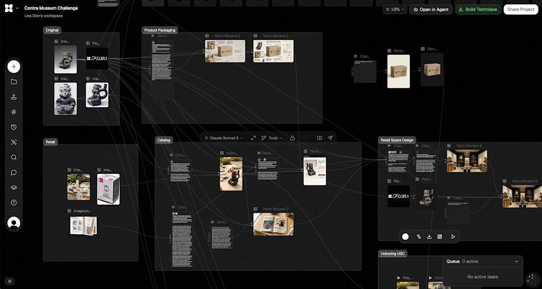
Flora as the canvas, every node and reference held in one connected workflow
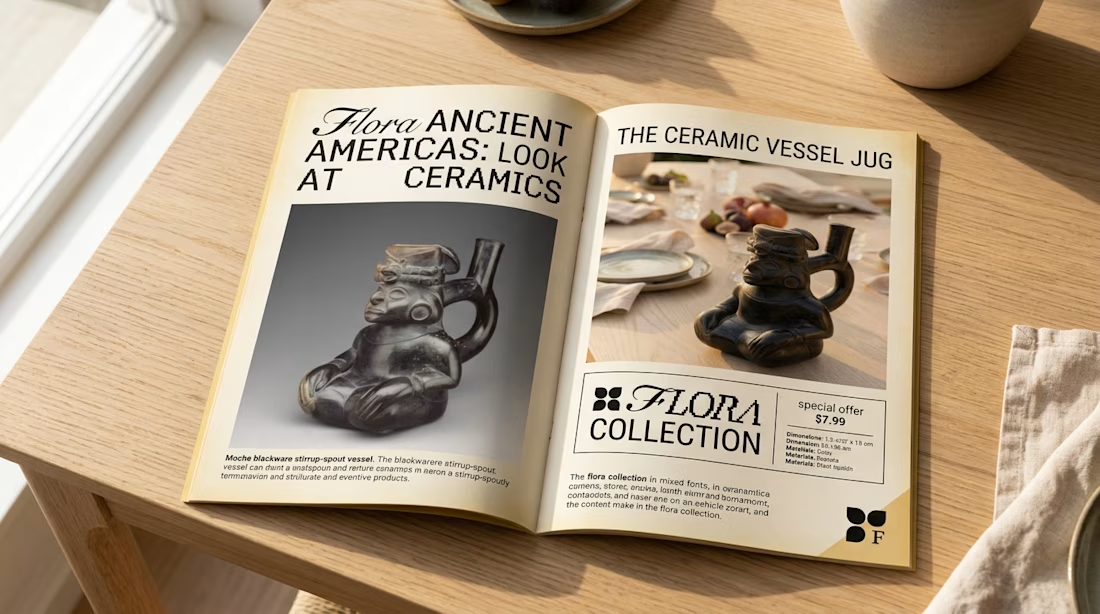
Nano Banana 2 for the product photography, the lifestyle table scenes, the catalog spread, the packaging system and the retail interior
Seedance 2.5 for the UGC box opening
Why This One:
Museums preserve objects by removing them from use. This piece was made to hold something and pour it out.
The original: https://www.metmuseum.org/art/collection/search/307474
The project in Flora: https://app.flora.ai/join-project/ccd3041c-6b9b-450f-b160-e8d467a863fd
#FLORAMuseum
The network for creativity
Join 1.25M professional creatives like you
Connect with clients, get discovered, and run your business 100% commission-free
Creatives on Contra have earned over $150M and we are just getting started






Related posts

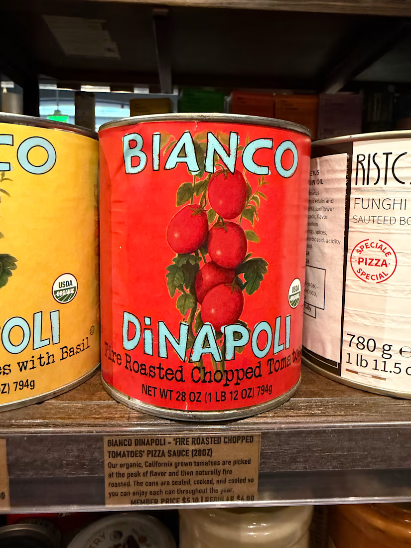
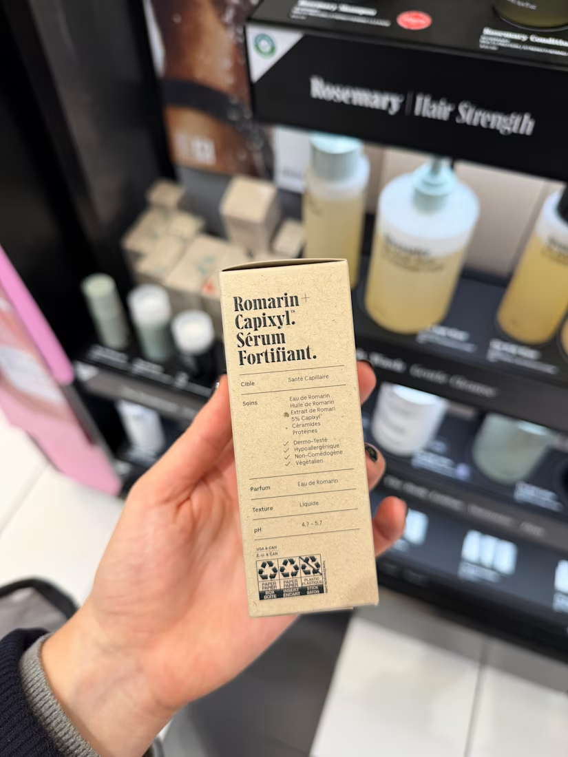
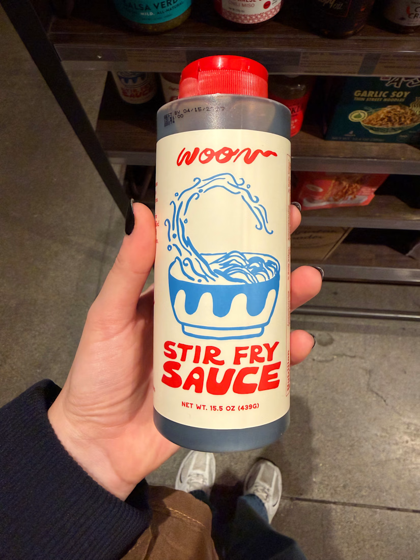
I have a weird habit. Whenever I travel, I spend HOURS in pharmacies and supermarkets 🥫🧴
But I’m not shopping, I’m studying. Typography, paper finish, how much white space the brand dares to leave, how the label wraps around the bottles.
The best packaging lessons I’ve had weren’t from courses but from picking things up and turning them around in my hands.
What was the last product you bought only because of how it looked?
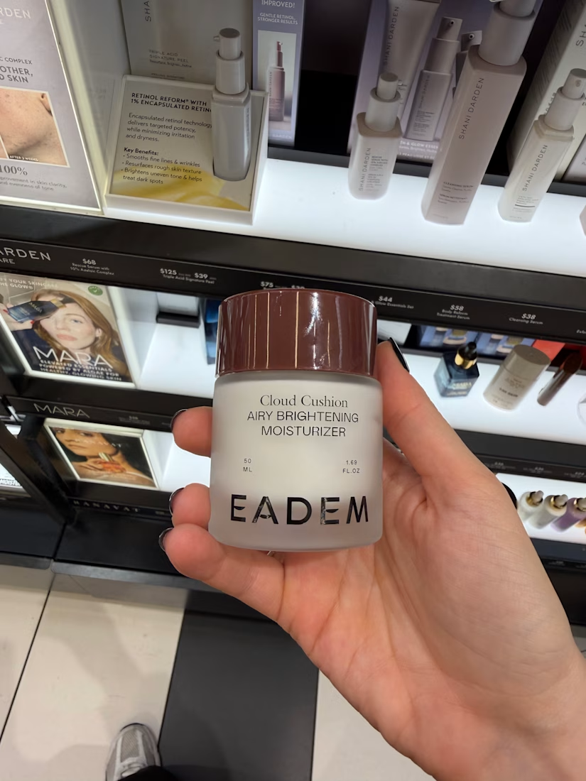

According to many creatives this is the best form of inspiration, I haven't really paid it the attention it needs or maybe not haha you tell me Anita how has this habit formed you taste?

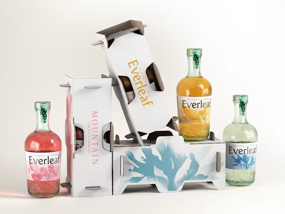
This packaging was designed using real plants and sunlight. Literally.
LOVE's new work for Everleaf is a great example of combining traditional craft with contemporary brand design.
Instead of creating generic botanical illustrations, the team used cyanotype, an early photographic technique, to capture silhouettes of real plants on light-sensitive paper.
Those prints became part of the labels, paired with embossed glass and a more distinctive bottle shape.
The interesting part is that the redesign isn't purely aesthetic. The new bottle is also 23% lighter and made from 100% post-consumer recycled glass.
I love projects where the production process becomes part of the visual identity itself.
It gives the design a story that feels genuinely connected to the product.

Looks great!

First merch line for Xaturnday House: oversized shirts, labels, lighters and packaging with print-ready blueprints, a motion teaser and 3D turntables.


Nice work!!


