The network for creativity
Join 1.25M professional creatives like you
Connect with clients, get discovered, and run your business 100% commission-free
Creatives on Contra have earned over $150M and we are just getting started
Back to feedPost

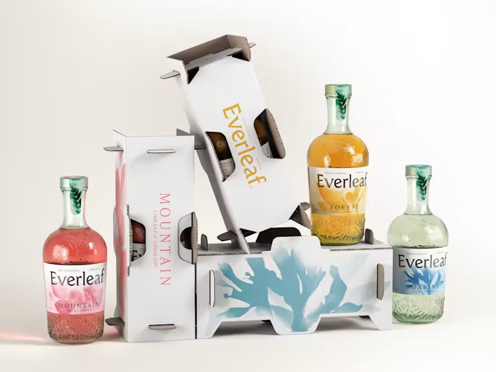
This packaging was designed using real plants and sunlight. Literally.
LOVE's new work for Everleaf is a great example of combining traditional craft with contemporary brand design.
Instead of creating generic botanical illustrations, the team used cyanotype, an early photographic technique, to capture silhouettes of real plants on light-sensitive paper.
Those prints became part of the labels, paired with embossed glass and a more distinctive bottle shape.
The interesting part is that the redesign isn't purely aesthetic. The new bottle is also 23% lighter and made from 100% post-consumer recycled glass.
I love projects where the production process becomes part of the visual identity itself.
It gives the design a story that feels genuinely connected to the product.

Looks great!
The network for creativity
Join 1.25M professional creatives like you
Connect with clients, get discovered, and run your business 100% commission-free
Creatives on Contra have earned over $150M and we are just getting started


Related posts

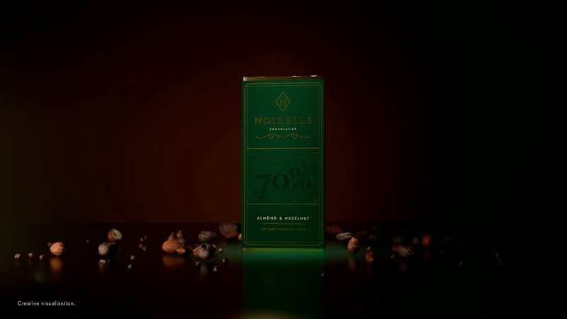
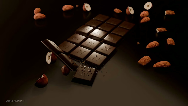
Two hero shots for Noirelle, a chocolate brand I made up. I designed the pack and rendered both in Blender.
The hero shot is what people judge the product by before they read a word, so it has to do the selling on its own.
A: the pack, standing alone
B: the bar, snapped open with the almonds and hazelnuts
Which one goes on the shop page?

0 voted
1%
0 voted
1%
0 votes
Closed


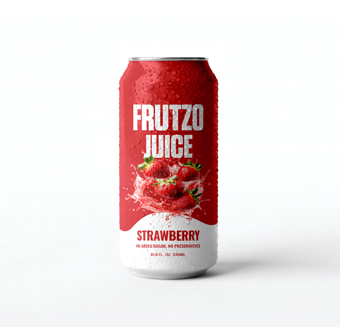
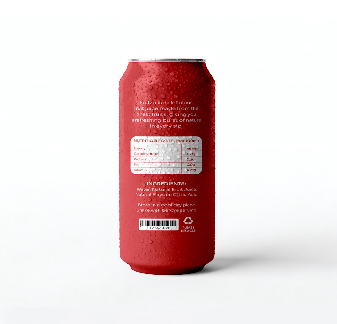
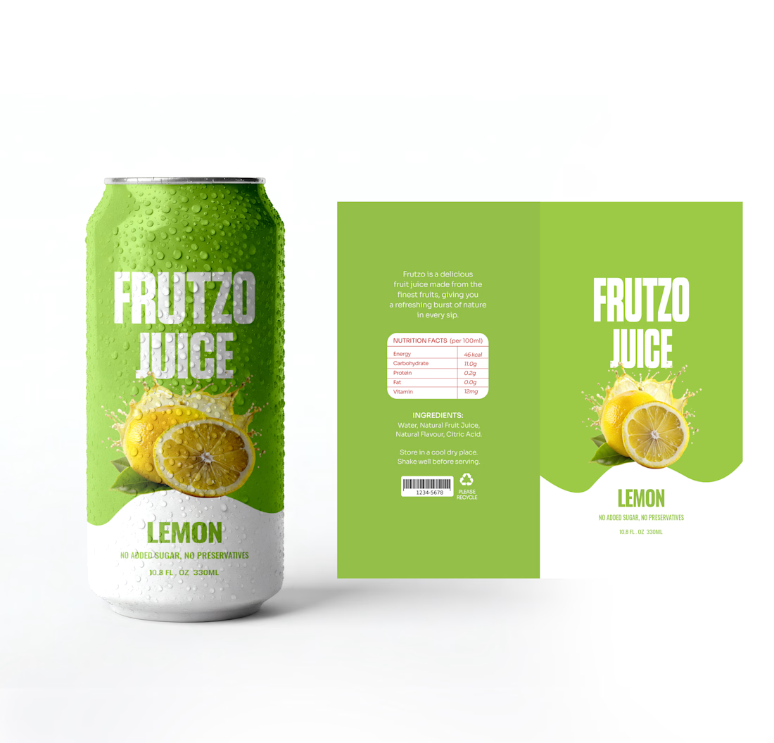
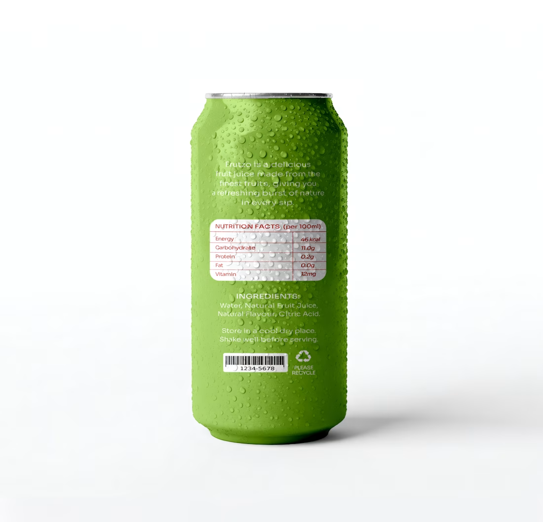
I designed FRUTZO as a complete packaging system, exploring two distinctive flavour variants: Strawberry and Lemon. From the visual direction and colour development to the front and back packaging layouts, every element was carefully designed to create a cohesive and recognisable brand experience.
The presentation also includes the packaging dielines, showcasing the actual artwork behind the final product visuals.
Two flavours. One distinctive identity. A packaging experience designed to make an impression.

A system makes it work. A brand makes it matter.
Through Adora Garden, we explore how a structured visual system can evolve into a cohesive brand identity — bringing consistency, character, and a more meaningful visual experience to every touchpoint.
Because branding isn't just about how a brand looks. It's about how it feels, speaks, and connects.
6 voted
27%
16 voted
73%
22 votes
Closed
Identity 💯