The network for creativity
Join 1.25M professional creatives like you
Connect with clients, get discovered, and run your business 100% commission-free
Creatives on Contra have earned over $150M and we are just getting started
Back to feedPost

Most people don’t fail because they’re lazy.
They fail because they don’t have structure.
Nexo isn’t motivation.
It’s a system.
Train with intention.
Track what actually matters.
Stay consistent — even when motivation disappears.
This is what calm, focused design looks like.
Built to remove noise. Built to keep you moving.


The network for creativity
Join 1.25M professional creatives like you
Connect with clients, get discovered, and run your business 100% commission-free
Creatives on Contra have earned over $150M and we are just getting started




Related posts

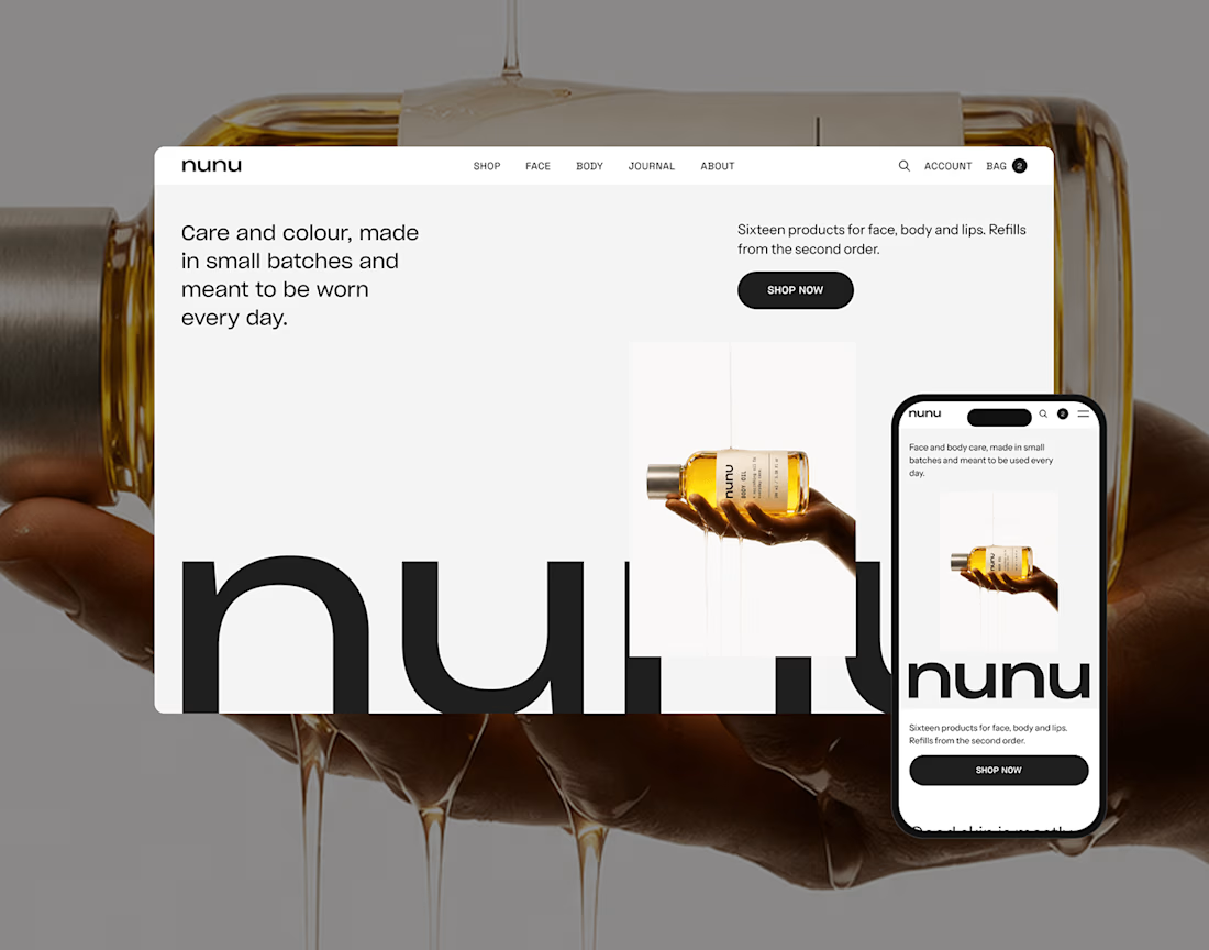
nunu is a self-initiated skincare and body care brand built from zero: naming, brand identity, art direction, product imagery and a responsive e-commerce websit

Nice work!

One pixel grid. A whole brand.
For Appy, a London product studio for impact-driven startups, the wordmark, icons, 3D smile and Appy Pixel, its custom typeface, all come from the same grid.
Appy Pixel won Typography at the Online Design Awards.
Type first or symbol first: where do you start a rebrand?


thats so nice, i loveee


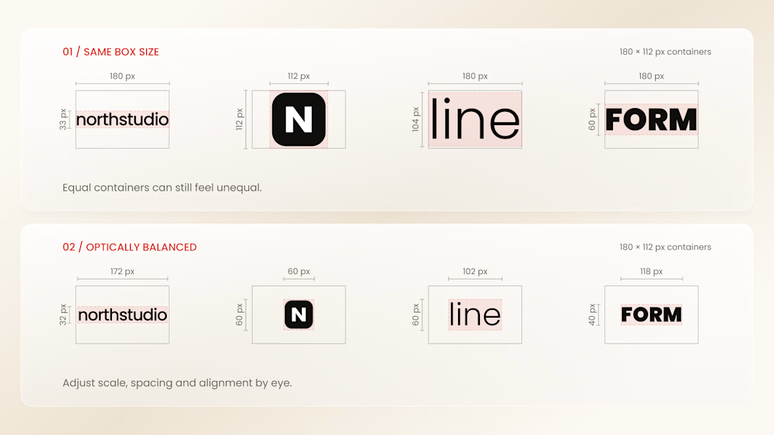
Why do logos look uneven even when they have the same size?
Every logo has a different shape, proportion, and visual weight. A wide wordmark can appear smaller than a compact symbol, while a bold logo may dominate a thinner one - even when their dimensions are technically identical.
That’s why logo sections shouldn’t be aligned by numbers alone.
Adjusting each logo optically, using a consistent visual area, balanced spacing, and a shared baseline helps every brand feel equally represented.
The goal isn’t to make every logo exactly the same size.
It’s to make them feel equally important.
Because visual consistency is based on perception, not just pixels.


Thanks for the information you shared