The network for creativity
Join 1.25M professional creatives like you
Connect with clients, get discovered, and run your business 100% commission-free
Creatives on Contra have earned over $150M and we are just getting started
Back to feedPost


Most cookie packaging on shelf leans loud and cluttered — I wanted to see
what happens when you strip that back and let the product feel premium
instead of just sweet.
This project started as a redesign exercise on an existing cookie packaging
concept. I kept the product category and target shelf context the same,
then rebuilt the concept from scratch: new color story, new typography
system, new material direction.
What changed:
— Concept shifted from playful/busy to minimalist and premium
— Palette rebuilt around cream, charcoal, and a warm gold accent
— Custom logotype and clean geometric type system
— Matte textured finish to signal quality over sugar-rush energy
The result reads less like a snack and more like a gift — which is exactly
the shelf position a lot of artisanal food brands are chasing right now.
Open to redesign work like this for food, cosmetic, and skincare brands
looking to reposition their packaging. Let's talk about your product.
#Packaging Design, #Food Packaging, #Branding, #Product Design, #Label Design,#Package Mockup


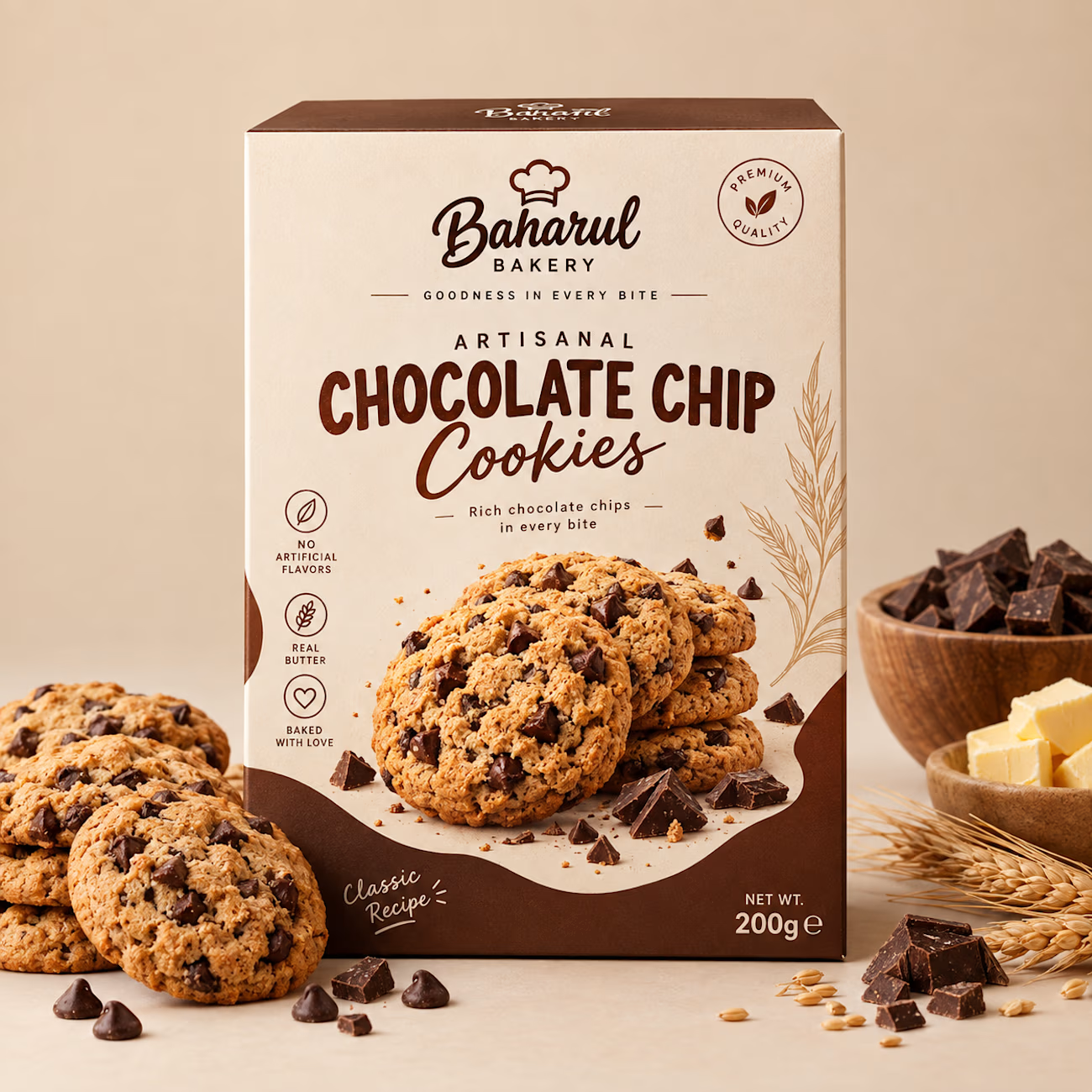

The restraint here really works—the warm chocolate palette and generous negative space make the pack feel premium without losing the product cue. The ingredient callouts are a nice touch for quick shelf scanning.

The design is cool

Visually Good.
The network for creativity
Join 1.25M professional creatives like you
Connect with clients, get discovered, and run your business 100% commission-free
Creatives on Contra have earned over $150M and we are just getting started





Related posts

Next intelligence. A brand you can feel.
Ice blue, deep black and refracted glass bring texture, depth and a sense of touch to an invisible technology. An identity designed to be recognised. And felt.
Brand identity and visual direction for Niwos, a platform that brings AI agents together as a digital workforce.
Five modules. One W. A simple idea at the heart of the identity: working as one.
I’ve really enjoyed working on this project with Muhammed. His trust in my design judgement and openness to new ideas gave me the creative freedom to explore fully.
Here’s hoping this is just the first chapter of an exciting journey with him and his team.

👍 nicely done


Does an AI brand still need to look like an AI brand?
Lupr helps small and growing businesses adopt AI without the complexity, so the identity needed to do the same.
We built a clean, approachable system around movement, connection and continuous improvement, without leaning on the usual futuristic tech clichés.
The idea was simple: make AI feel like useful business infrastructure, not something you need to be an expert to understand.
As AI becomes part of everyday business, do you think brands still need to visibly signal “AI”?
Full case study below 👇


Great design it feels alive 🎉🎉❤️❤️

A few things we’ve been working on this month.
Different industries, different problems, but the same goal: making complex products feel simple, clear, and trustworthy.
Fintech → Investment Banking → Geospatial AI
More projects are still in progress.
Full case studies coming soon.






This is the kind of work I enjoy seeing — simple, focused, and actually thought through.


