The network for creativity
Join 1.25M professional creatives like you
Connect with clients, get discovered, and run your business 100% commission-free
Creatives on Contra have earned over $150M and we are just getting started
Back to feedPost

These are self initiated concept projects.
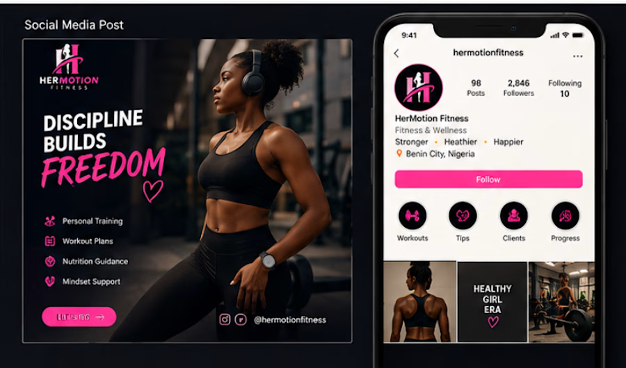
1. HerMotion Fitness
A self initiated fitness branding concept focused on confidence and energy featuring a bold logo,vibrant colors and engaging social media designs.
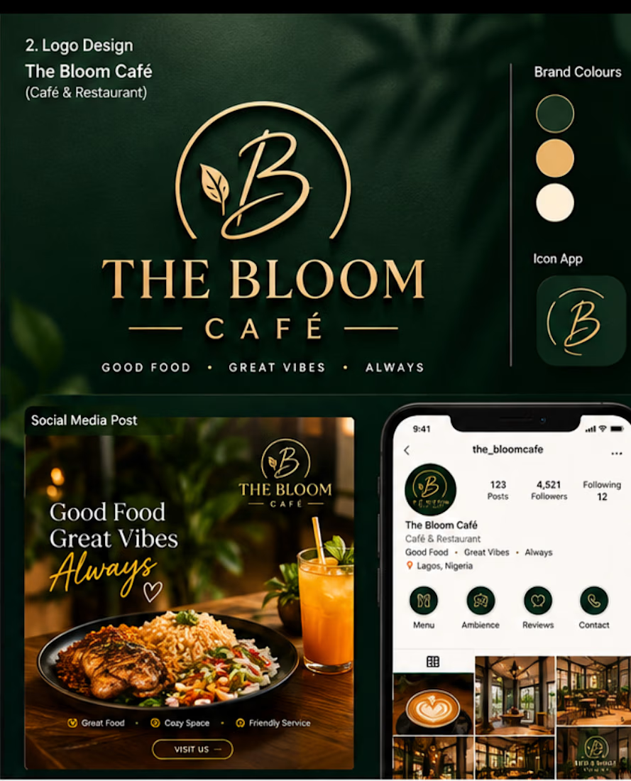
2. The Bloom Café
A self initiated cafe branding concept combining a sophisticated logo,warm color palette and social media graphics to create a welcoming and memorable visual identity.
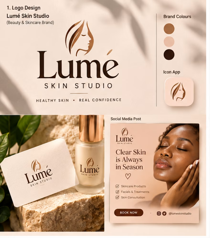
3. Lumé Skin Studio
A self initiated luxury skincare branding concept featuring a clean logo,elegant color palette,a modern social media designs created to give the brand a premium and feminine identity.
The network for creativity
Join 1.25M professional creatives like you
Connect with clients, get discovered, and run your business 100% commission-free
Creatives on Contra have earned over $150M and we are just getting started







Related posts

New on Contra 👋
A collection of logo & branding projects I’ve worked on — built around clarity, strategy, and timeless visual identities.
I’m here to connect with new people, discover exciting brands, and share more of my work.
If you’re building a brand or simply love good design, let’s connect. ✦
More work → spgmarks.com

Welcome to Contra!!

Does presenting more design options actually give clients more freedom?
I’m starting to think the opposite can happen.
If I present 5 directions, the client now has to decide which one they like. If I present 1–2 strong, well thought-out directions, I’m also showing them what I think the brand needs.
For me, the number of options is part of the design process itself.
How many directions do you usually present to a client?

One or two, never five. Five options is not freedom, it is homework you handed the client. One or two strong directions says I made the hard calls for you, which is what they are actually paying for. Choice is a burden dressed up as a courtesy.


A look at my design work for Oure, a six page wellness template inspired by the high end look of brands like Noom and Equinox, built for an app, app overview, an organizations page, a shop, and contact, with support for more than one language.
This helped shape the design itself. An earthy palette with soft green-toned accents and a recurring water motif give the pages a calm, grounded feel, while thoughtful animation conveys that its not just your "run of the mill" -wellness app.
There's a lot happening across six distinct pages, from introducing the app to reaching organizations to a full shop flow. The challenge was keeping every section clean and well-planned so the whole thing still feels like one cohesive world, not six separate sites stitched together.


