The network for creativity
Join 1.25M professional creatives like you
Connect with clients, get discovered, and run your business 100% commission-free
Creatives on Contra have earned over $150M and we are just getting started
Back to feedPost

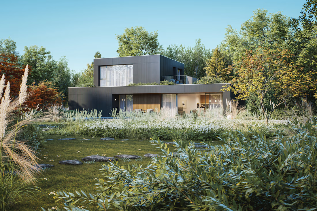
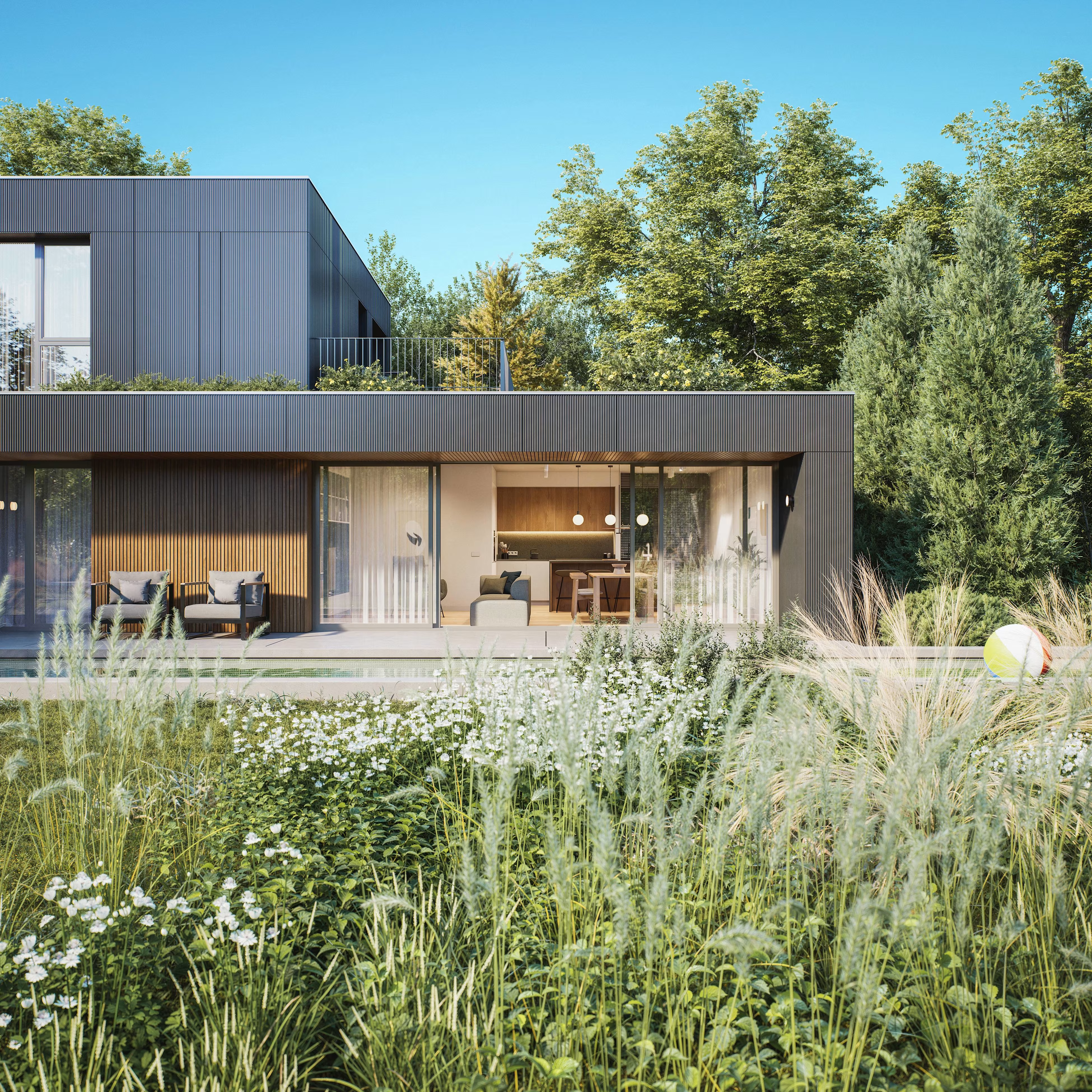
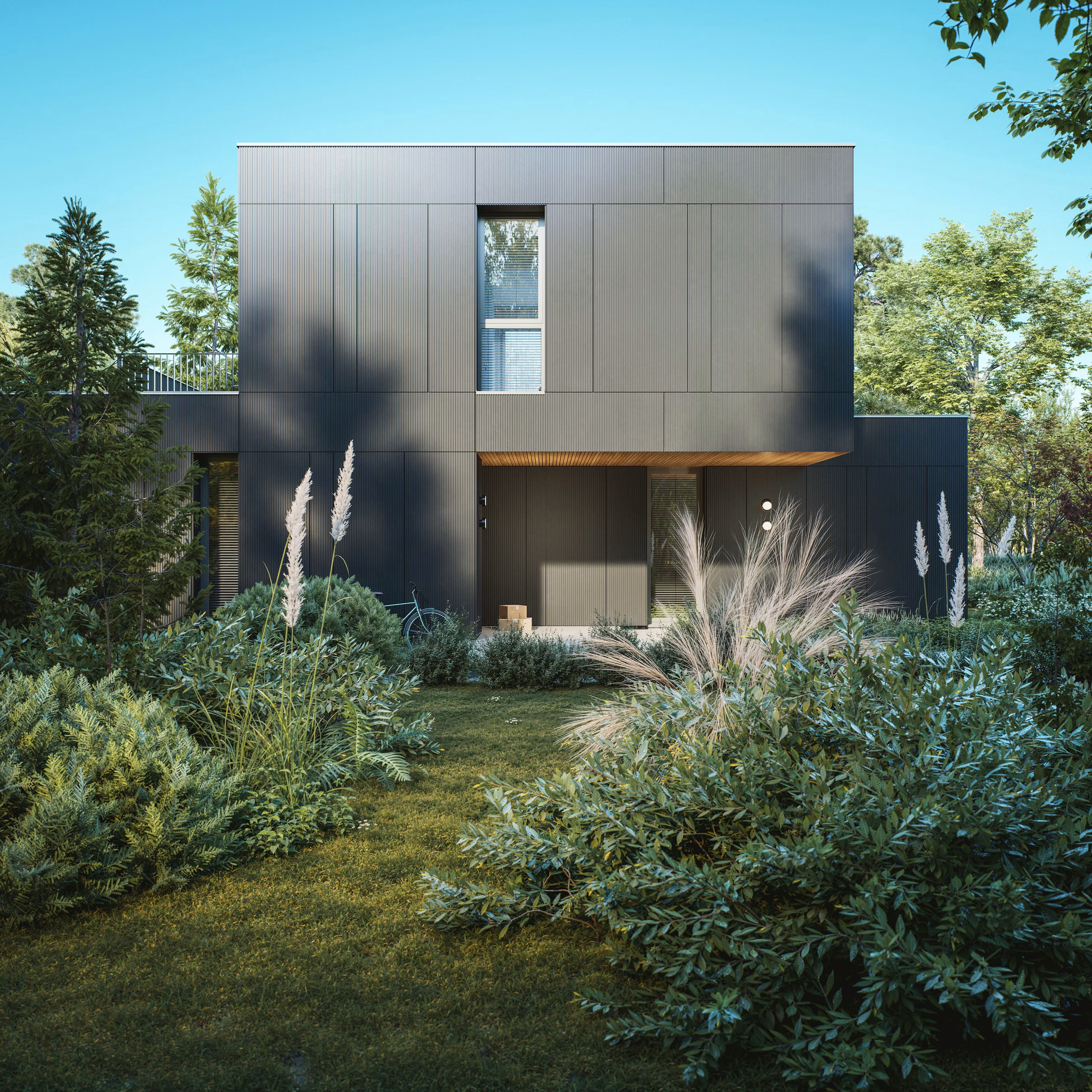
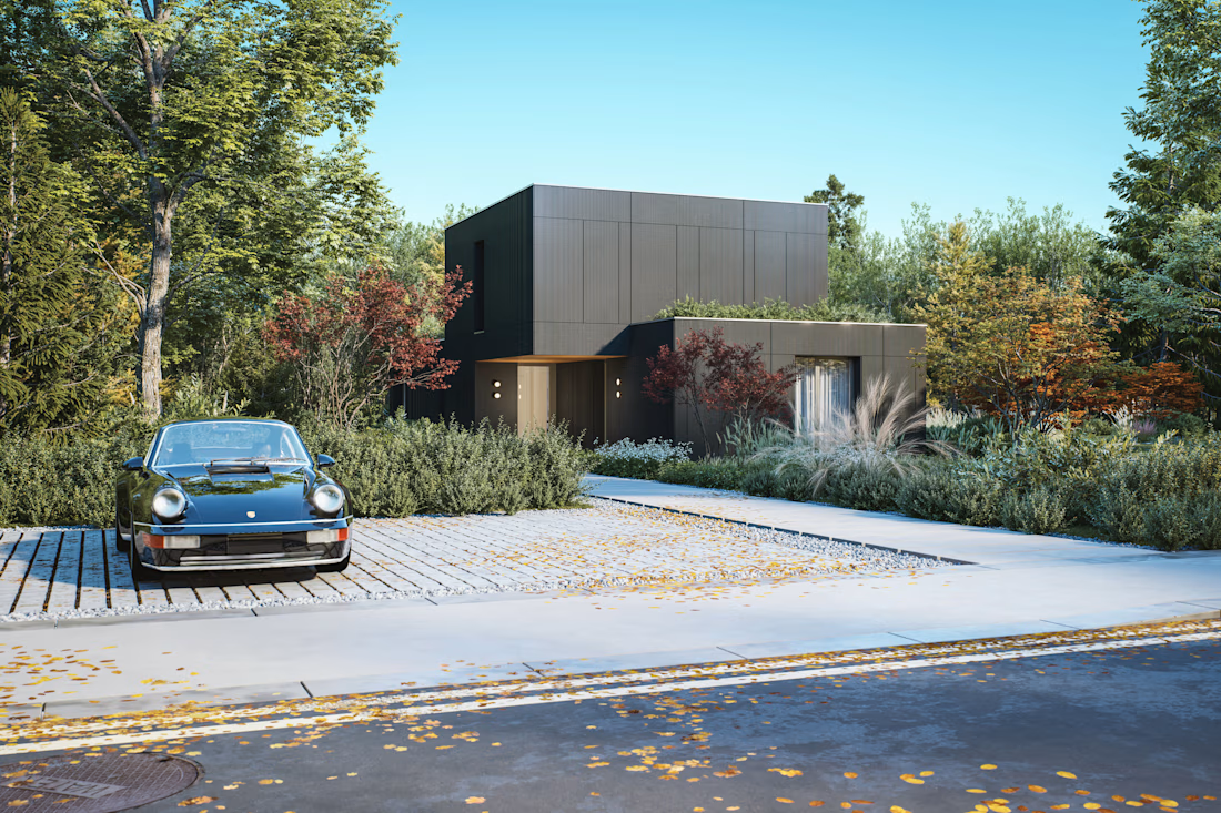
Revisiting an architectural concept I worked on a few years ago, this time with fresh eyes and a stronger focus on visualization.
The design itself was already there, but I felt it deserved a more mature visual interpretation. I reworked the material expression, landscape mood and overall atmosphere to better convey the contemporary character I had in mind from the beginning
I rebuilt the camera compositions and lighting from scratch to better express spatial hierarchy and the indoor outdoor relationship, treating this exercise as both a visual update and a way to reassess the project with the experience I have gained since.
Hope you like it!

Looks great! What region would you say this design typology would fit well in?
The network for creativity
Join 1.25M professional creatives like you
Connect with clients, get discovered, and run your business 100% commission-free
Creatives on Contra have earned over $150M and we are just getting started




Related posts

Color Direction Test - Tecta Architecture
Exploring two visual directions for Tecta, a contemporary architecture brand built around clarity, form, and human-centered spaces.
Direction 01 - Warm, calm, and timeless.
Direction 02 - Fresh, modern, and expressive.
Same identity. Different atmosphere.
Which direction feels stronger for an architecture brand - 01 or 02?
21 voted
38%
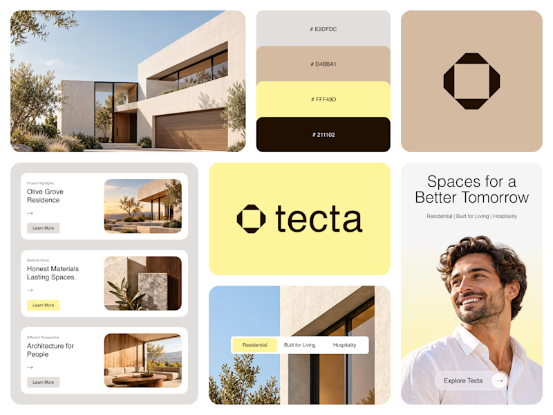
35 voted
62%
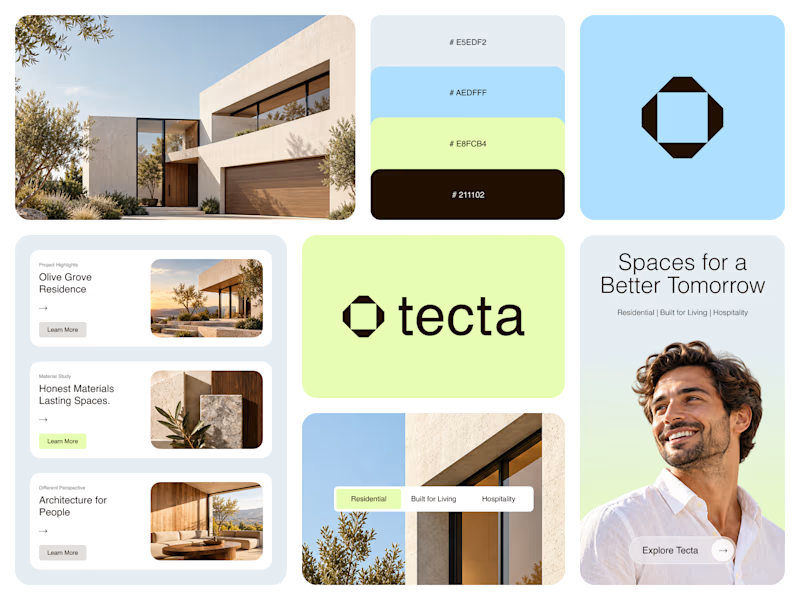
56 votes
Closed

Great branding! The presentation is top-notch. Learned something new from this.

A modern AllTrails redesign concept focused on making trail discovery more visual, immersive, and intuitive. 🥾
Would love to hear your thoughts or suggestions!


This is such a clever way to turn familiar client feedback into a visual language. The concept and typography make the message really memorable. 👏


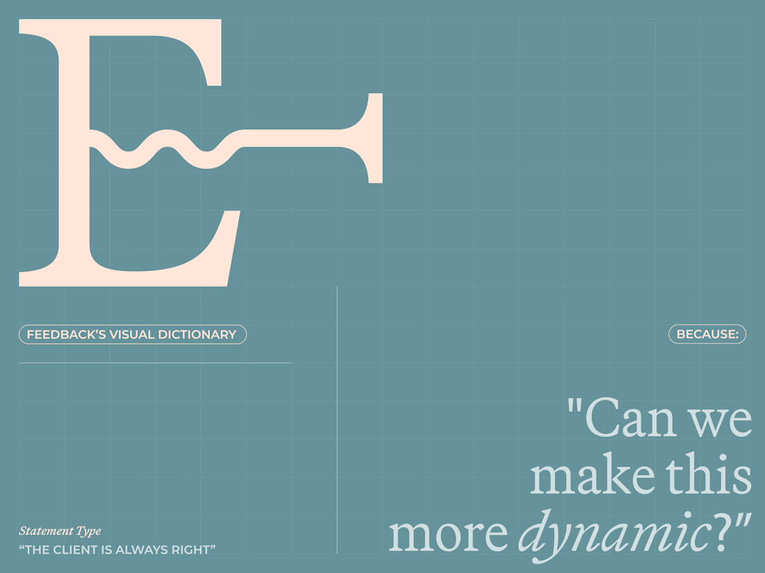
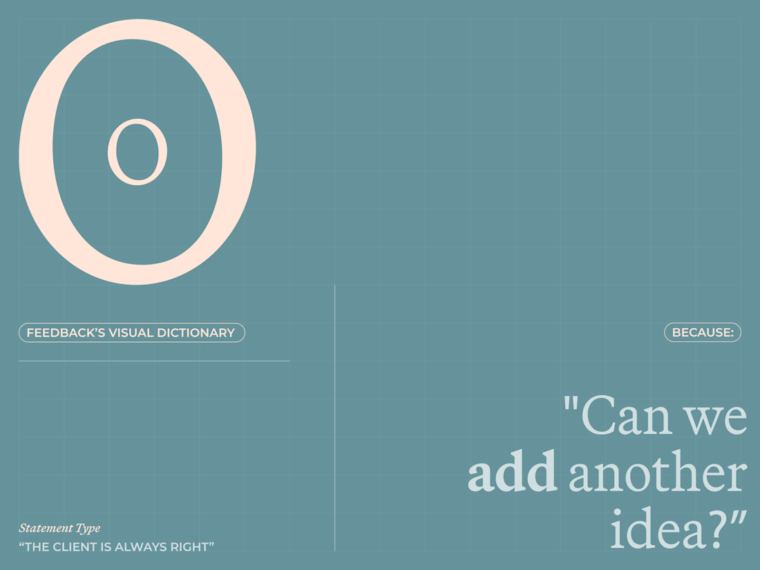
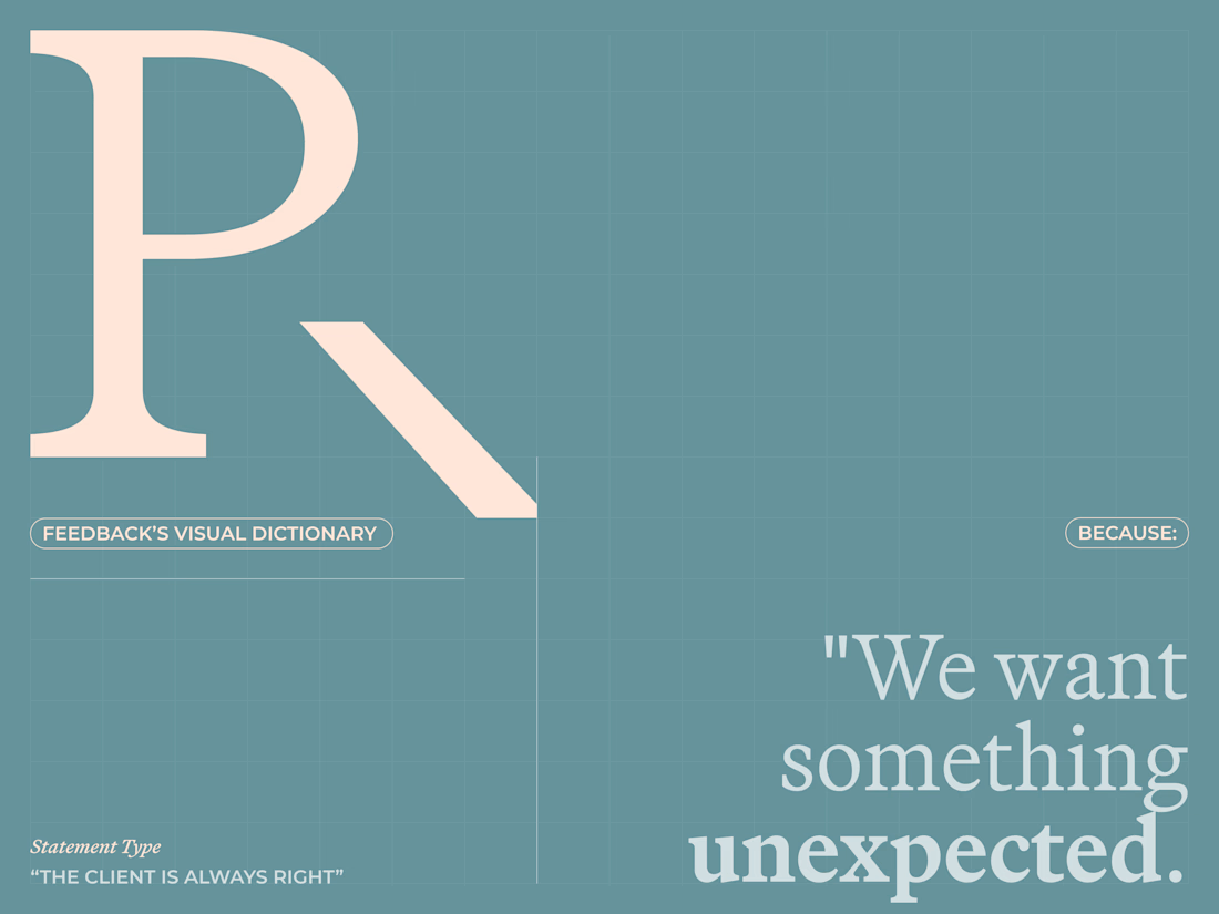
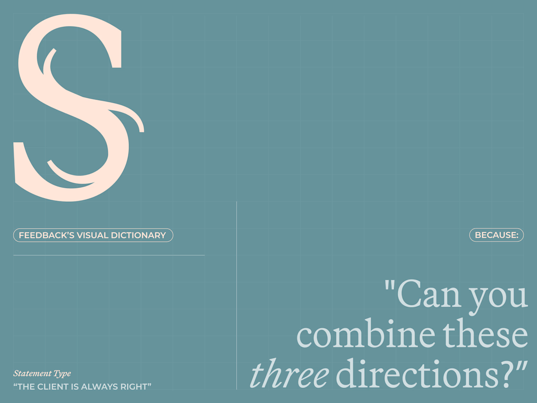
Are clients always right? 😀
I created a lettering system where every letterform represents one of the things designers routinely hear from clients.
The typeface becomes a visual dictionary of bad creative feedback, that proves the statement wrong.
Give me your worst client...